the brief for this project is to uncover and illustrate moments of wonder hidden within the everyday world. creating something extraordinary from the mundane.
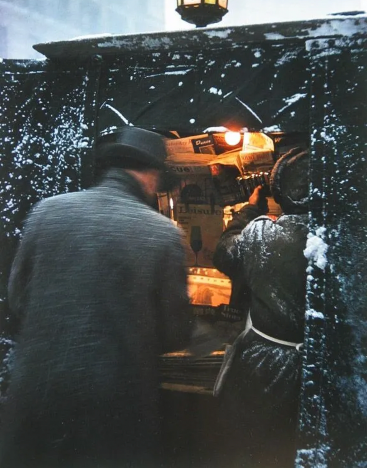
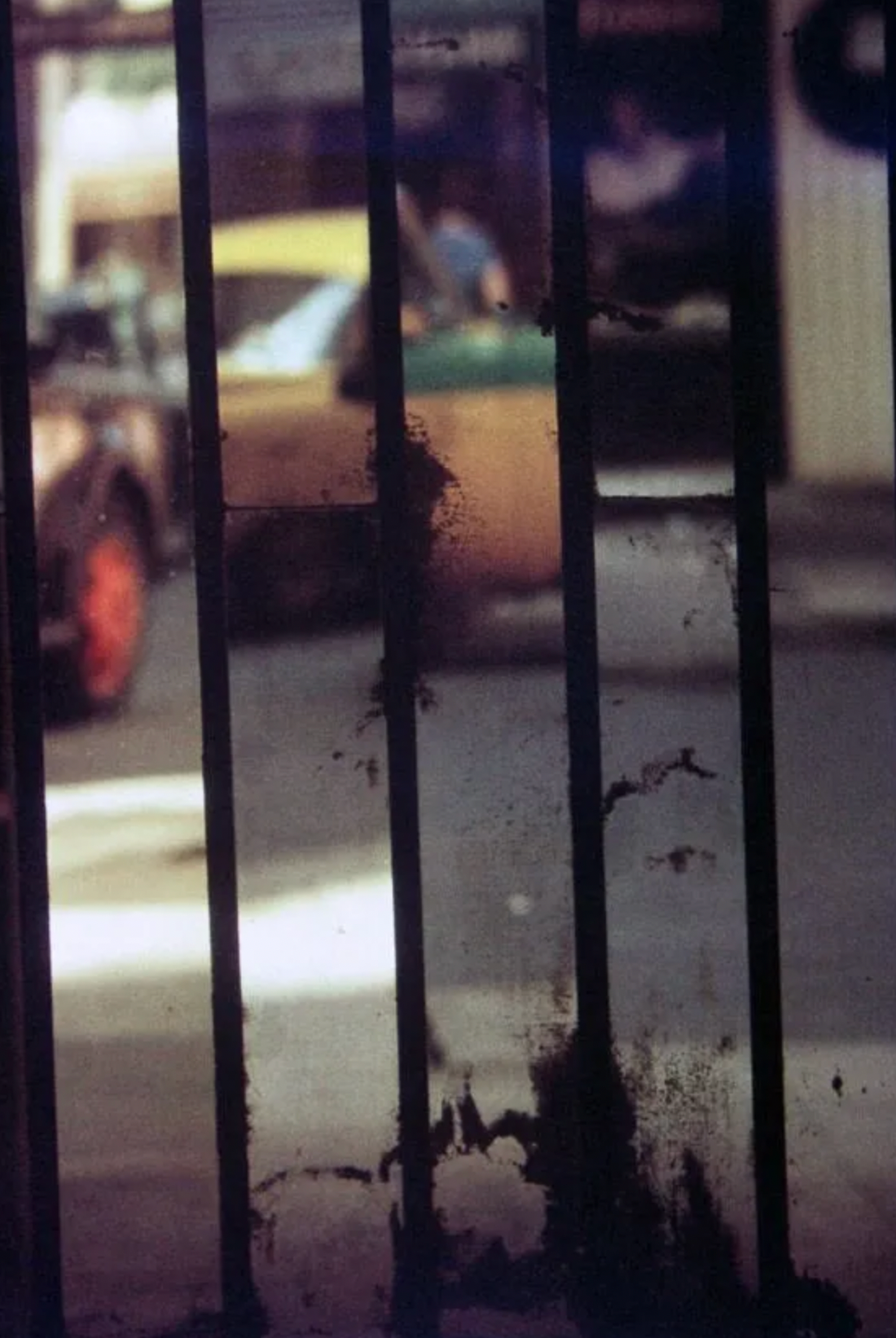
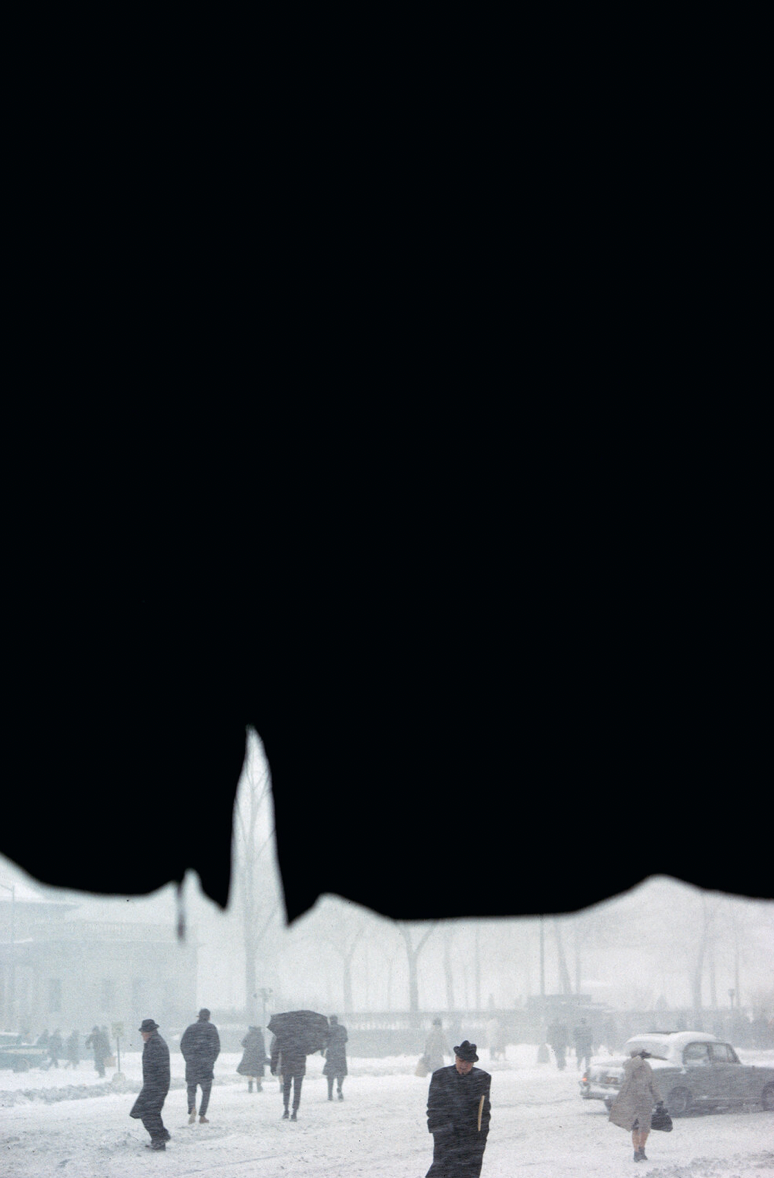
Saul Leiter was an artist and photographer from Pittsburgh who discovered his passion for photography after being inspired by another artist upon moving to New York. He believed in finding beauty in simplicity, demonstrating that even the most ordinary subjects can be profoundly interesting.
His work features a wide variety of compositions, each offering unique perspectives on everyday life. Leiter skillfully crafted his images by using elements from his surroundings to create structure and depth.
I admire his inventive approach and how he uses perspective to transform the mundane into something truly beautiful. His mastery of composition and interpretation is something I hope to incorporate into my own project.
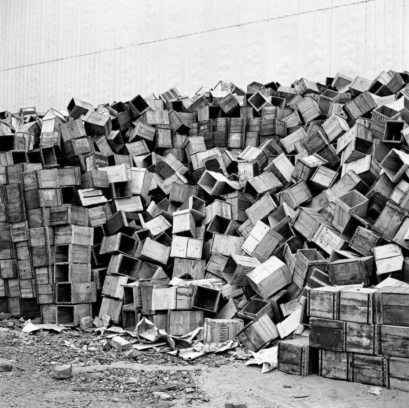
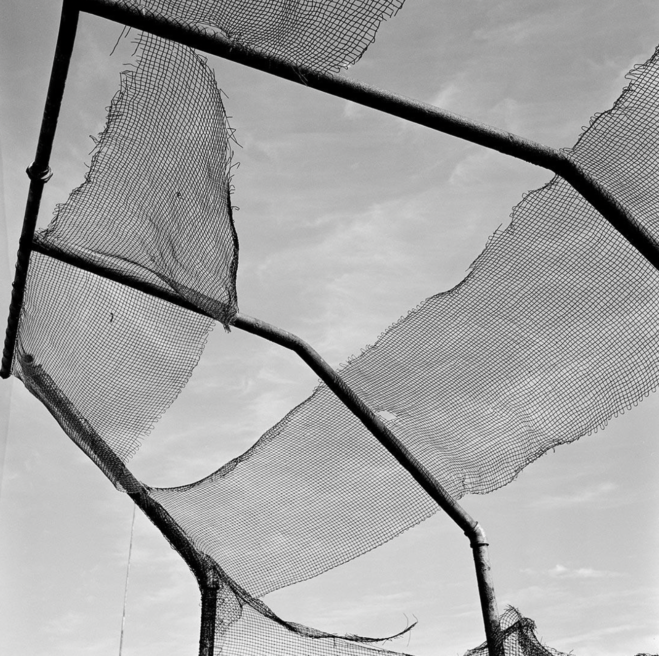
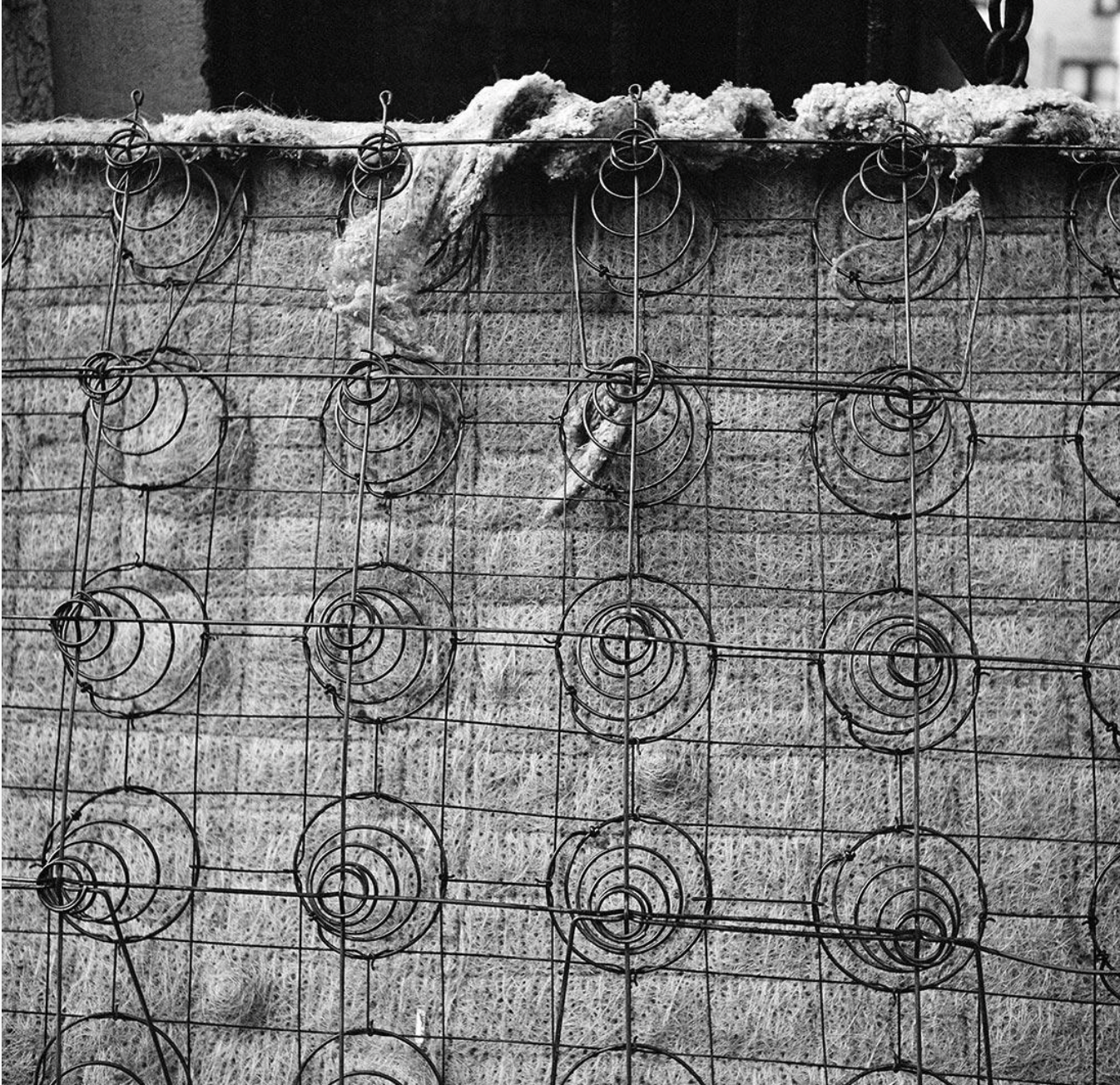
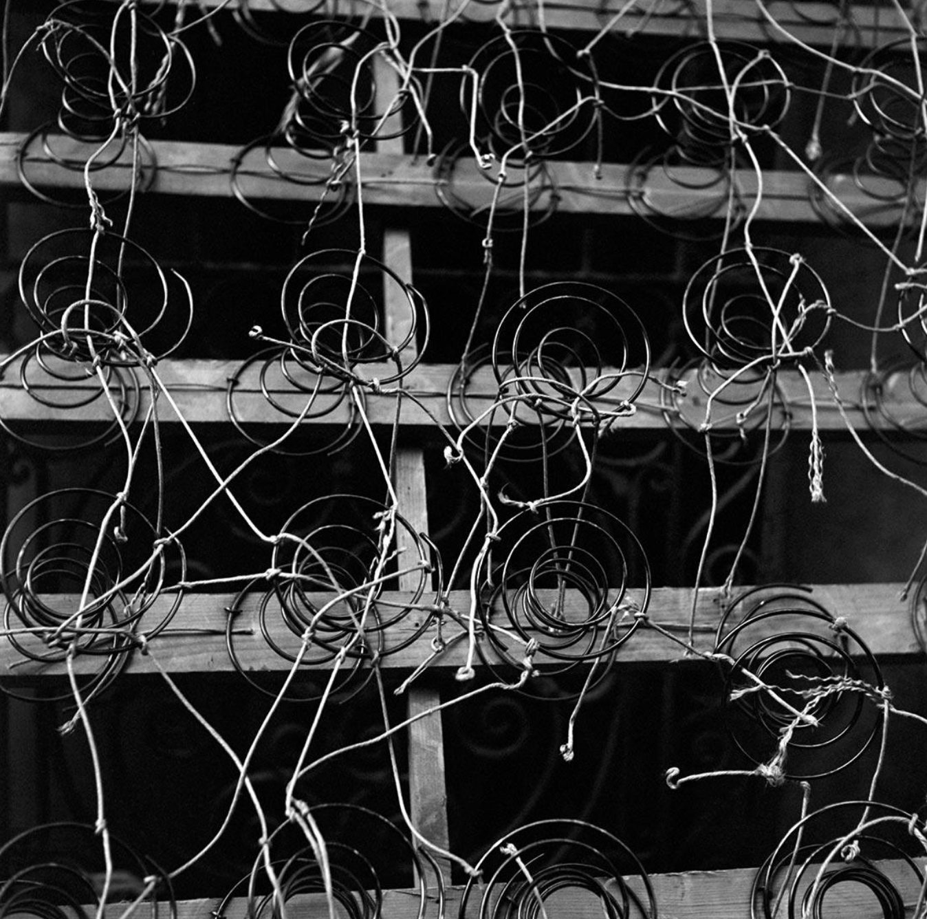
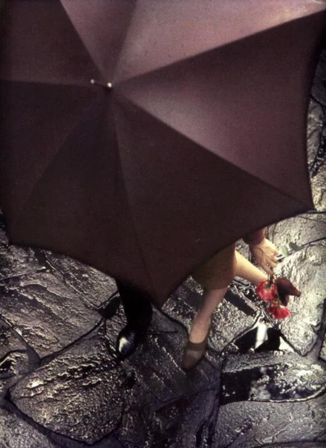
Vivian Maier was an American artist and photographer known primarily for her street photography, capturing everyday scenes, people, and events in urban settings. Her images often reveal moments of human interaction, emotion, and humor, highlighting the beauty and complexity of ordinary life.
Her work shares similarities with Saul Leiter’s in the way both artists present unique perspectives and compositions within the mundane.
There are particular aspects of Maier’s photography that I found especially inspiring. Many of her photos focus on patterns in materials from her surroundings. What I appreciate most is the simplicity of her perspective by getting close to the subject, she captures compositions that might otherwise be overlooked.
I believe I can experiment with similar approaches in my own photography and then develop these images further to create outcomes with greater depth and meaning.
I also liked the style of her street view photos. they isolate the elements bordering the road or pavement possessing beauty, which are often disregarded.
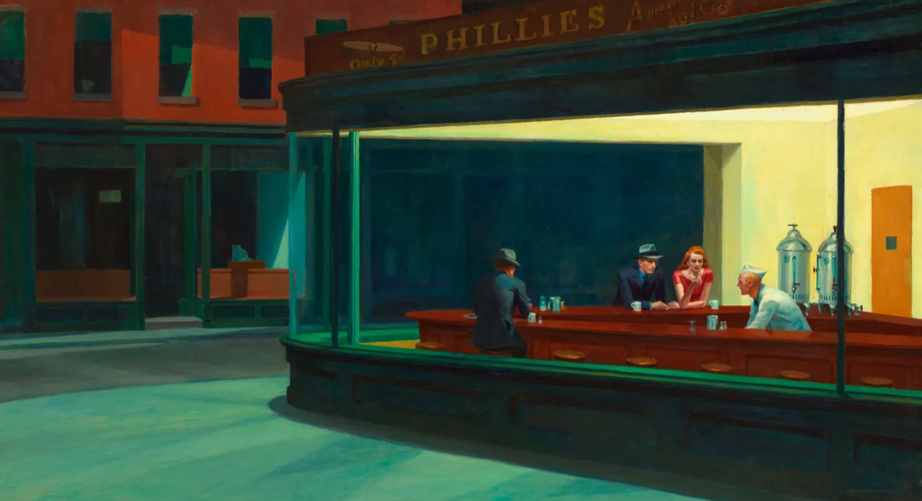


Edward Hopper’s artwork powerfully conveys solitude through his use of light and composition. He creates strong contrasts in his paintings, isolating figures and spaces within their environments. The mood in each piece is shaped by the direction and intensity of light, which Hopper masterfully controls to evoke meaning and atmosphere.
His compositions often separate individuals from crowds and landscapes, making the people in his paintings appear isolated and detached from the world around them, even when others are present.
I find his use of light to evoke emotion and solitude particularly inspiring, and it’s an approach I hope to incorporate into my own work.


Catherine Pape is an artist and illustrator from Leeds who blends digital and traditional media in her work. I really admire how her pieces balance simplicity with intricate detail, her compositions may appear straightforward, but there is always much to explore visually.
She adds depth and character through a variety of textures, achieved by using different brush strokes and drawing techniques. For example, in the image of the golden retriever, Pape uses brush strokes to convincingly capture the texture of the fur.
I plan to draw inspiration from her use of rough detailing to depict shadows, texture, and dimension in my own work.


Michael McGregor is an artist and illustrator from Los Angeles who draws inspiration from his immediate surroundings.
I really appreciate the rawness in his work, which gives it a strong sense of character and personality. I also admire the media he uses, which lends his illustrations a loose, sketchy quality. This playful and lighthearted style brings energy to otherwise mundane scenes.
McGregor’s choice of colour palettes often features strong contrasts, effectively separating different elements within an image. I find this approach highly engaging, as it adds layers of complexity for the viewer to explore.

I want the foundation of my project to be a constant source of inspiration that I can always return to. To start, I’ve been reflecting on the mundane aspects of my everyday life.
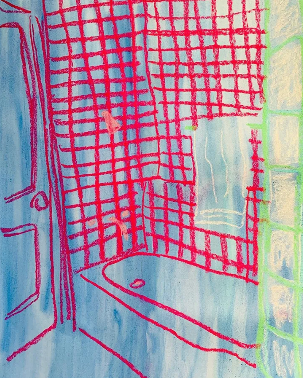
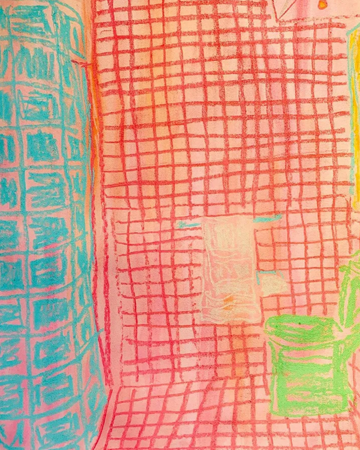
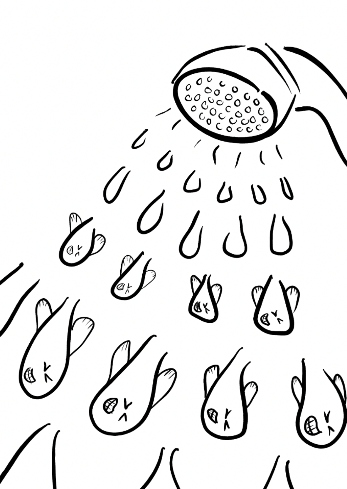
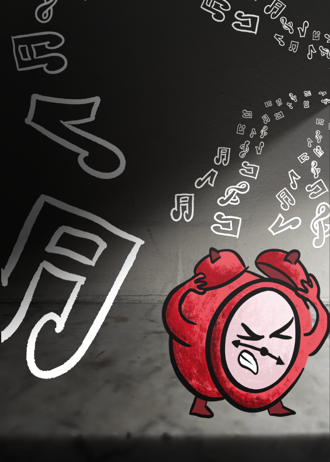
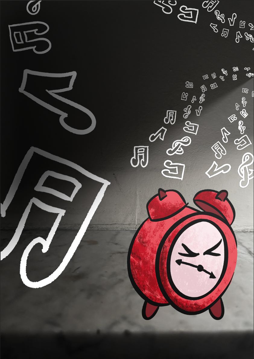
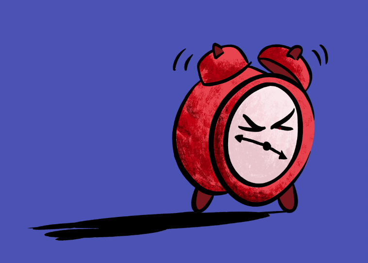
My approach has been to work chronologically, beginning with my morning routine. I’ve started creating thumbnails exploring different directions, such as my alarm clock ringing, turning on the shower, and sunlight streaming through the curtains.
I’m particularly interested in the concept of anthropomorphism, the attribution of human traits, emotions, or intentions to non-human entities like animals, objects, or natural forces. I believe this could introduce a lighter tone and add contrast to the otherwise ordinary subjects. Exploring the idea of giving human qualities to these elements is something I plan to develop further.
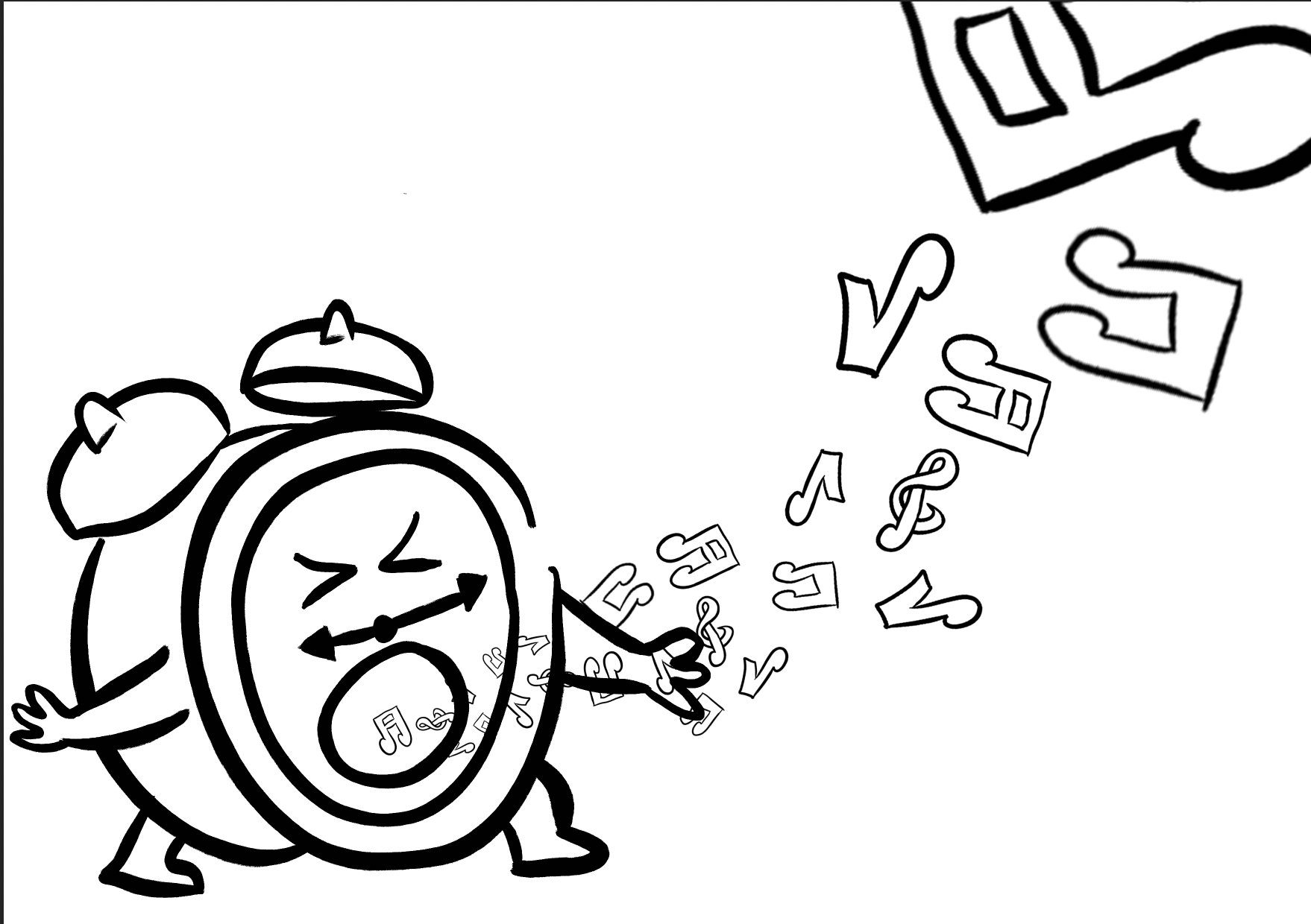
I've started experimenting further with my alarm clock thumbnail, considering compositions and the attributes I attach.

I wasn’t entirely satisfied with how the clock originally looked, so I refined the strokes to create a much smoother appearance. I also aimed to better convey the emotion I want to express. Through the character’s body language and facial features, I want to communicate a sense of frustration caused by the irritating noise of the alarm.
I believe these changes have been successful, but now I need to focus on evaluating the overall composition and structure of the illustration.
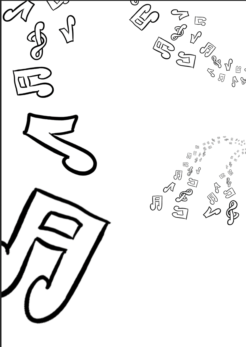
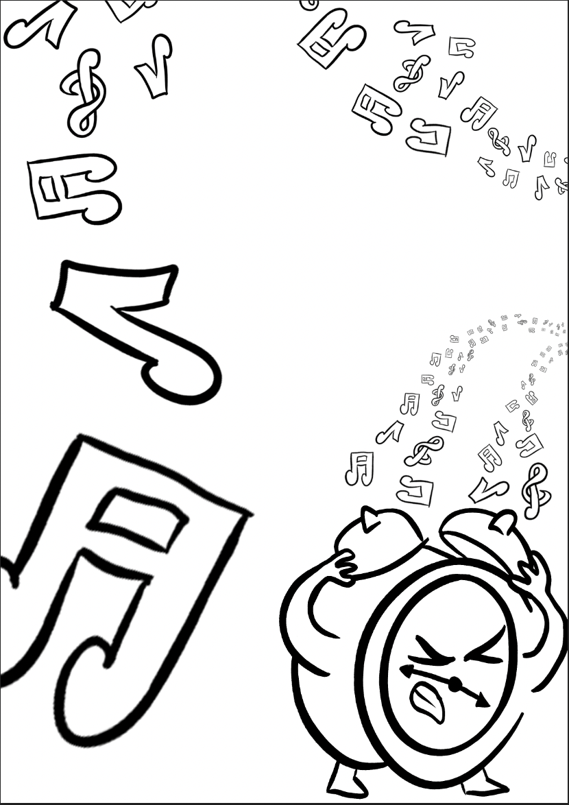
visually representing the sound of the alarm is something I am not certain on. I've added a line of music notes flowing around the page, suggesting a louder and quieter noise through the size of the notes. although I think this may appear messy and take away from the alarm clock itself.
I will keep the music notes for now but I feel as if they will likely be a hindrance and will need to be removed.
.

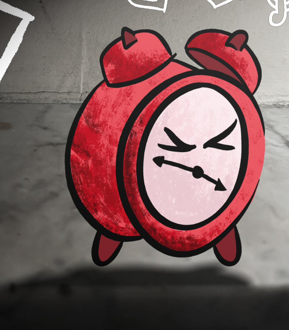
The texture in Catherine Pape’s work, especially her milk bottle piece, is something I want to incorporate into my alarm clock illustration. I’ve experimented with different brushes to replicate that textured feel and am pleased with how it’s turning out. Adding colour and texture has definitely given the piece more depth and character.
I also tried moving the darker shading to the center of the clock’s face to see how it would look, but I think the original version on the left works better.
Incorporating darker reds to suggest light direction was important as well. This ties into what I’ve learned from Edward Hopper’s use of contrast and light to create depth.
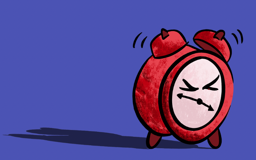
I chose a red color palette because the emotions I’m aiming to convey are anger and frustration, and red is strongly associated with both, making it a fitting choice for this piece.


I’ve been interested in combining photography and digital design for some time, so I wanted to experiment and put this idea into practice. My goal was to amplify contrast and create a more layered, dynamic outcome by merging the two mediums.
I took photos of various platforms where my character could be positioned and adjusted their brightness to heighten the sense of tension within the setting. I believe this approach has already helped me achieve some success in realizing my vision.

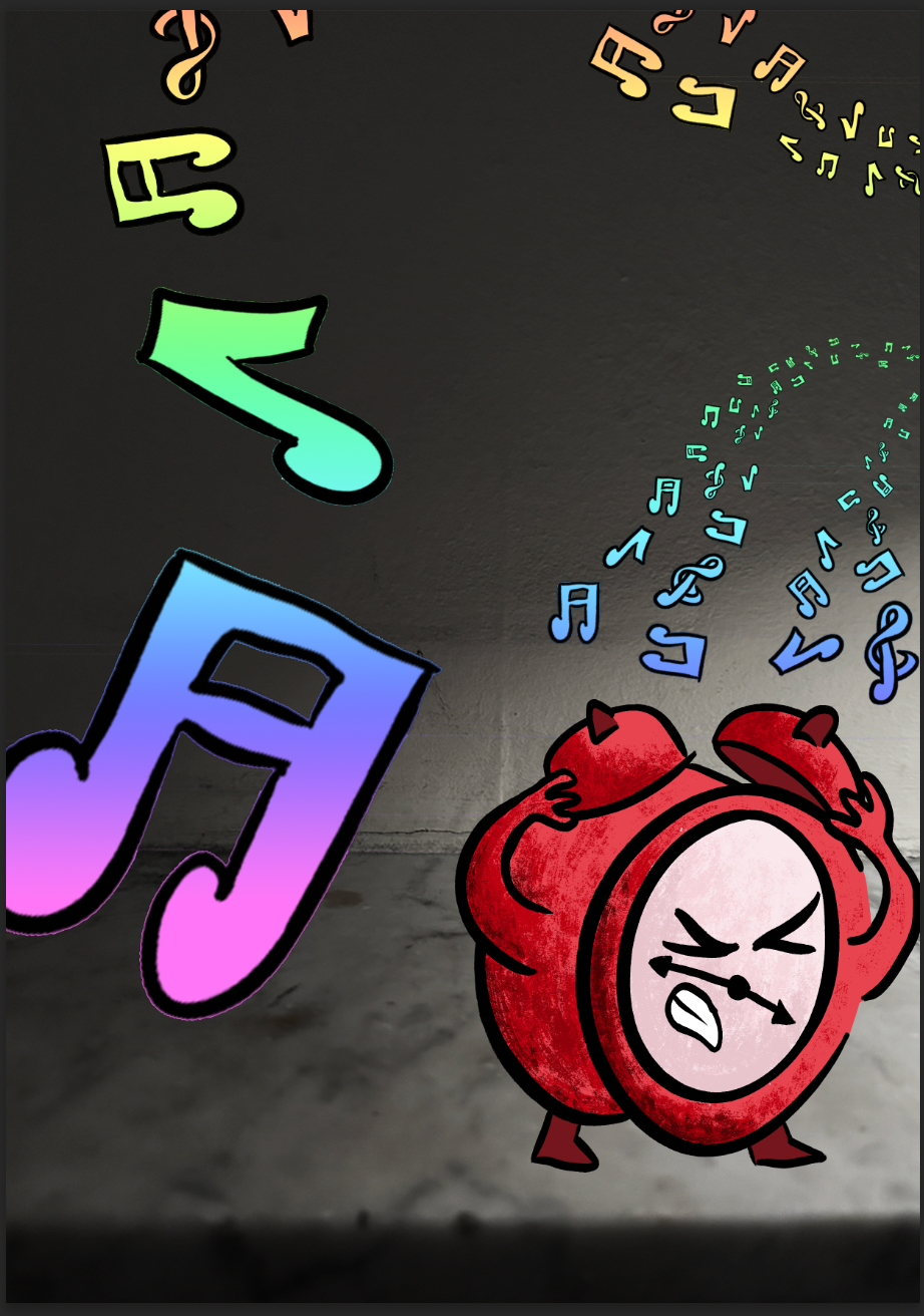
Once again, I tried adding the music notes back into the composition. After experimenting with the colours, I still don’t think the result works, it feels disruptive and unnecessary.
I then hollowed out the notes and changed their color from black to white as a final attempt to see if they could fit better within the piece. While this looks improved compared to before, it hasn’t changed my mind about potentially removing them altogether.

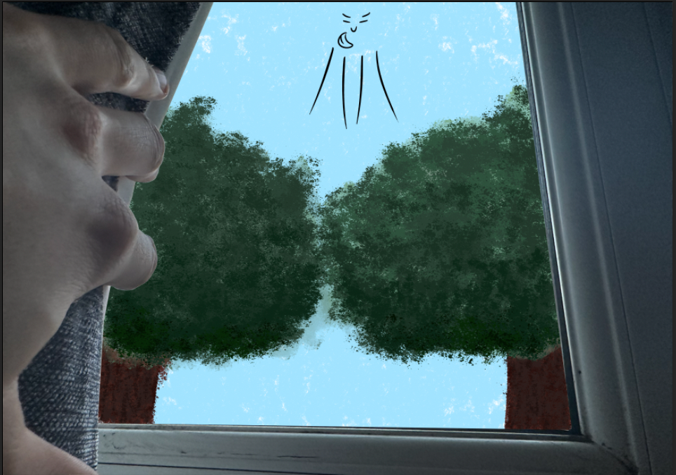
Feeling like I had reached a plateau with my previous experiment, I decided to explore a different idea by developing another thumbnail. However, I quickly became dissatisfied with what I was creating.
This illustration didn’t have the same potential I saw in the alarm clock concept. The subject, the light streaming through the window, was too abstract and lacked a solid form, making it difficult to attribute human traits. Although I attempted a sketch to depict the sun directing the light into the room, I found that it didn’t work effectively.


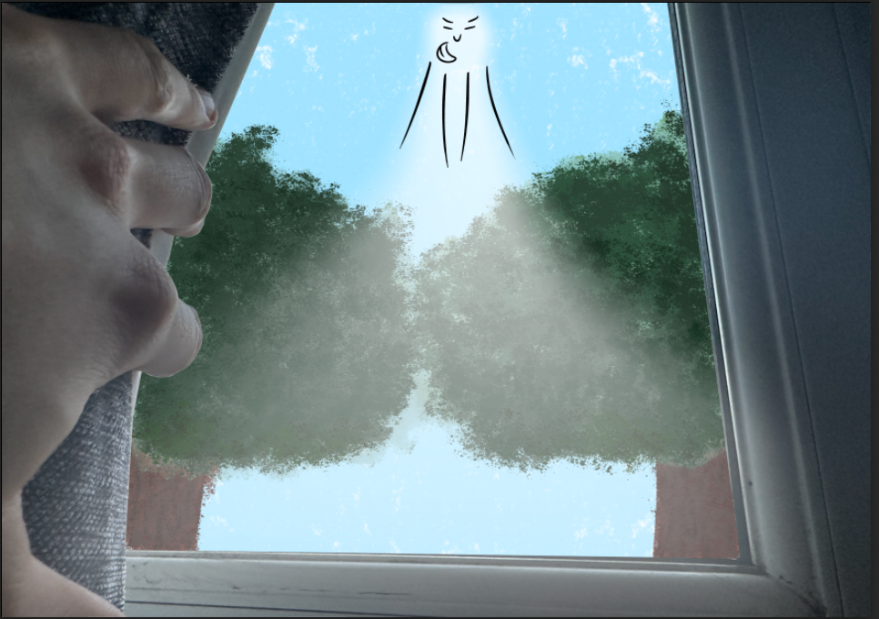
After reflecting on the project and receiving some feedback, I revisited my previous experiment. I realized that the anthropomorphism could be more subtle. I removed the arms and mouth, and surprisingly, it didn’t take away from the emotion I wanted to convey.
In fact, I believe the more understated approach is even more effective. It emphasizes that it’s an inanimate object with hints of life, rather than a full character disguised as an object.
Through further reflection, I grew curious about whether showing signs of wear on the clock could effectively represent the impacts of frustration. As a result, I deconstructed one of the bells to appear broken.


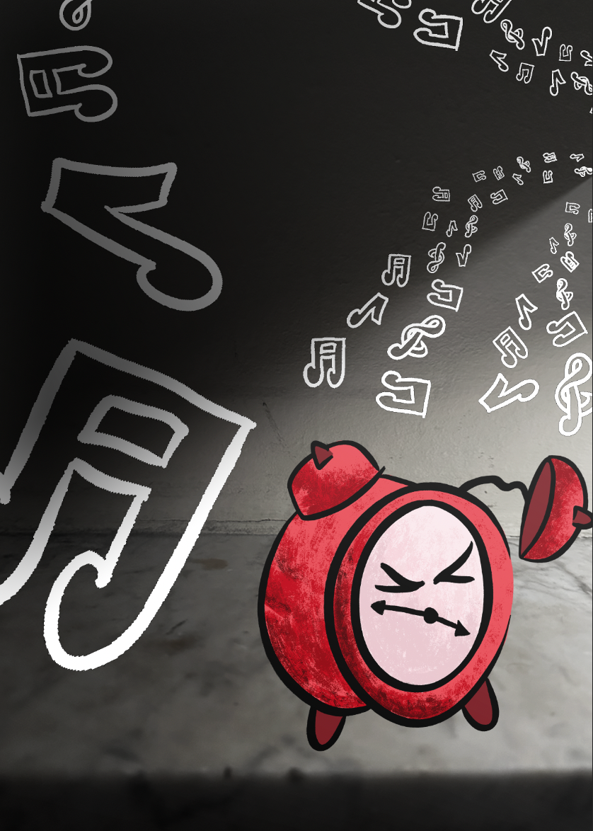
I wanted to see how the broken clock would fit within my composition. However, after comparing them side by side, I found the simplicity of the original to be more impactful. Even though I prefer the original, I think it was valuable to explore how the broken version would look.

In Edward Hopper's work, I noticed how effectively he uses shadows to add depth and substance to his images. Inspired by this, I decided to experiment with shadows in my own composition.
To start, I filled in a simple background color to make the shadow stand out more clearly. However, when I switched the background to purple, I was struck by how much more powerful the illustration appeared against the minimal backdrop. The purple also complemented the red of the alarm clock surprisingly well. This made me question whether I had been overcomplicating the setting and if a simpler approach might actually be more impactful.
I still wanted to see how the shadow would look within the original composition, so I added it back in. While it did contribute something, it didn’t have the same impact as it did against the purple background.
Reflecting on this, I revisited the purple version and added a few sound markings. This adjustment made the piece feel far more striking and effective than my previous outcomes.

such as my fan. Although it’s not a typical design and may not be immediately recognizable as a fan, I was still curious to see how the alarm clock's style would translate.
I was really pleased with how it turned out. Similar to the sound markings on the clock, I illustrated the air being blown into the space, using the fan's face as a mouth. I made sure to use a similar color palette, as the red and purple combination had been so successful before. Overall, I think both images are visually powerful, and I’m happy with the results.
However, I’m starting to feel that they lack deeper meaning. I want this project to have more purpose than just looking visually appealing. I think it’s time to re-evaluate the direction I’m heading in.


I also removed the texture from the outcomes and made some more experimental adjustments. I think that both with and without the added texture, they appear bold and impactful.