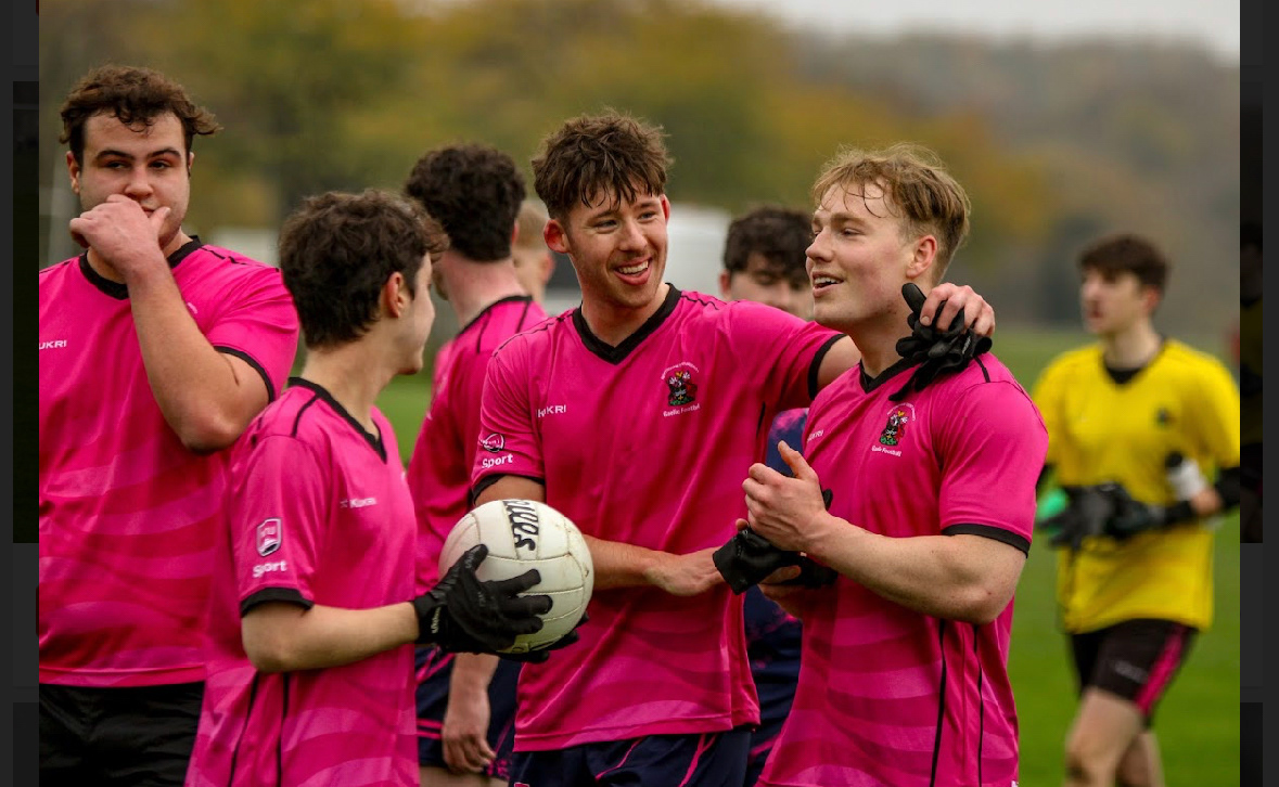
For this project, I am exploring the benefits and representation of belonging through team sports. I’ve chosen to draw inspiration from my experience with the Gaelic football university team, as it provides me with firsthand insight into the team environment and allows me to conduct primary research effectively.
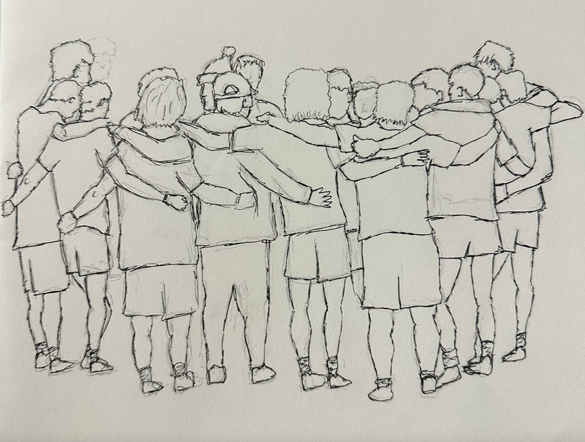
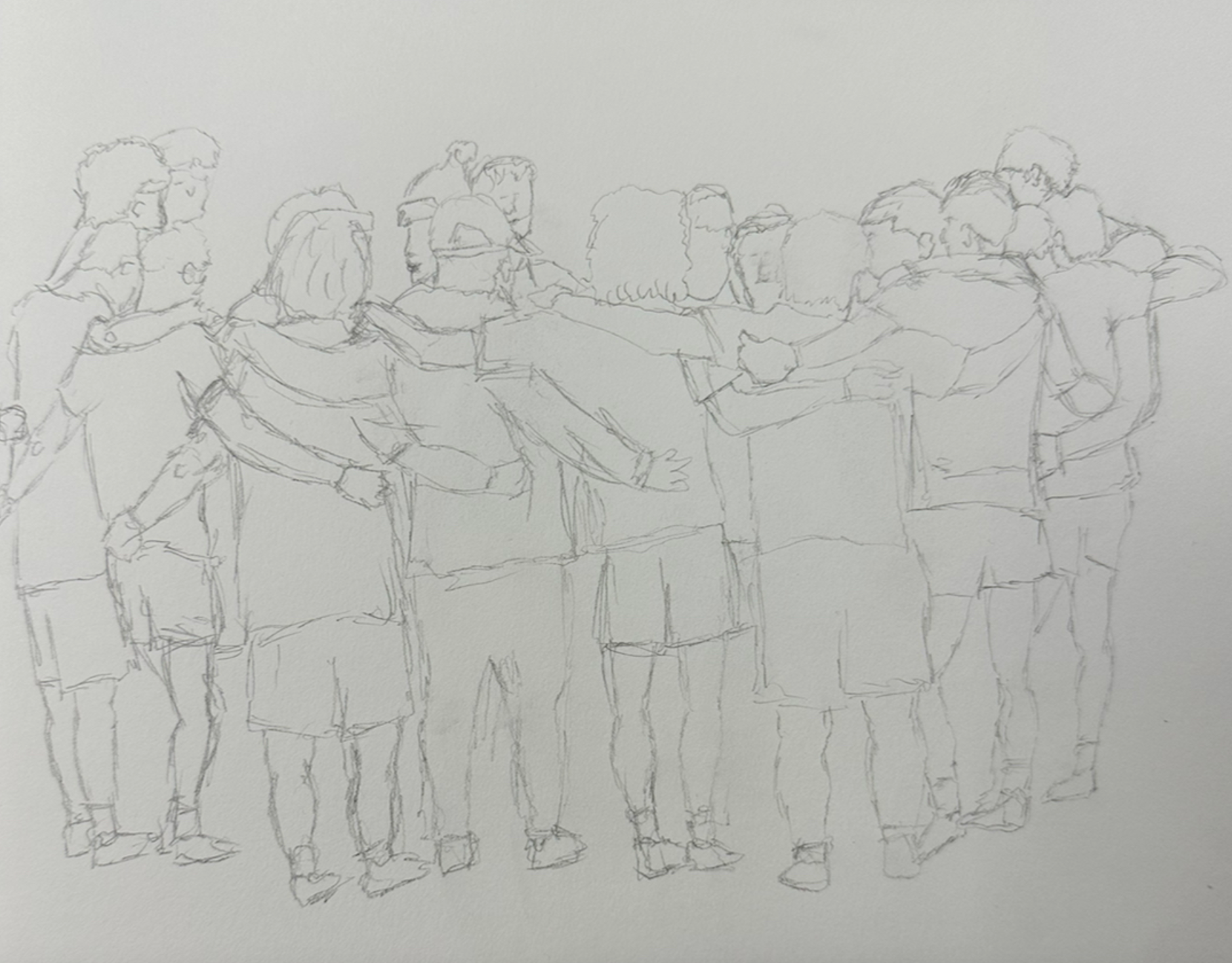
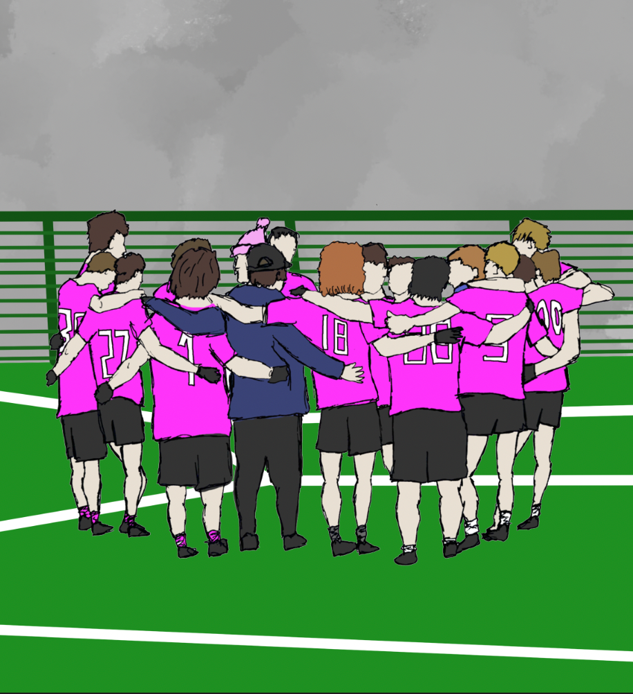
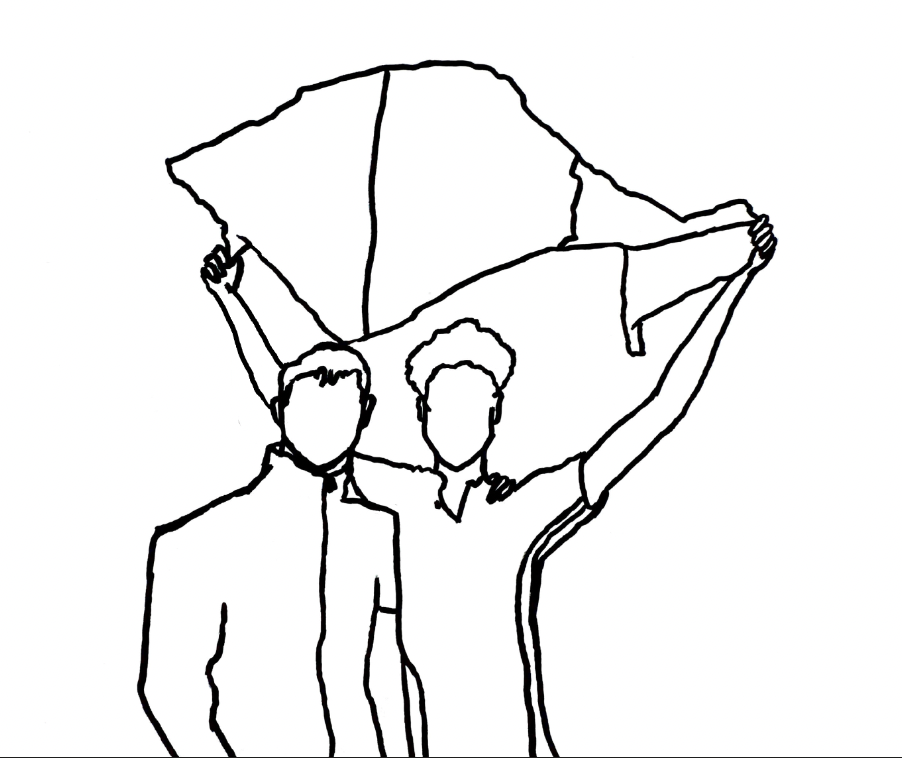
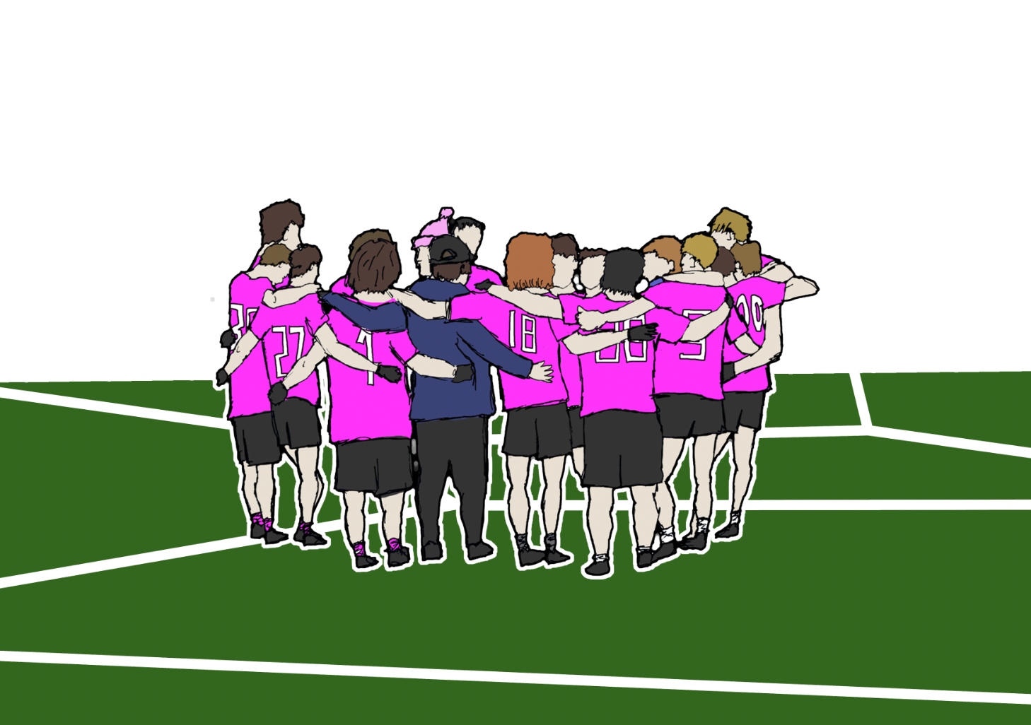
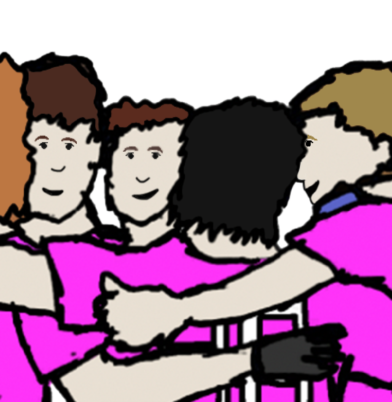
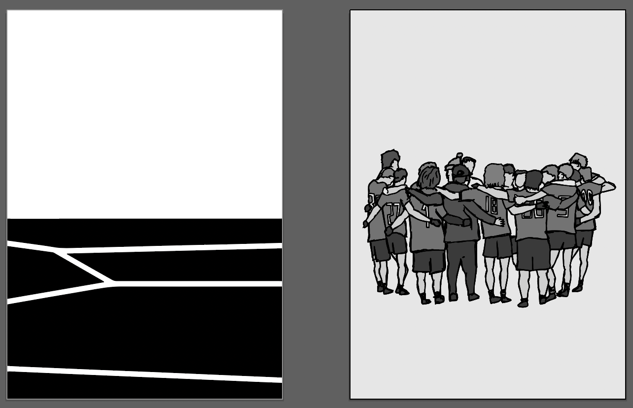
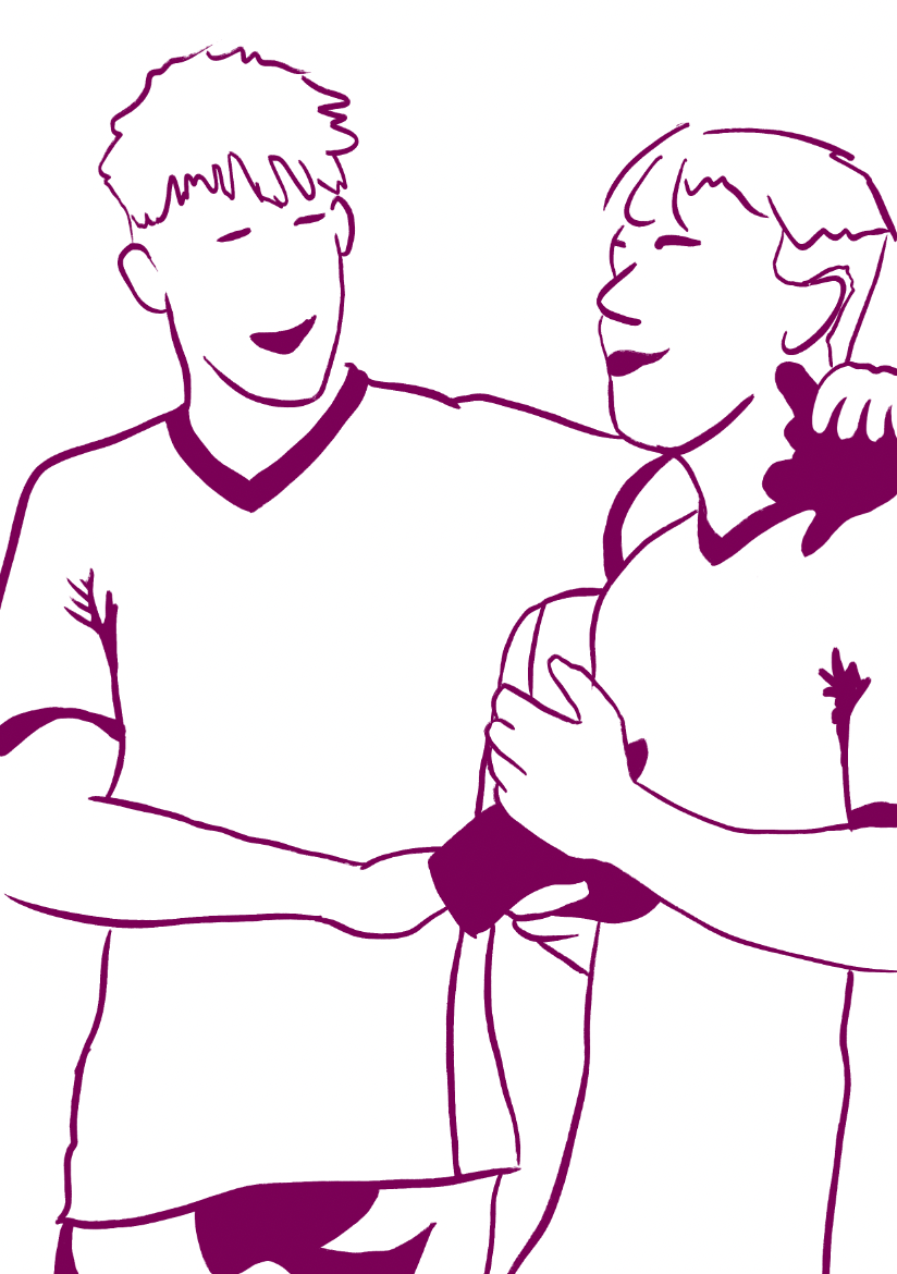
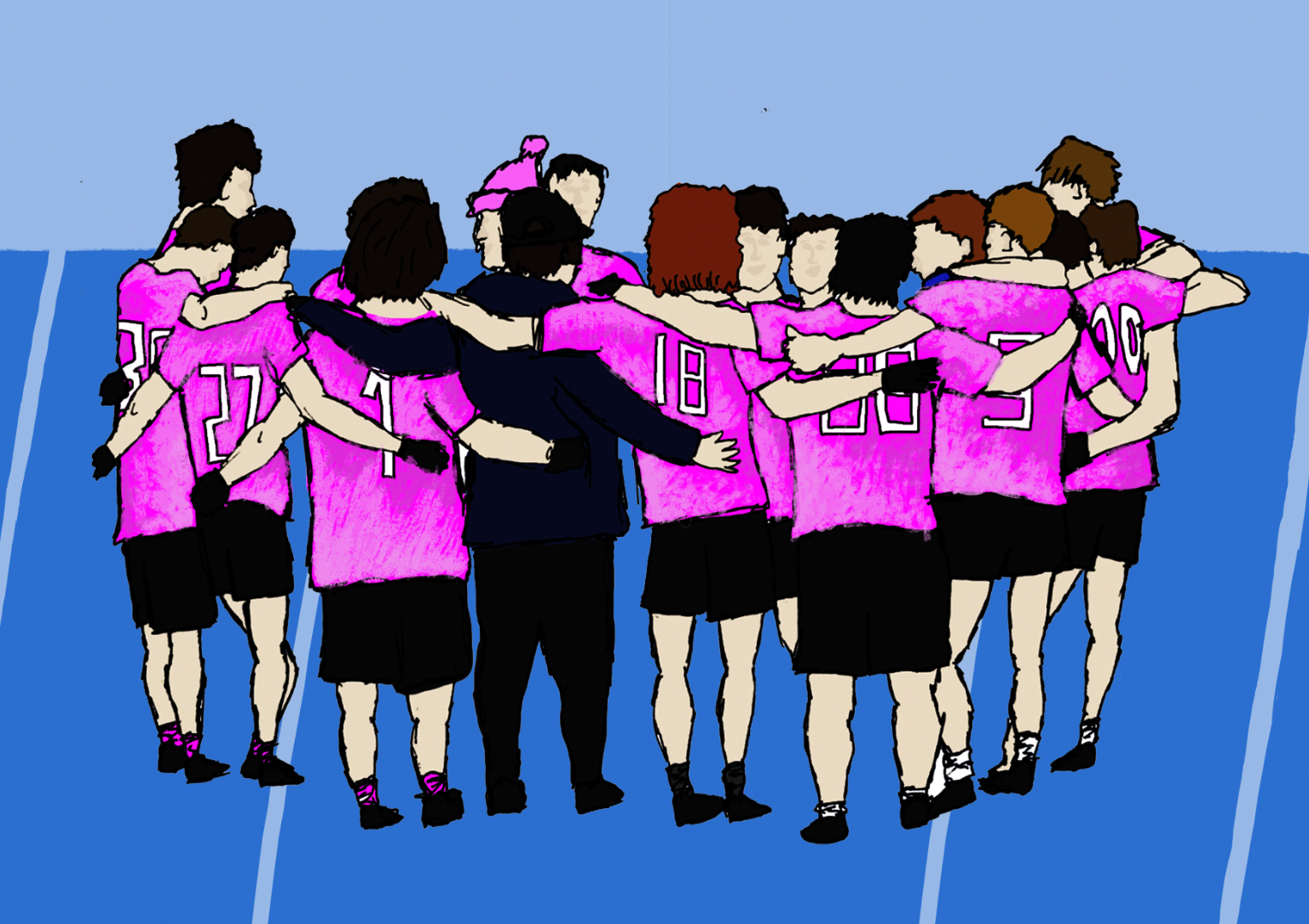
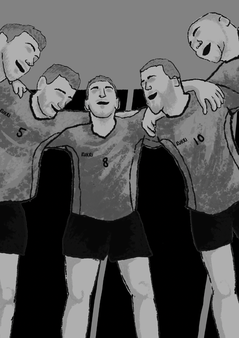
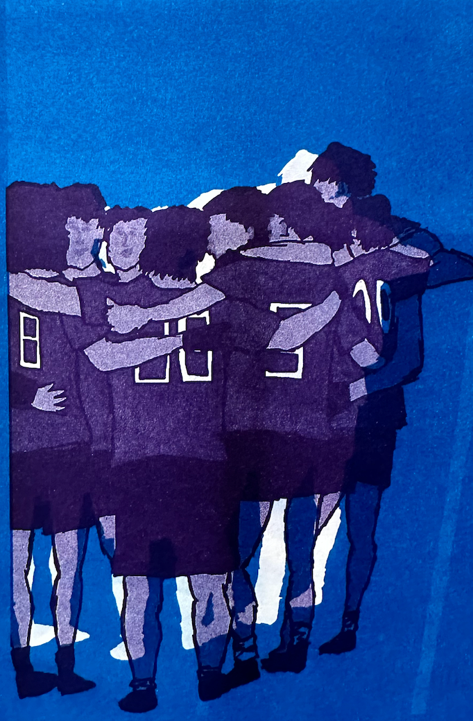
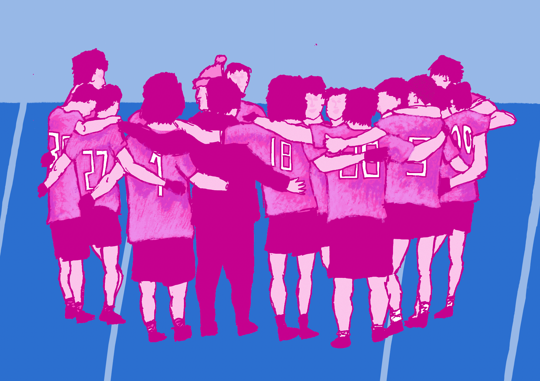
Initially, I created a sketch of a team huddle, which I believe perfectly symbolizes the unity and solidarity found within a team.
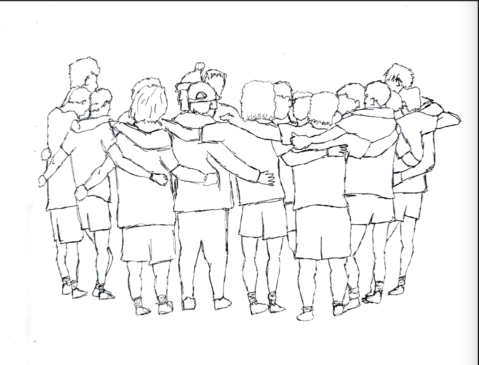

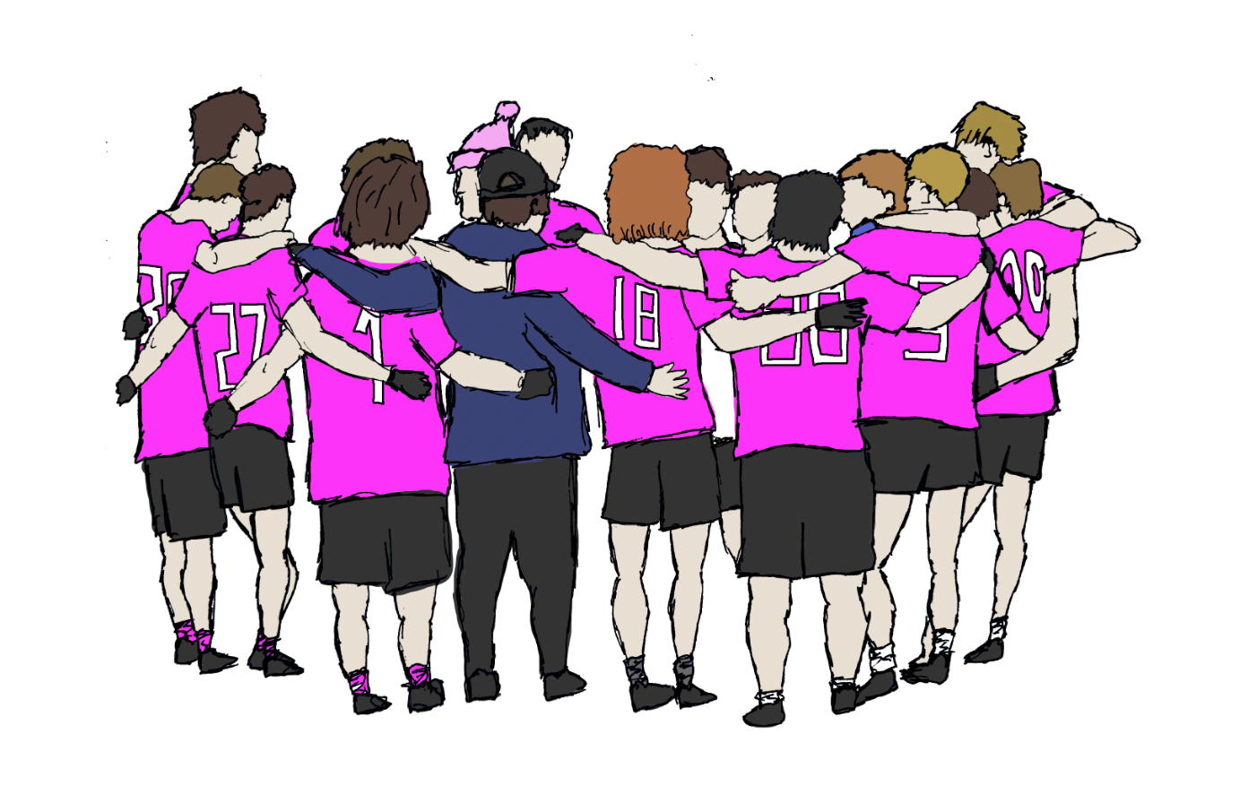
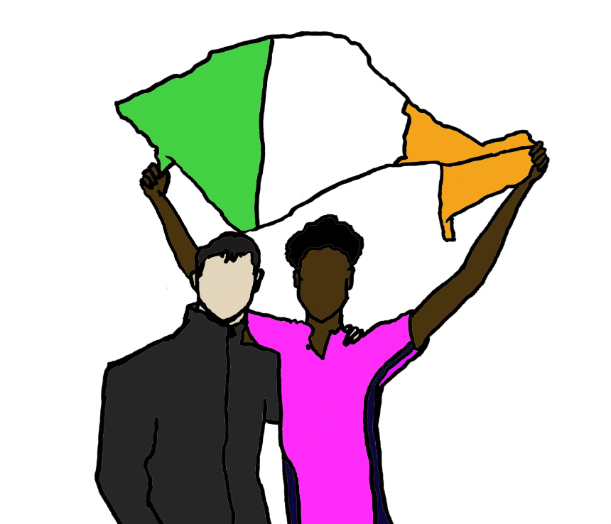
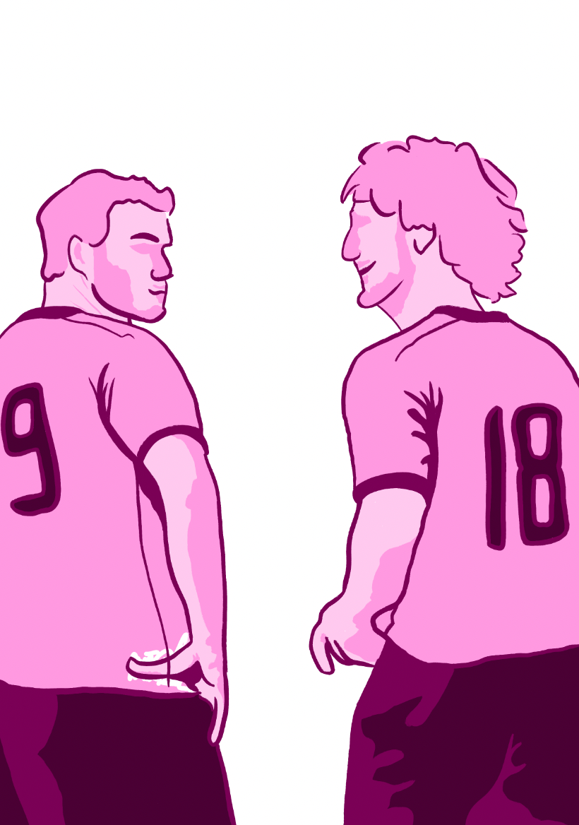
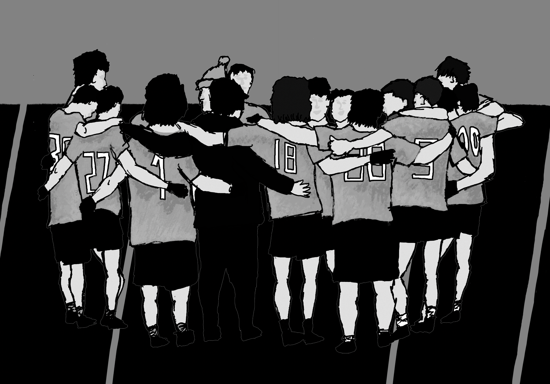
Next, I added color to bring the image to life and experimented with removing the outline. However, I found that the sketched outline contributed to the rawness of the illustration, so I’ve decided to keep it.
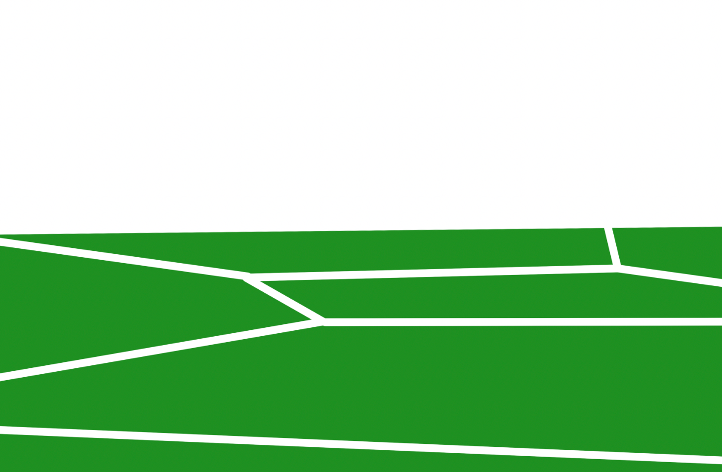

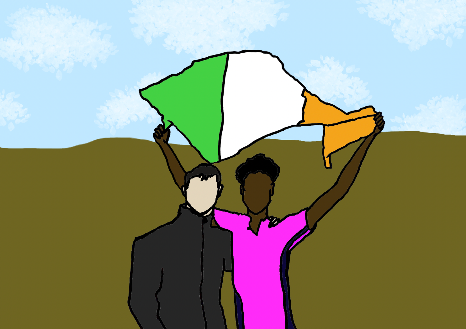
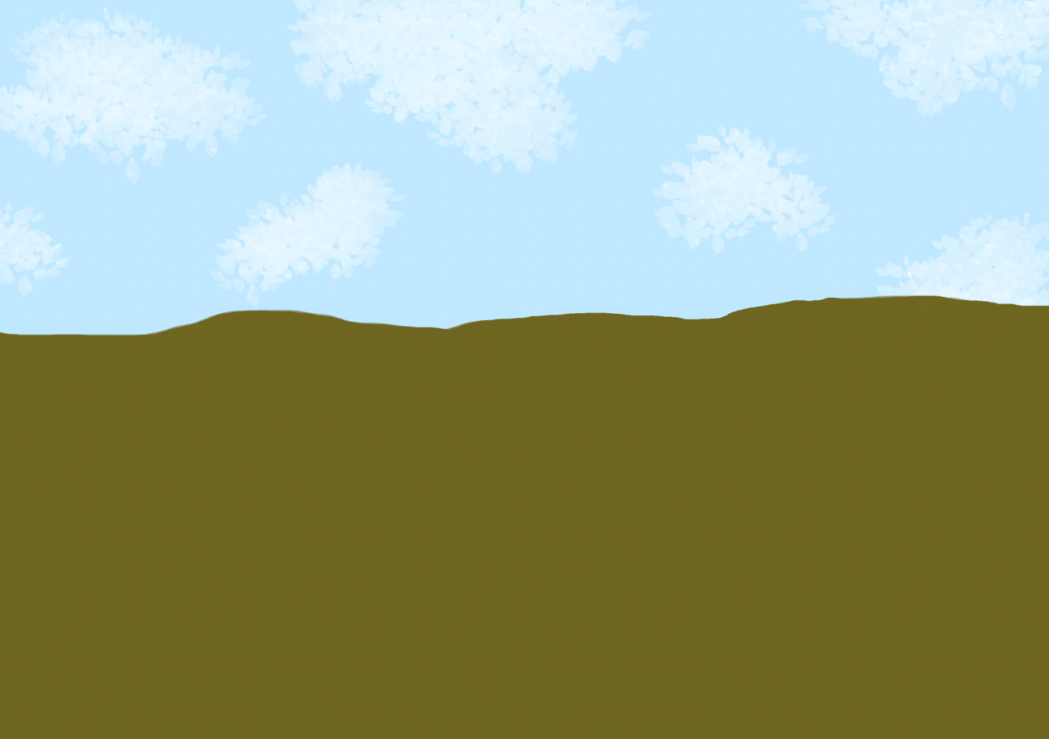
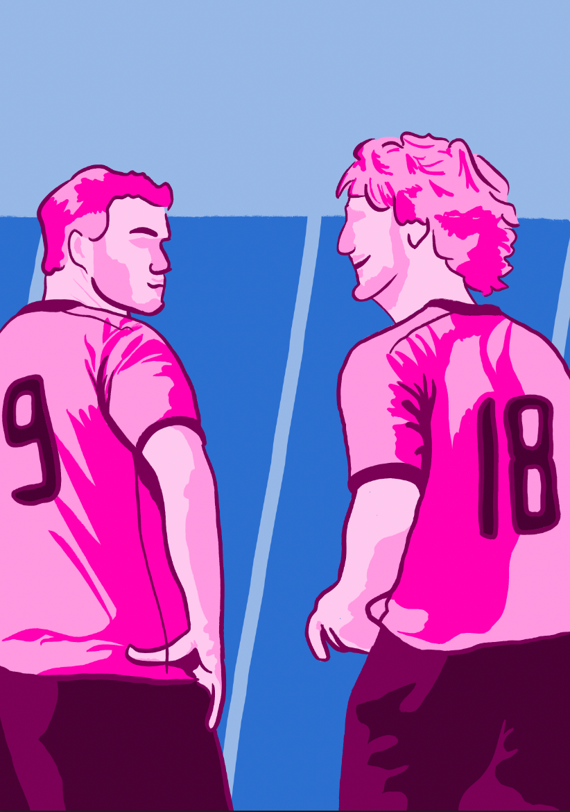
Continuing with the development, I added a pitch background to provide context. I believe this addition significantly enhanced the visual impact, giving the illustration more depth and character.
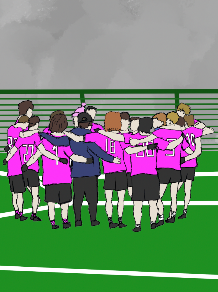


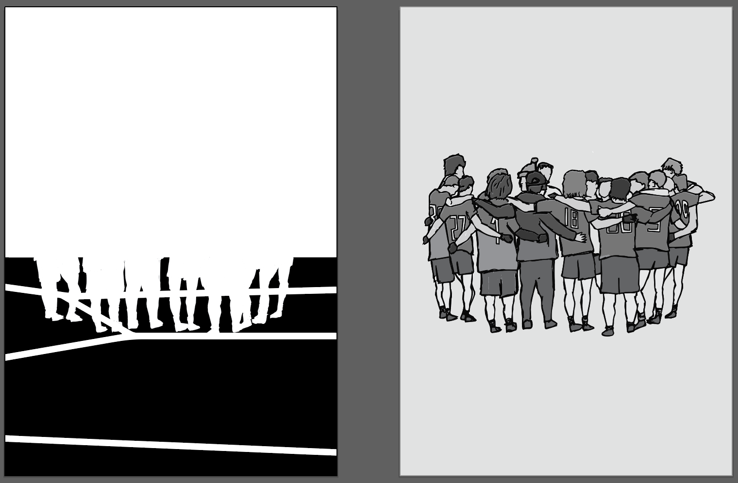
During further experimentation, I experimented with adding different stroke lines and cropping the image to draw more focus to the players. While the cropping successfully enhanced the emphasis on the team, the stroke lines felt messy and ineffective, so I’ve decided not to include them.

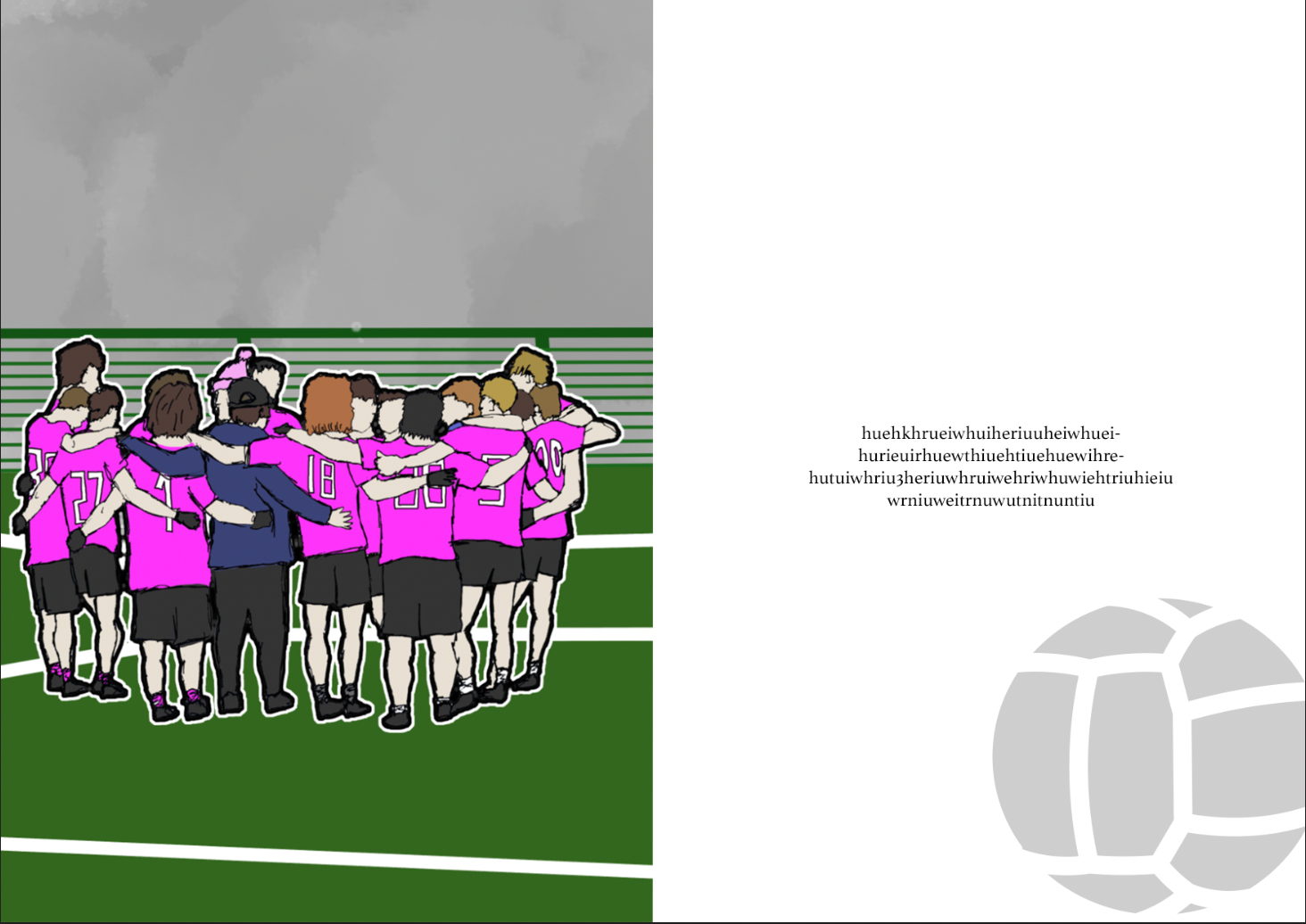
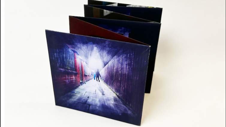
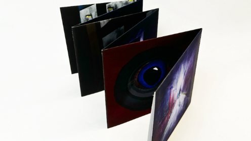
I also experimented with how the image might look as a book illustration by creating a mock-up presentation. Although it worked reasonably well, I realized I had spent too much time focusing on a single outcome this early in the project, so I decided to move on.
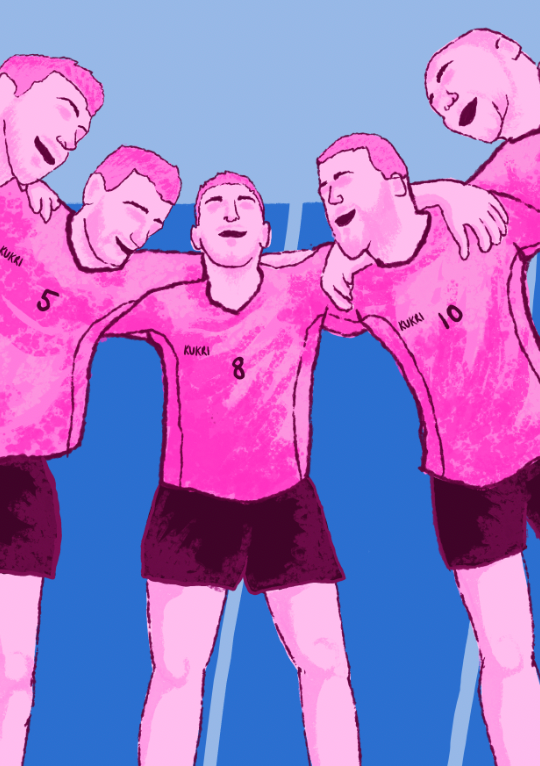
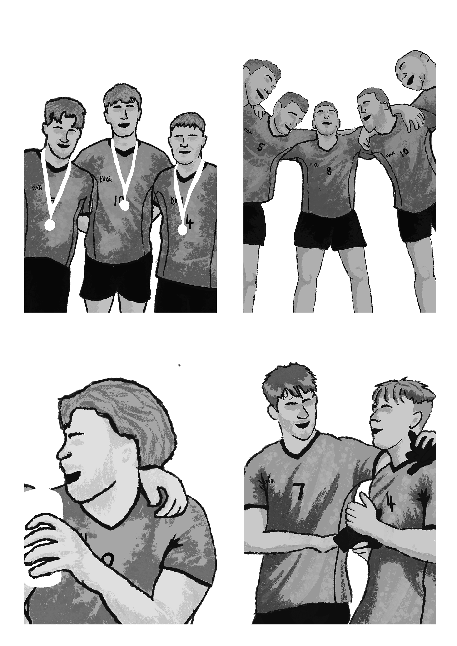
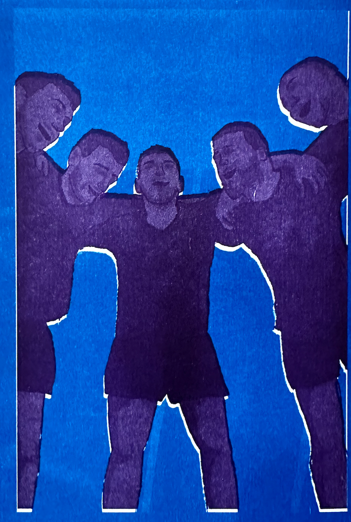
While drafting another potential outcome to represent the culture within the sport, I chose to take a minimalist approach, as I felt the previous outcome had the potential to appear cluttered. However, I’m not fully satisfied, as both outcomes feel surface-level and don't effectively convey the deeper features I want to express.

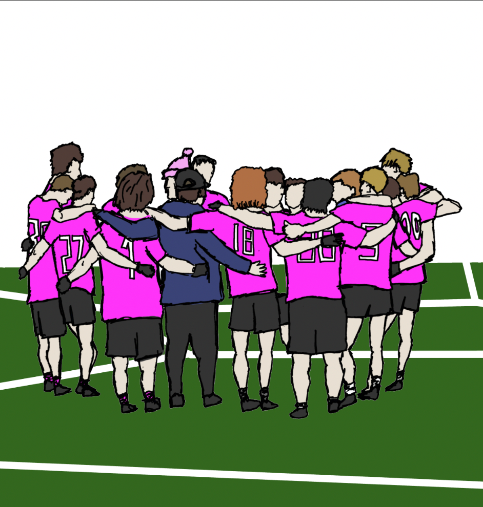
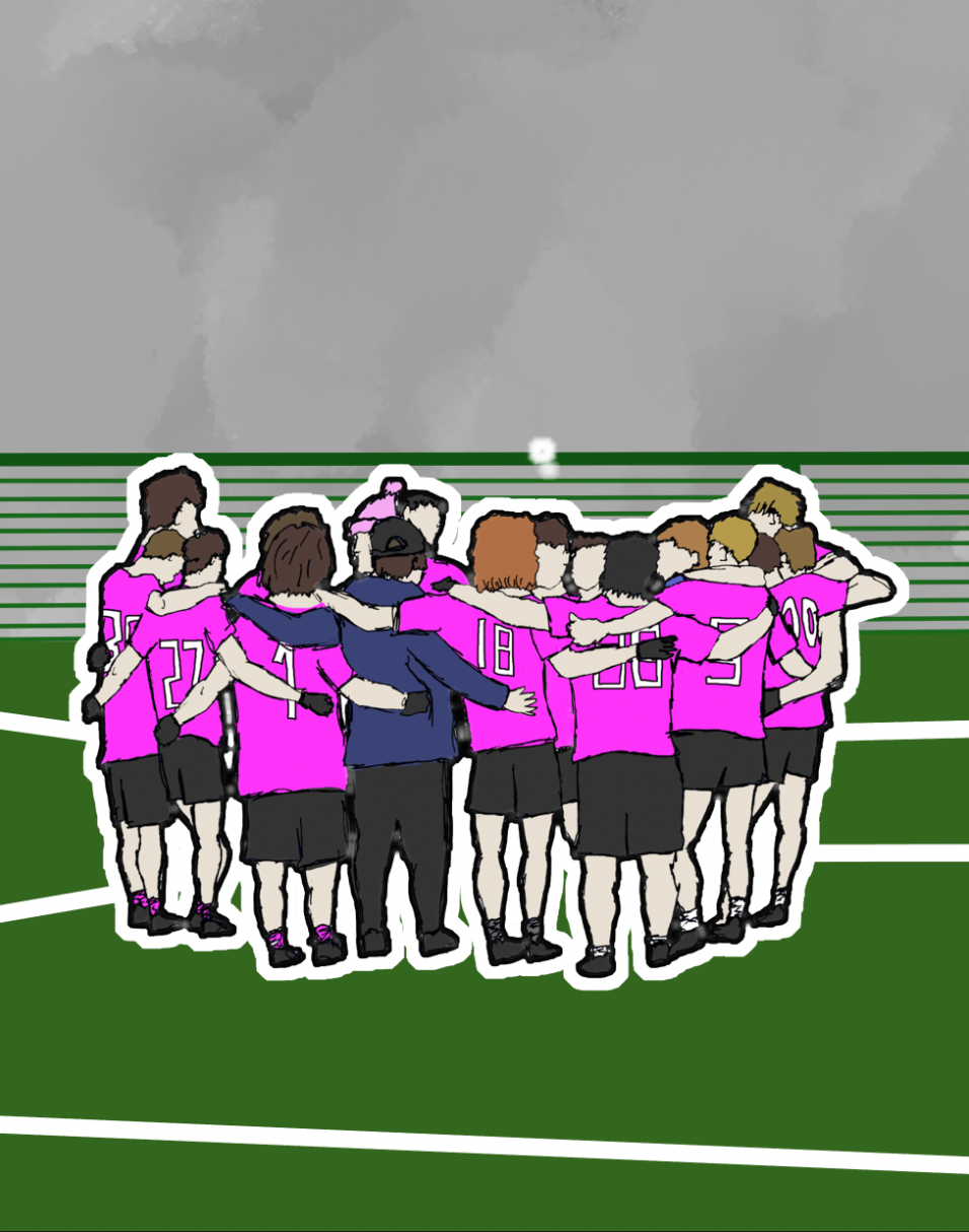
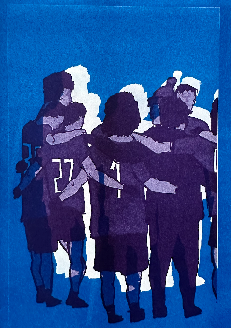
Revisiting the previous outcome, I realised it had potential to be developed into something successful. To achieve this, I focused on simplifying the background, aiming to reduce noise and enhance the intended focal points. This approach also helped create a more structured and cohesive composition.

During discussions with tutors and peers, it was suggested that I take a closer look at the hand positioning and the embraces within the image to more clearly convey the unity among the players. This feedback also made me realise I had been straying from the core themes I originally set out to explore in this project. Moving forward, I will definitely incorporate this insight to strengthen the work.
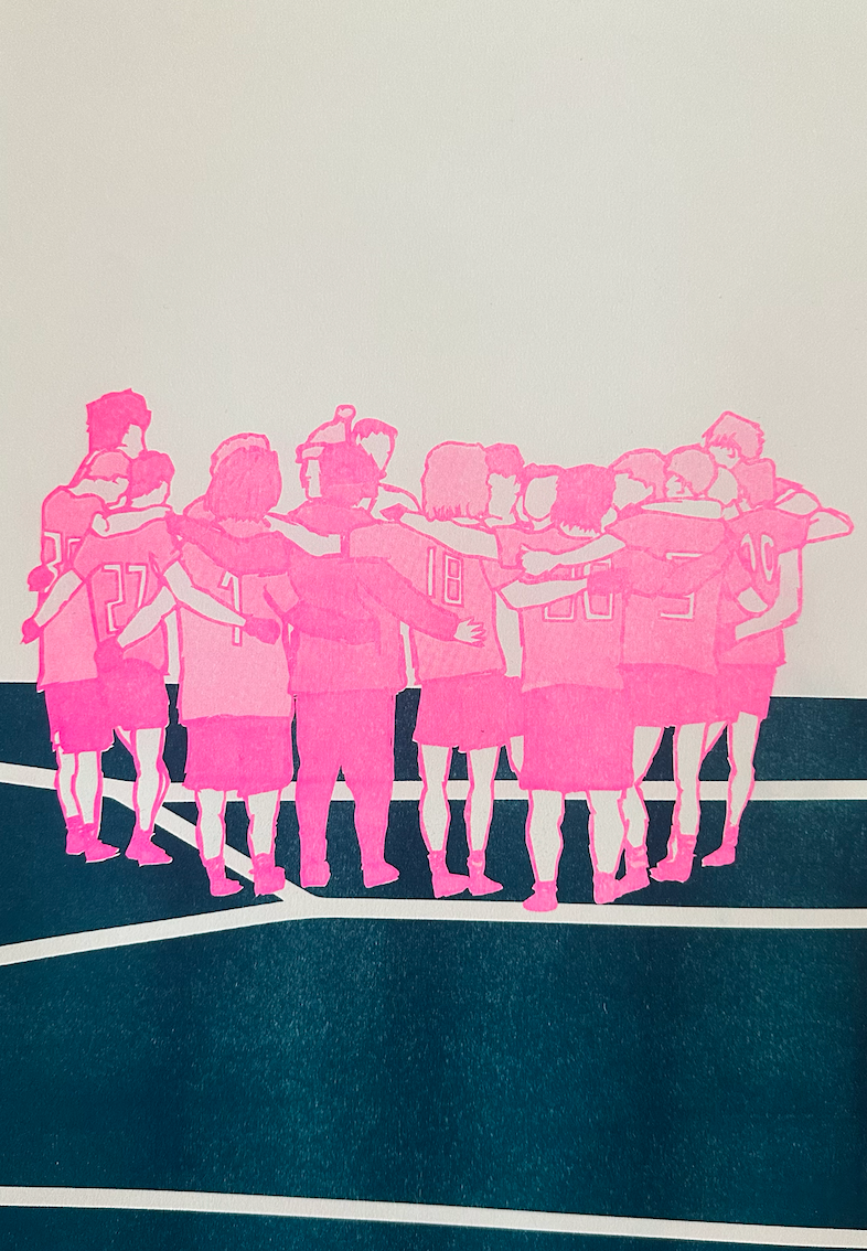
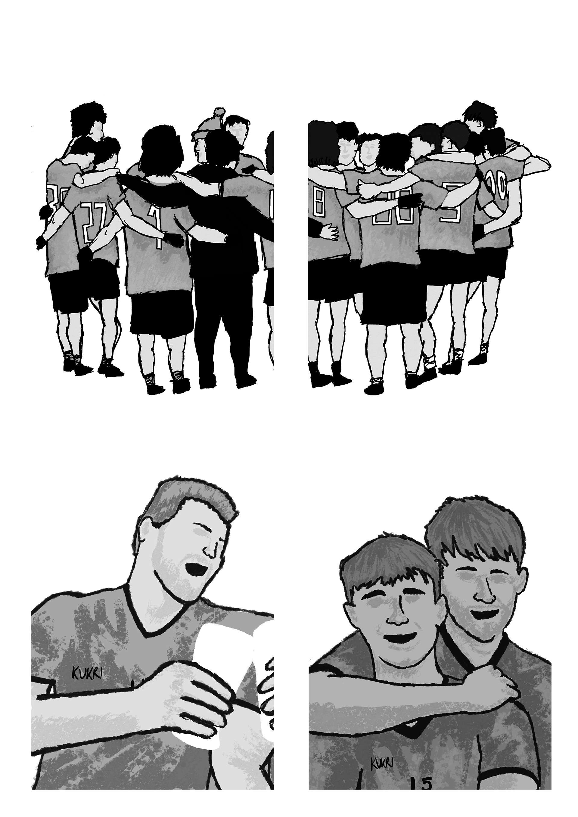
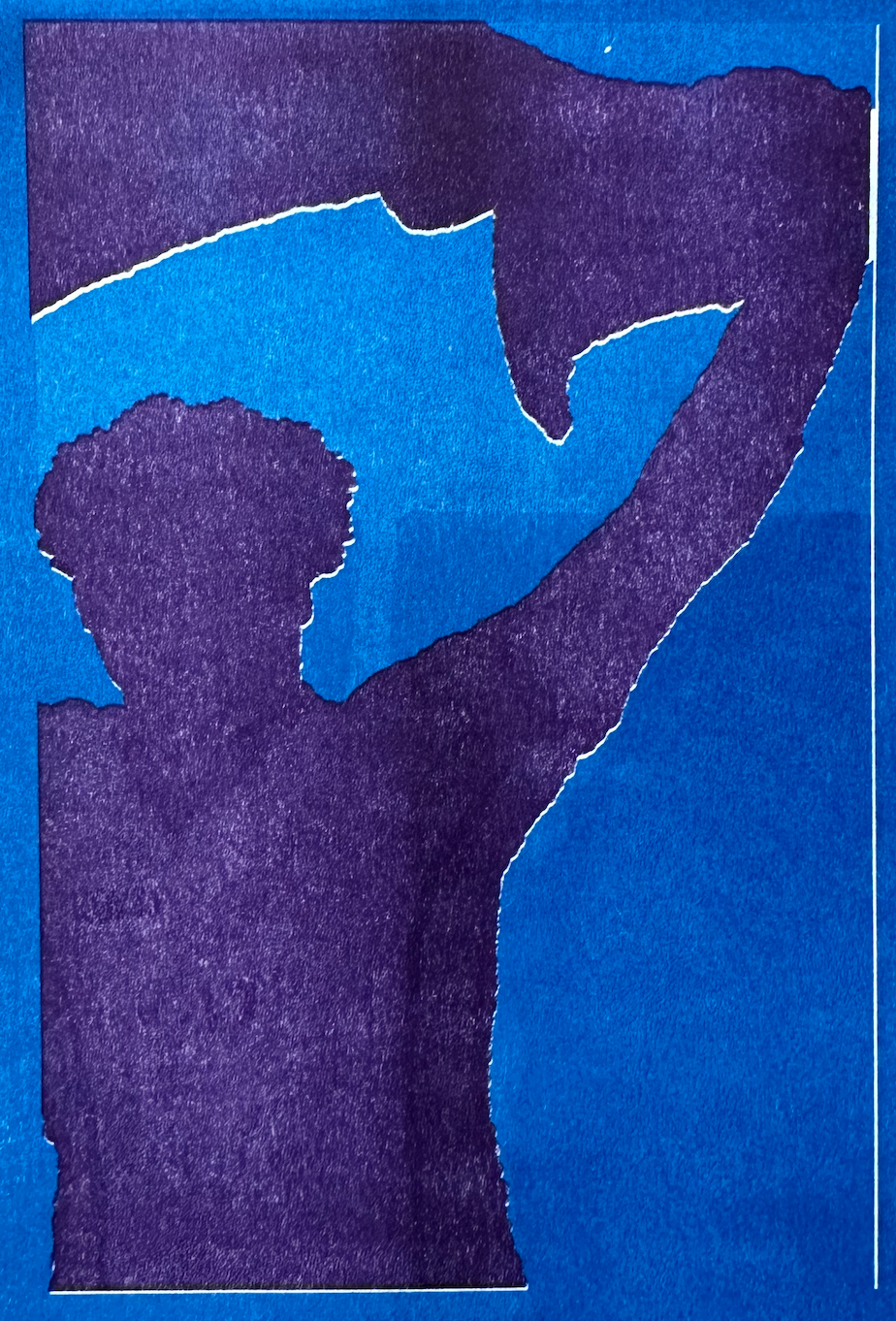
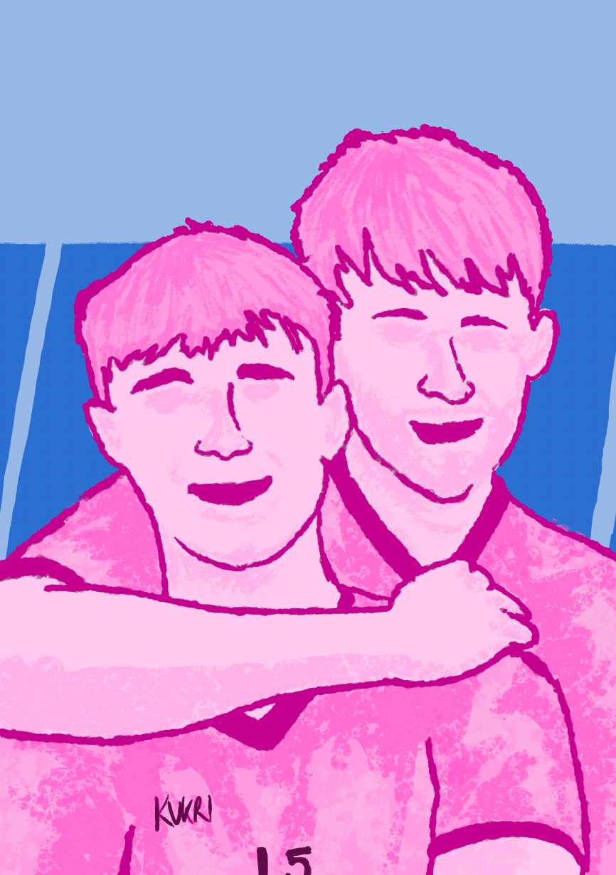
I experimented with a tighter crop of the image to test its effectiveness. However, I don’t think this particular image suited the closer framing, and perhaps a different composition would work better for that approach. I plan to revisit this idea with another image in the future.
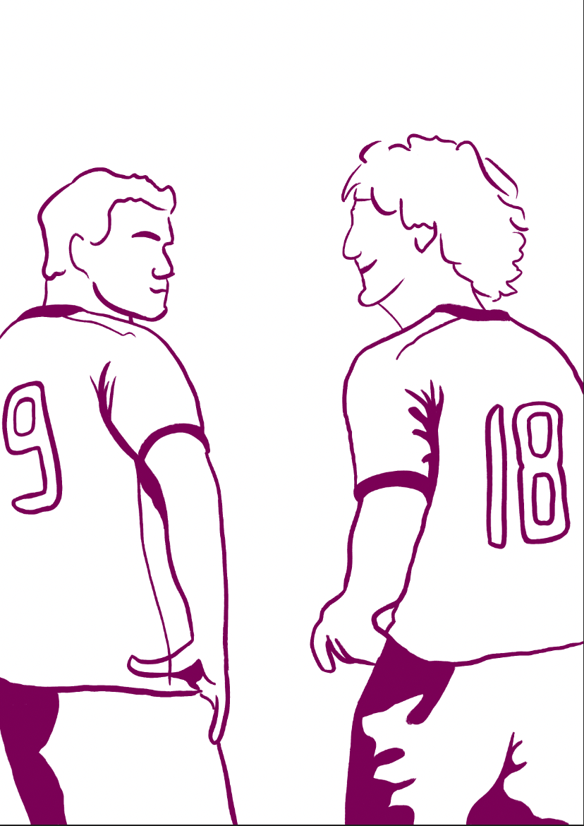
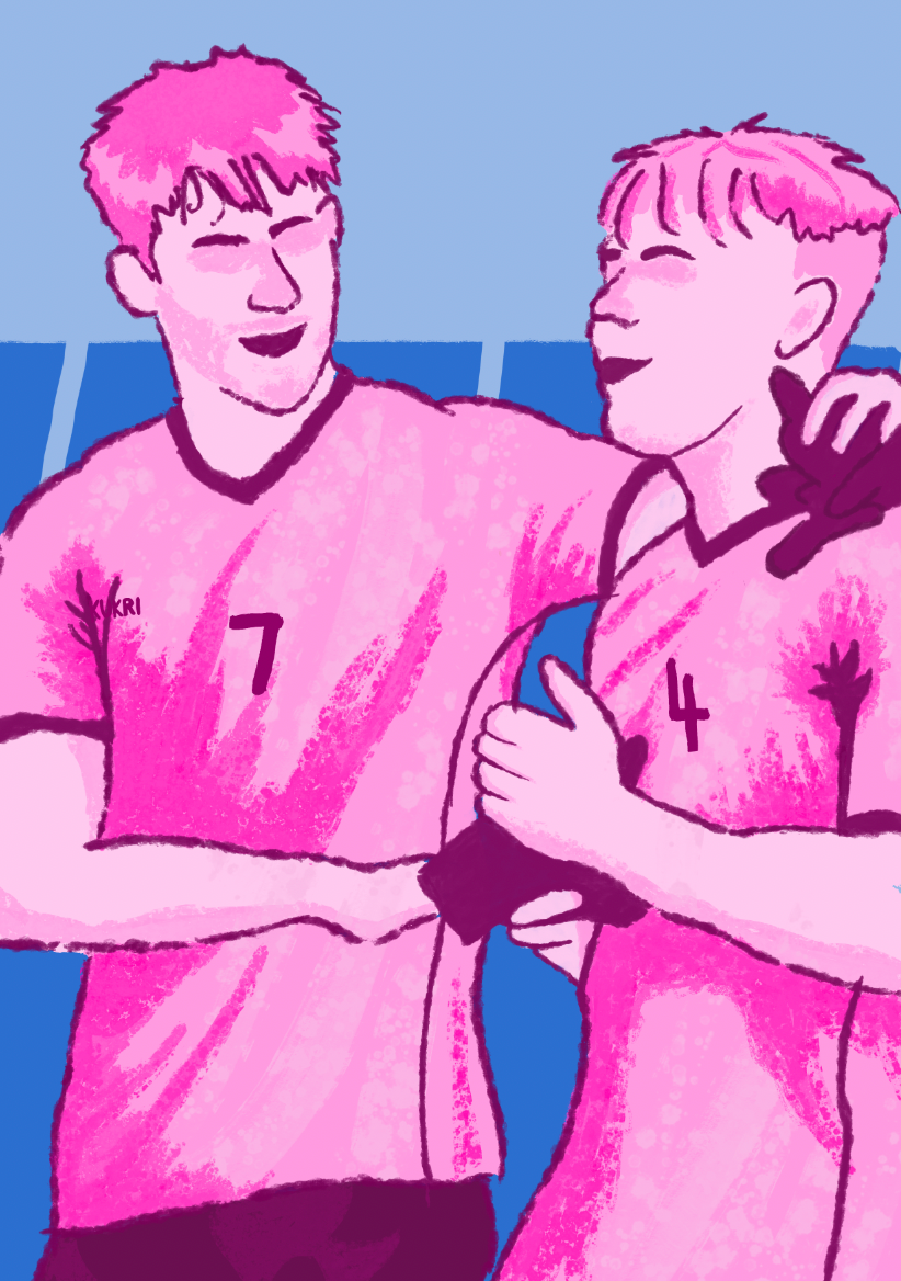
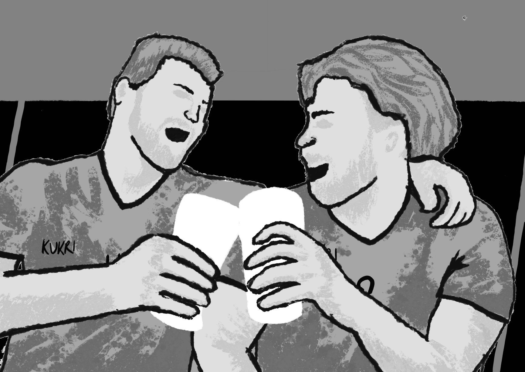
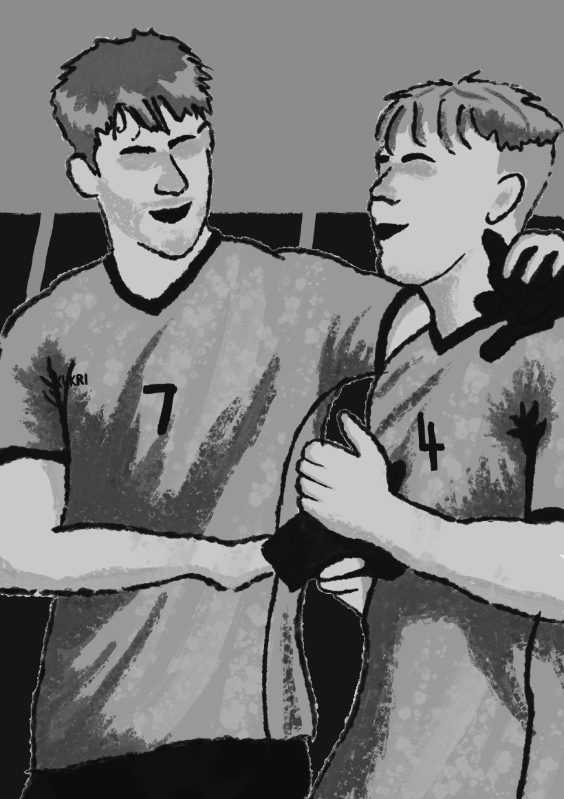
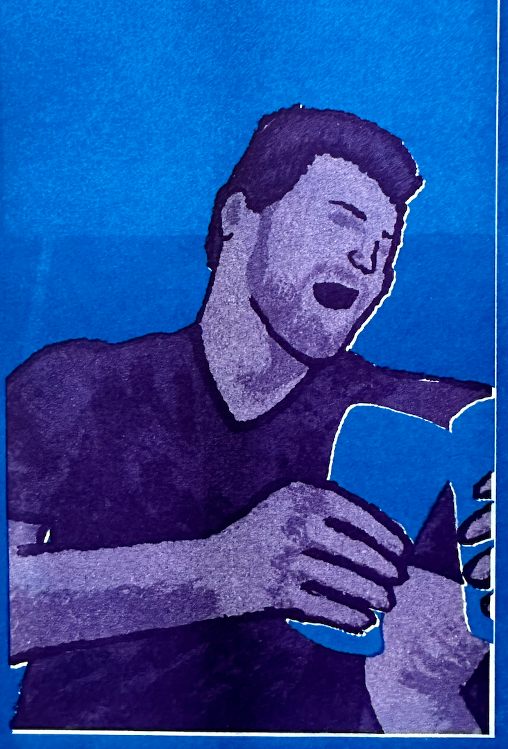
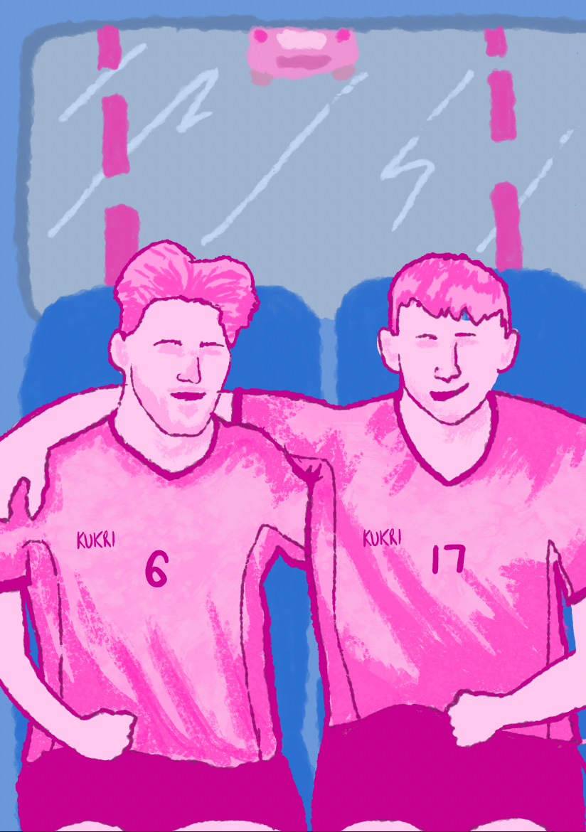
Another issue I noticed was that the characters lacked faces. Originally, this was intentional, as I thought it might work well, but it has since been pointed out that this takes away from the expression and emotion of the players. As a result, I am researching different styles to incorporate facial features. Simon Bailly was recommended to me, and after reviewing his work, I see why. his characters share fundamental similarities with mine. I really admire his style and aim to integrate it into this project’s development.
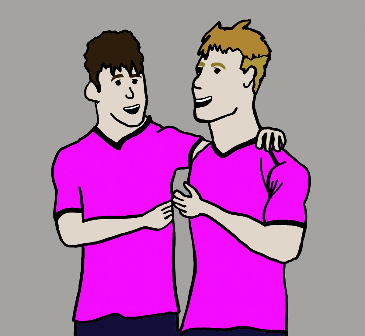
In an attempt to emulate Bailly’s style, I incorporated facial features using bold black outlines. Upon review, I now appreciate the benefits this brings. the characters have come alive and display much more personality.
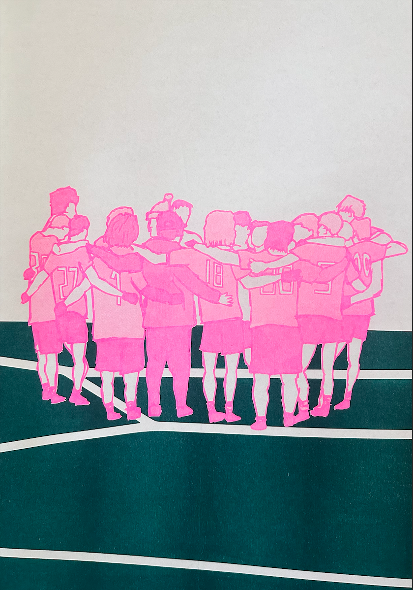
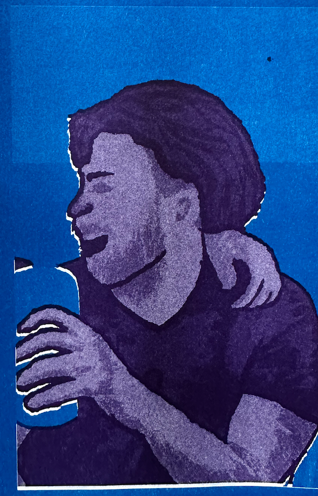
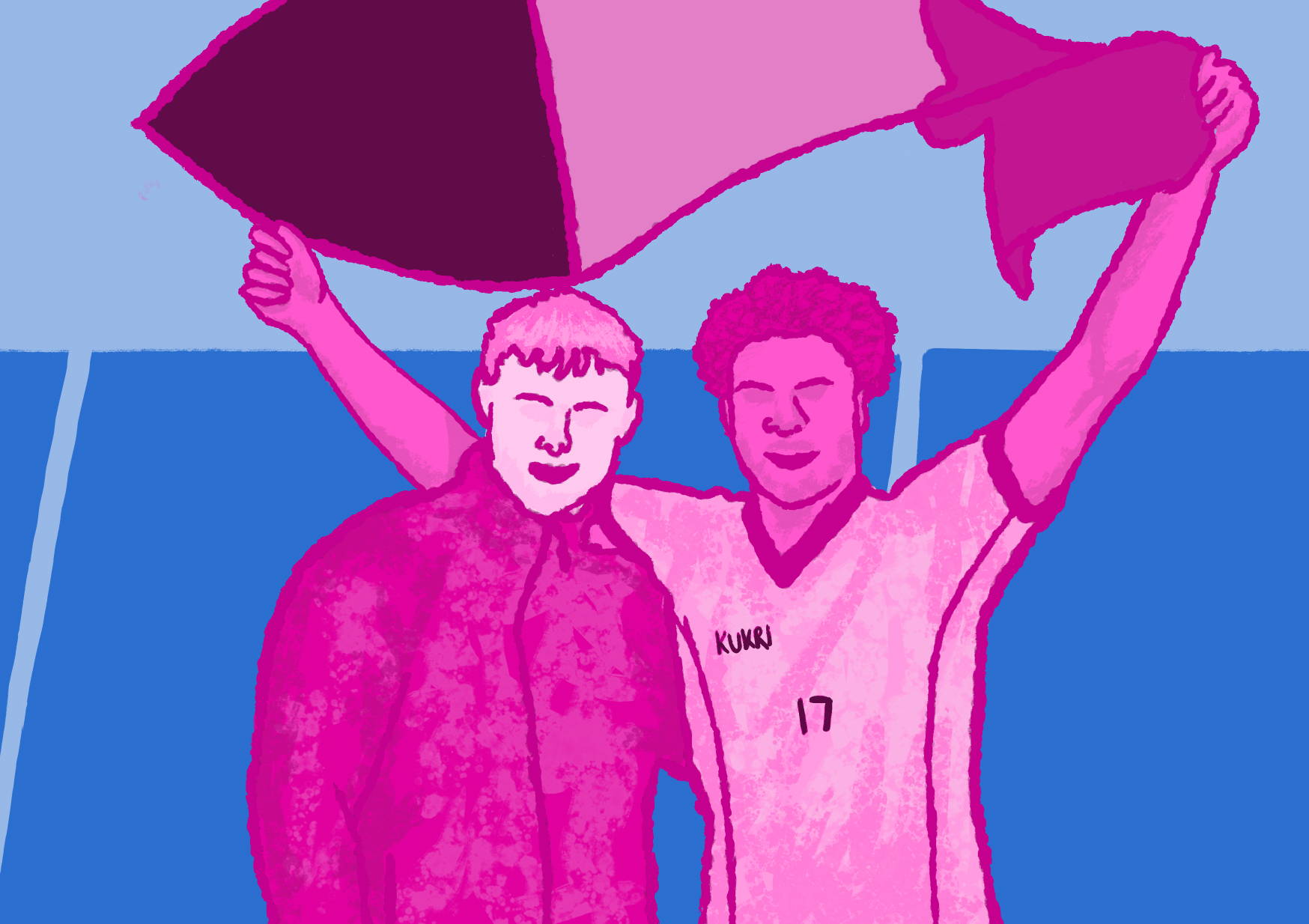
Wanting to broaden my range of media, I booked a Risograph print session. Up until now, I had been working primarily with digital media and a flat, minimalistic style, which felt quite limited, so I was eager to experiment with something new. I created a vector file of one of my images for printing. Having never used this printing method before, I was initially uncertain about how the result would turn out. However, I was pleasantly surprised. the vibrant colour contrast really enhances the image, leading me to believe that this technique could be very effective for potential final pieces.
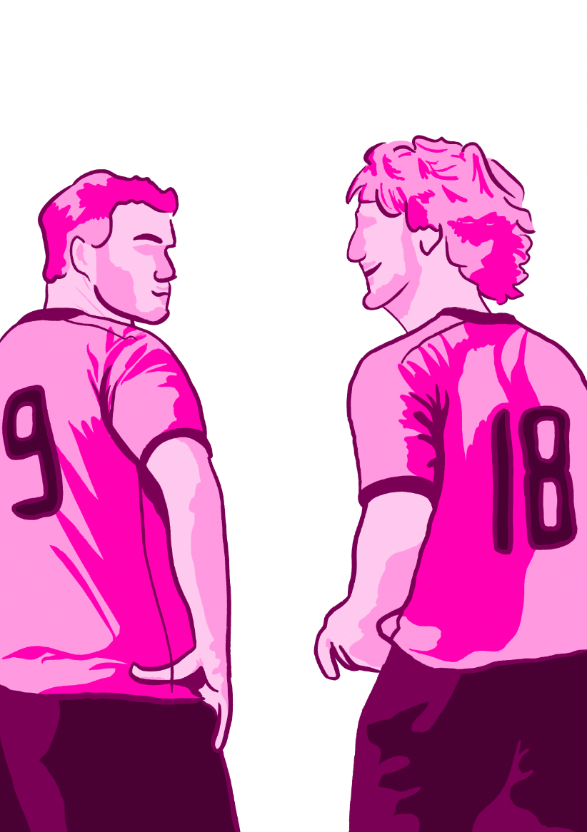
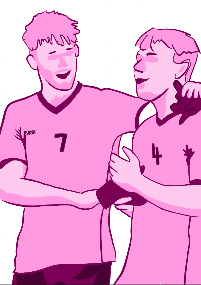
I moved on to producing more draft outcomes, experimenting with creating smoother image designs using various shades of pink to craft aesthetically pleasing compositions. However, the results felt too polished, almost like tracings and lacked the organic quality I wanted. Because of this, I’ll need to reconsider this approach.
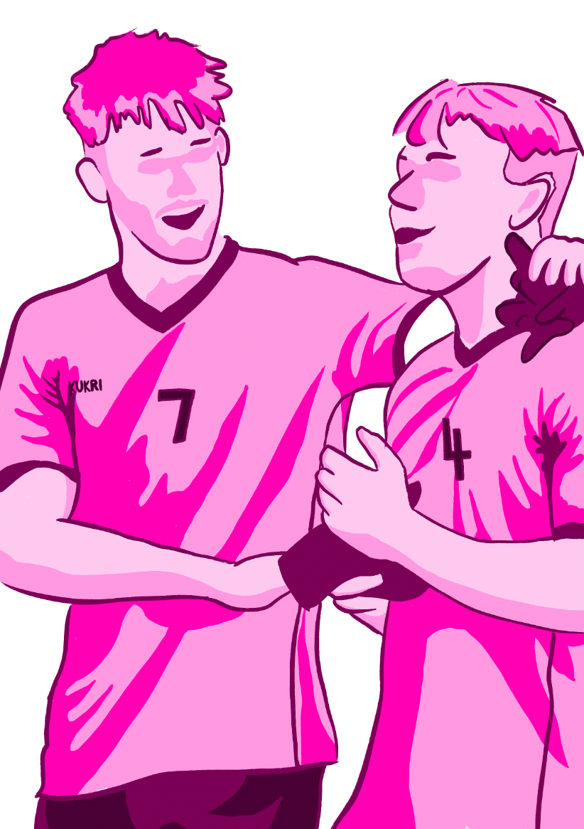
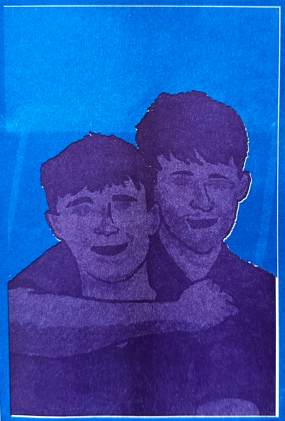
Drawing inspiration from Catherine Pape, an artist I researched in a previous project, I adopted her loose, layered style using more traditional, natural media. I reworked the same compositions in this style, and I believe they now appear much more organic and aligned with my original vision.


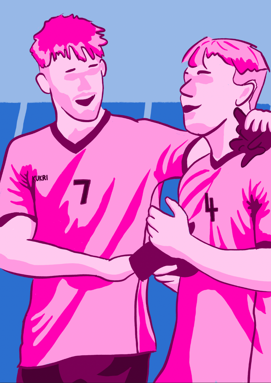
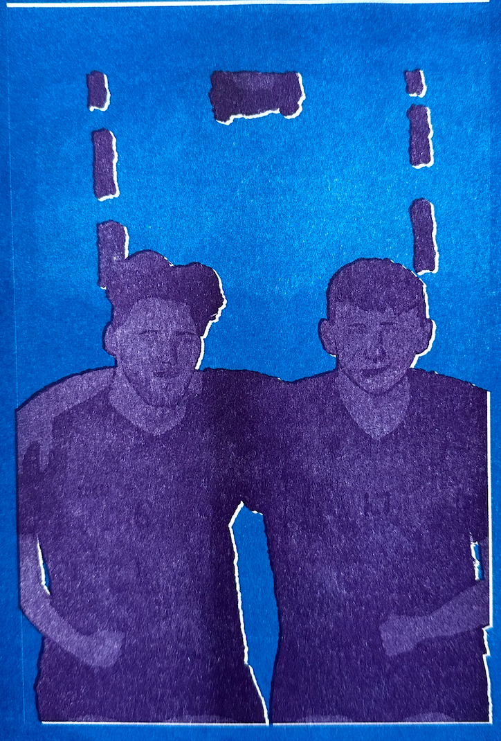
As the project nears completion, I focused on selecting compositions that highlight the social benefits of being part of a team, such as off-pitch interactions, building friendships, and the sense of community. I aimed to reflect these themes within the outcomes, and I believe the compositions I created effectively capture this essence.


For my final piece, I decided to return to Risograph printing. I then transformed the images I had created into vector files, preparing them for print.


Upon completing my prints, a lot went wrong. Due to my lack of experience with Risograph printing, the alignment and color differentiation were off, resulting in a blurred outcome. Unfortunately, with limited time left, I won’t be able to redo them. Despite this, I’m glad I stepped out of my comfort zone to try something new, even if it didn’t go as planned.


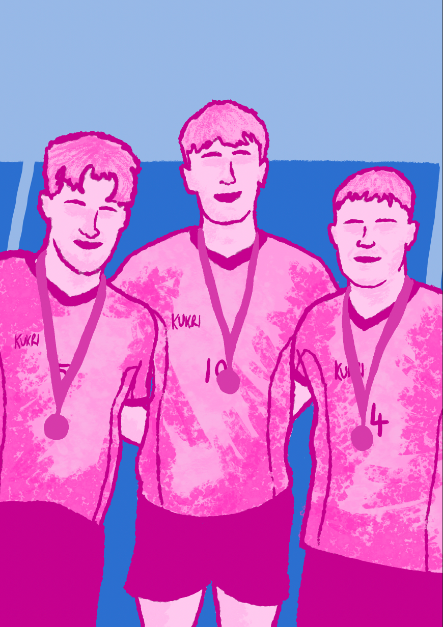
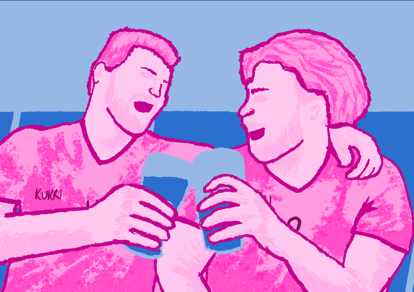
For my final outcomes, I decided to revert back to the original images. Although my initial intention was to have the final pieces presented as Risograph prints, I am very satisfied with these images. I believe they successfully convey everything I intended, while remaining compositionally and aesthetically strong.