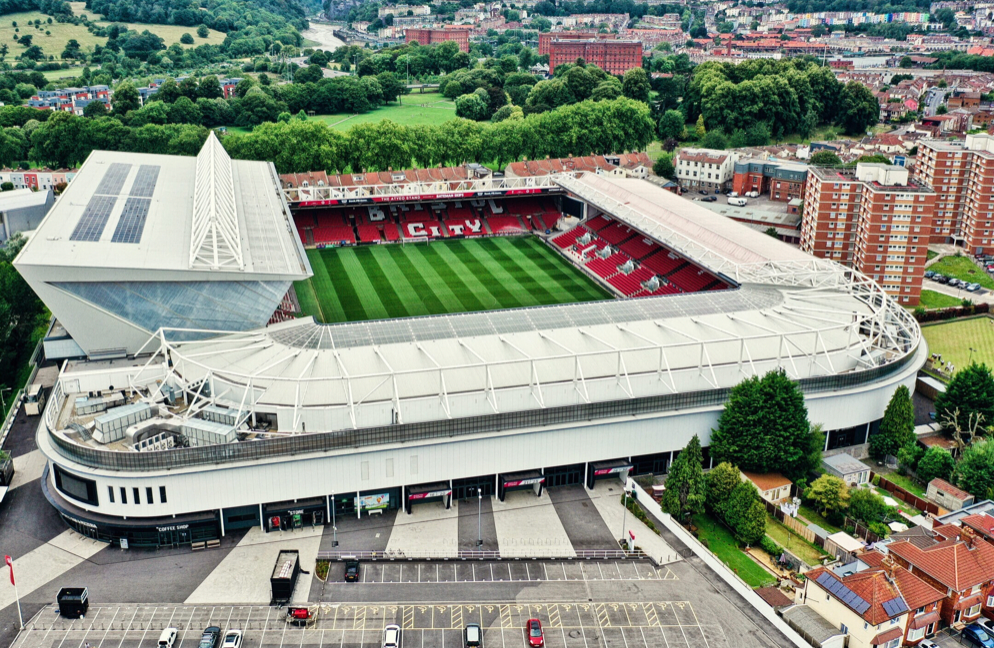

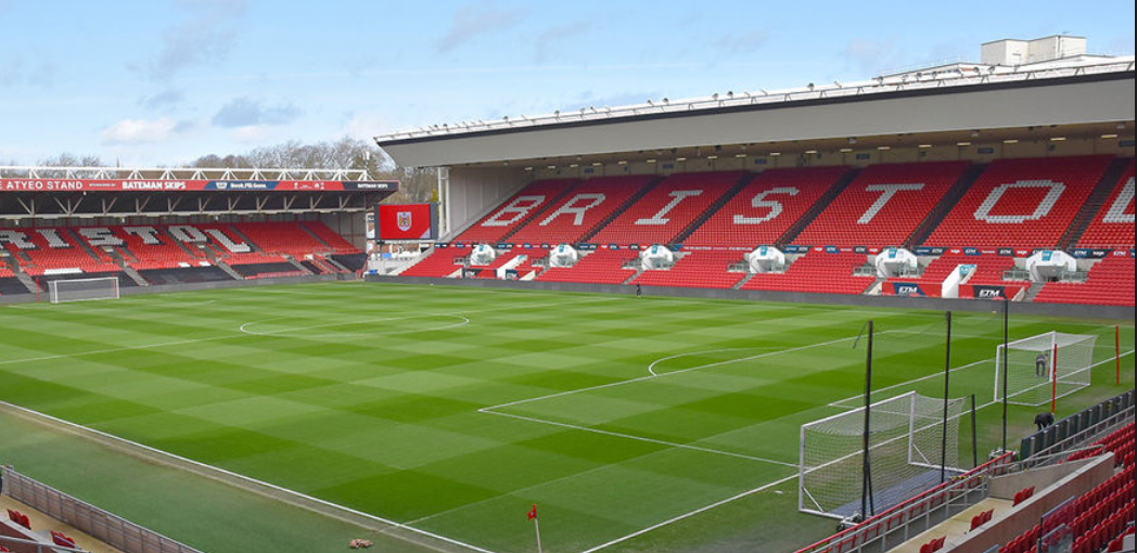
FOR MY 'PLACE PROJECT' I'VE SELECTED A BRIEF THAT DEMONSTRATES AN EXISTING PLACE OF YOUR CHOOSING through VISUAL REPRESENTATION. Initially I've decided to focus on the football club Bristol City as it's where I grew up watching football and found my passion for the sport. I'm aiming to look deeper beneath the surface of not only the club but football itself, exploring different avenue's and aspects of the culture within the community.
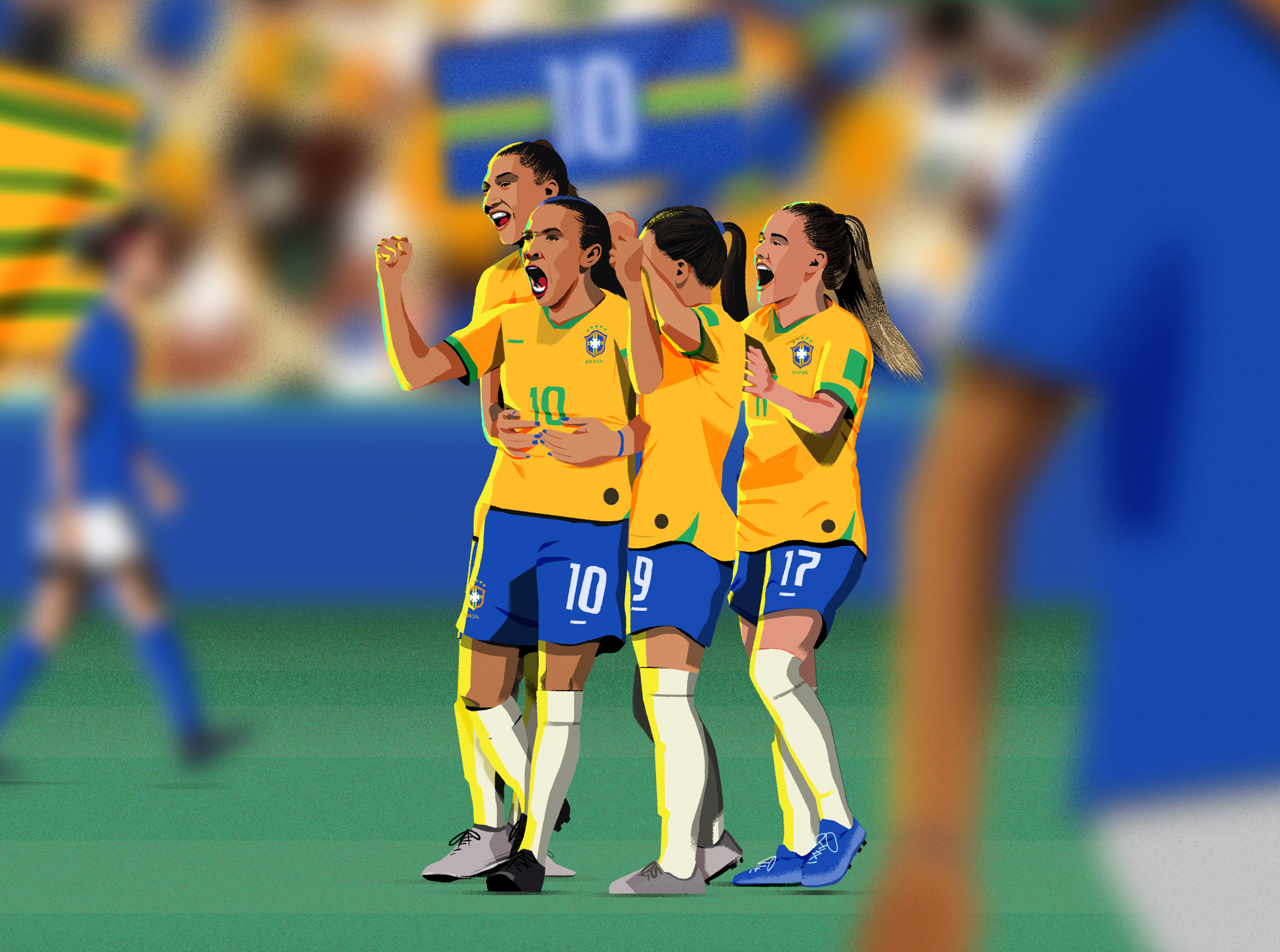


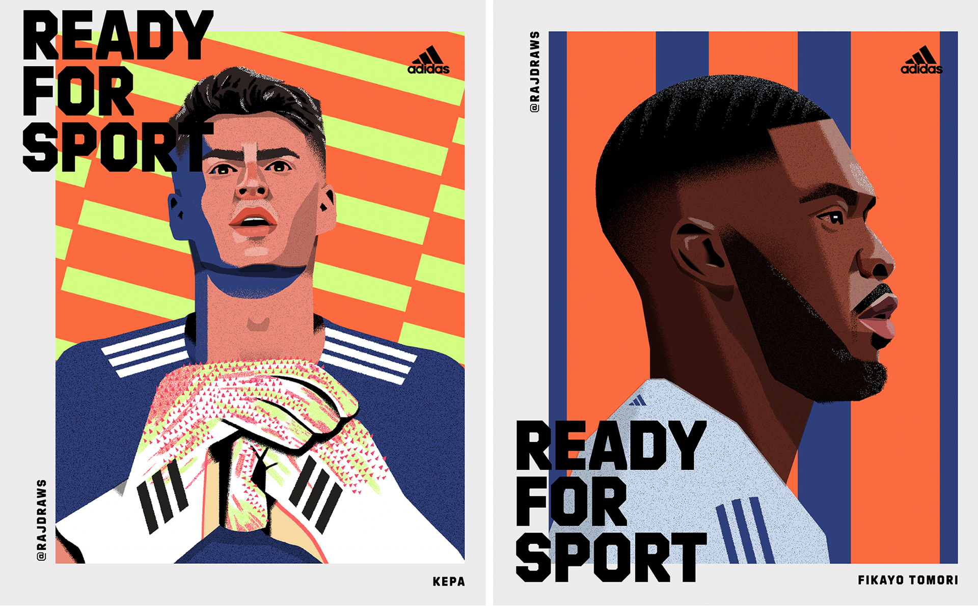

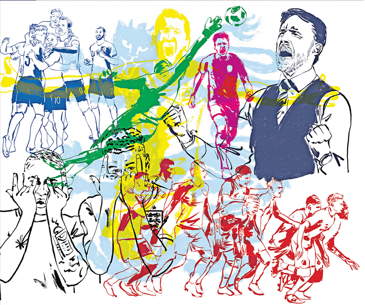
This is a mood-board I've created with images selected from the artist 'raj dhunna'. raj is An illustrator who pushes the boundaries of the narrative piece through impactful visuals. he has worked with giants in the sporting industries such as, Adidas, Nike, Umbro, Inter Milan, Liverpool FC, Spurs and the fa. I love his style and use of composition in his work. I've found a variety of different tools and ideas that could be useful for my own work from looking through his projects.
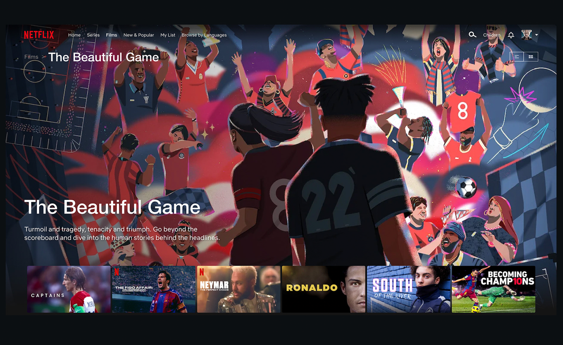
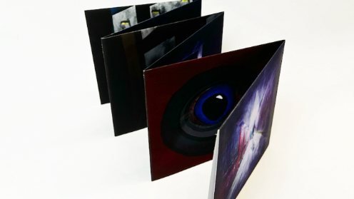
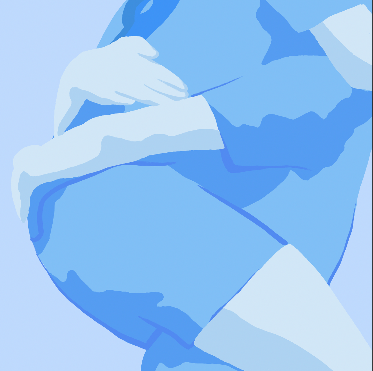
Dhunna has also worked with Netflix, creating the cover poster for a documentary about football 'the beautiful game'. The documentary has been very successful viewed by millions, meaning that of his work as well.
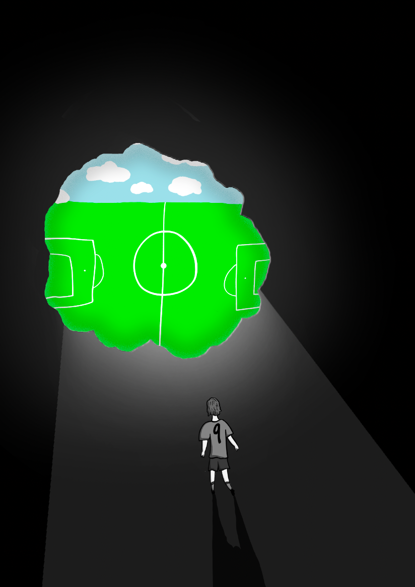
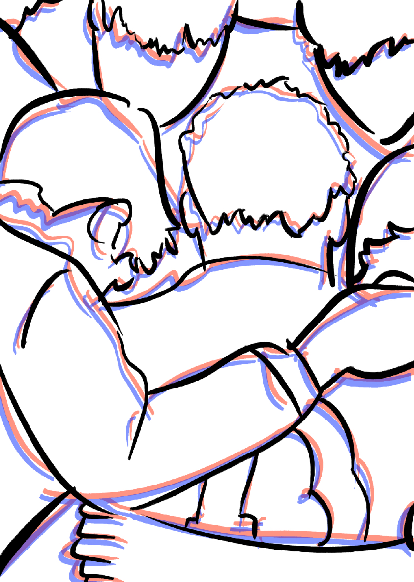
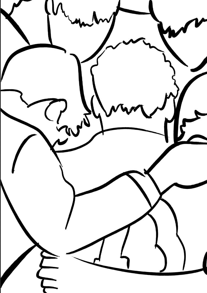
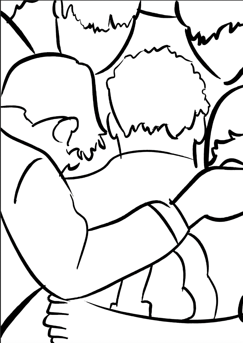
I actually took interest in the documentary cover before I realised he was the artist who created the illustration. what stood out to me was the use of contrast and sizing to determine the direction of focus.
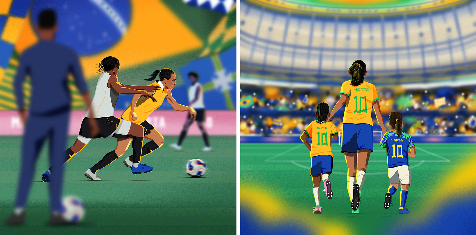
Dhunna effectively manipulates the viewer into looking at each feature in the order he intended. the first place you're drawn to is the centre of the image, which is highlighted with a shadowed disparity opposing the glow of the surroundings. You're then steered anticlockwise with the variation of brightness used around the cover, then noticing the other elements of the illustration.


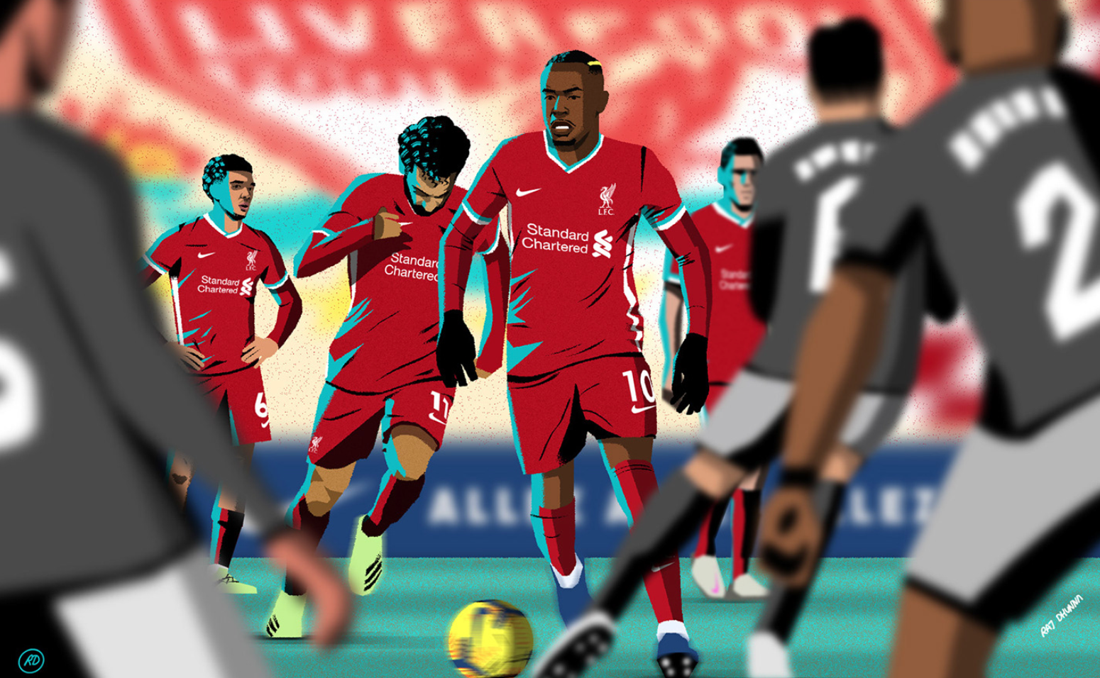
I think the way he uses a blur effect for loud backgrounds is really effective. it helps to isolate the features that the artist wants to highlight within the image. this is definitely something I can apply to my project.
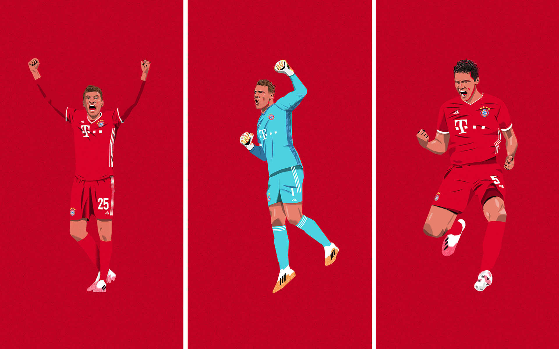
what I like about these images is the simplicity and style of composition, although I'm not too sure about the red on red clash between the subject and the backdrop. I think that some basic illustrations like these could work really well for breaking up noisier images within my final pieces.
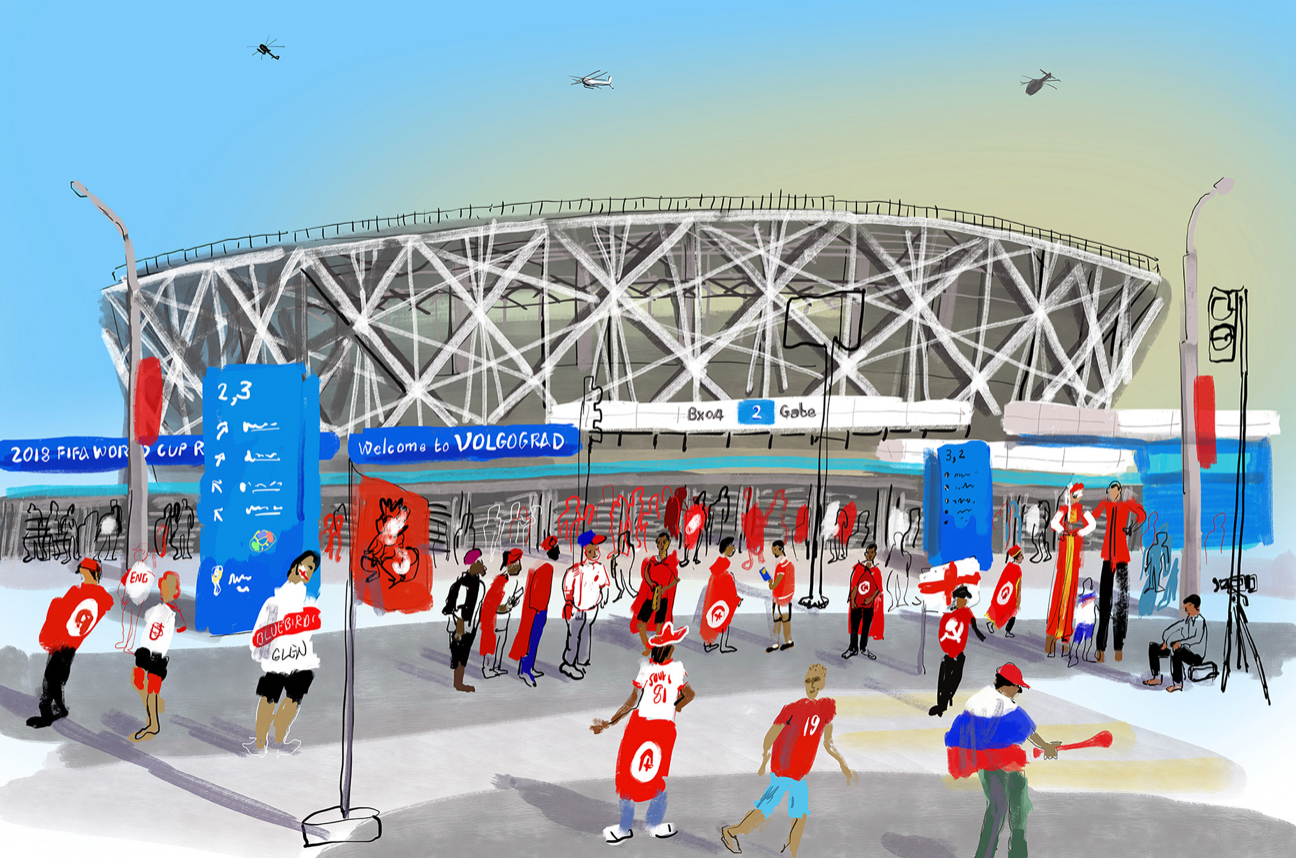
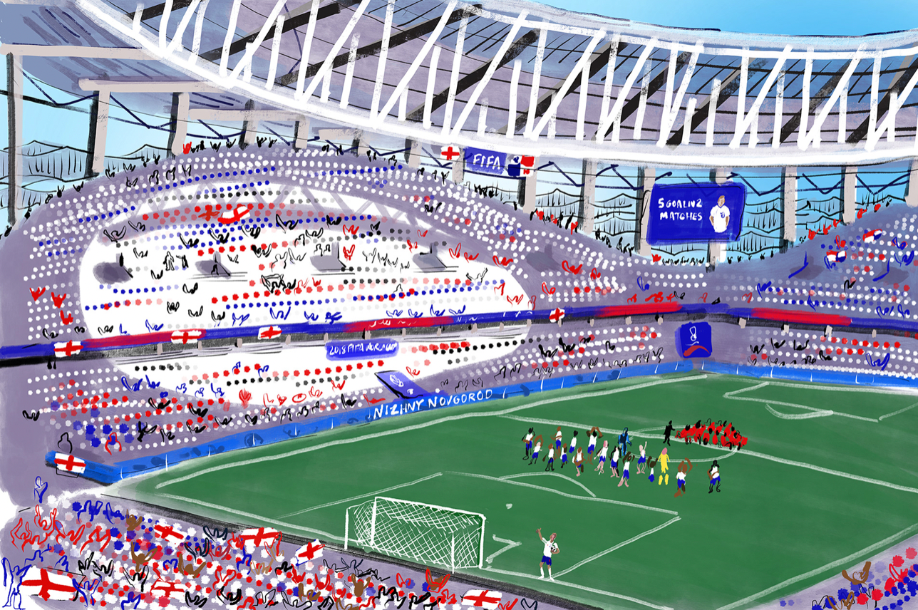

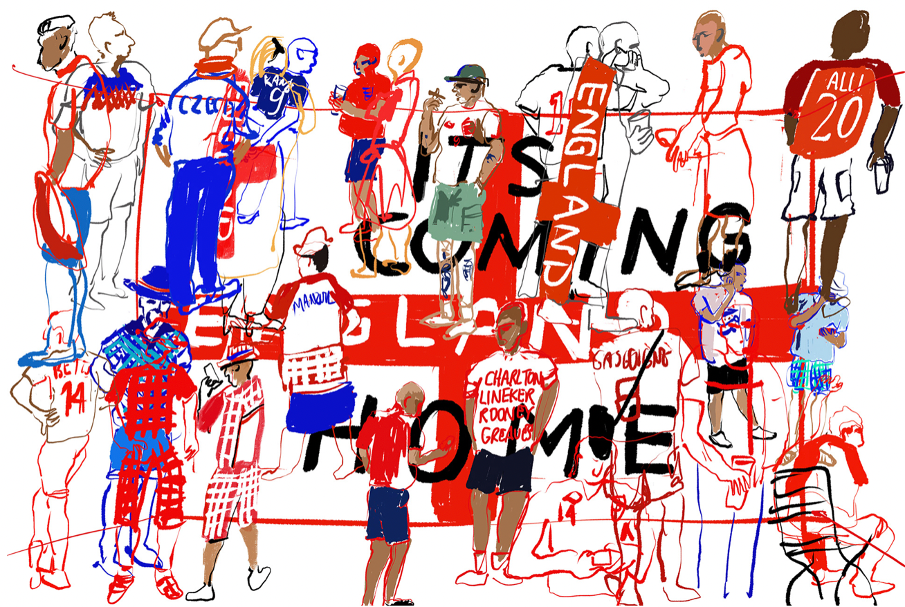

Another artist I've looked at for inspiration is Tim vyner. Vyner is a well established illustrator who records global sporting events, documents diverse communities and tours public museums. He works for galleries, publishers, newspapers and private collectors and has covered World Cups, Olympic Games, busy national events under the spotlight and private monastic communities far from the media gaze.
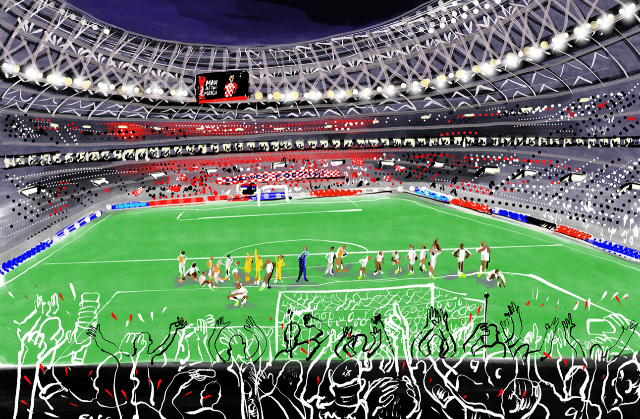

the work he did for the Moscow Fifa World Cup is done mostly on his iPad, sketching the games, fans and stadiums of the global event. what I like about the illustrations is the variation of detail. to differentiate the focus areas of the image vyner adds substantial detail to the features he is targeting, leaving the rest of the sketch as either hollow stroke lines, or brief shapes.
I think this style of illustration is really effective in making a busy image less tedious to look at. this is because there are things to take more notice of, such as the detailed components, which are complemented with negative space and less piercing elements to soften the noise.
This particular project interests me as it's football related and I can definitely use some of the imagery instruments for my own work. however, the main thing I am taking away, similar to raj dhunna, is how vyner molds his illustrations to highlight details and moderate others.
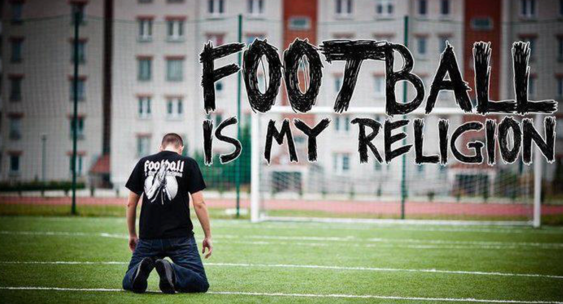
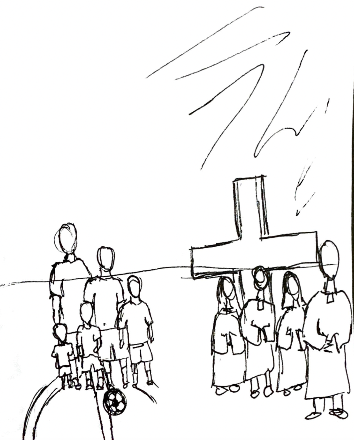
through extensive research, my initial idea has developed from looking at a specific football club to a broader view of football culture itself. I've explored a variety of different avenues such as hooliganism, community and rituals, all of which kept leading to the same ideal. that being the comparison of football and religion. multiple sources I reviewed suggested that football and religion have a significant amount of similarities, particularly in values and community.
I think that this could be an interesting topic to investigate through visual representation. it has the substance I've been looking for to compile a project with depth. this will make the illustrations meaningful and more than just surface level art.
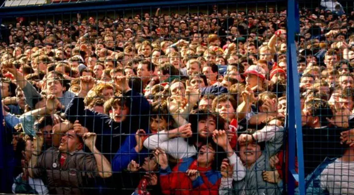
there was one article in particular that stood out to me. it analysed the resemblances between pilgrims and the Hillsborough tragedy, which occurred at the Sheffield Wednesday football stadium the 15th of April 1989.
the Hillsborough tragedy was a result of overcrowding, ending in 97 dead and 766 injured Liverpools supporters. it was the deadliest disaster in English sporting history.
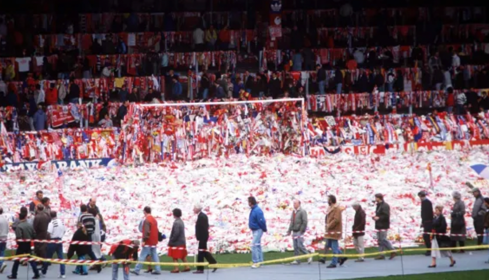
in the article, it was suggested that the shrine located at Anfield stadium, post disaster, was similar to that of a religious gathering. as over 200,000 people visited to pay their respects, lay flowers as well as memorabilia. the kope end of the stadium also acted as an alter.
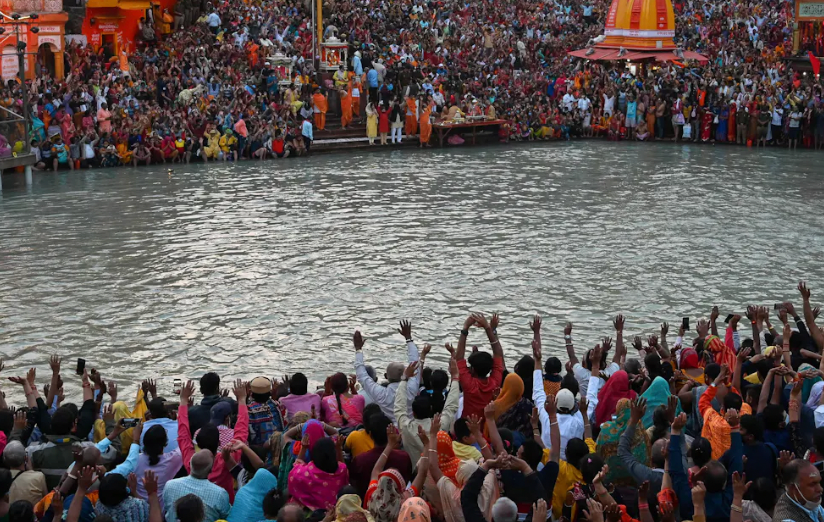
however, the main comparison was that of community. the togetherness of a whole city, including two major rival football clubs, to commemorate such a tragic event can be seen as comparable to mass religious gatherings. such as the hindu kumbh mela, the worlds largest religious gathering.
I want to investigate further the similarities between football culture and religion though visual representation. hopefully resulting in an illustrative outcome of deeper meaning.
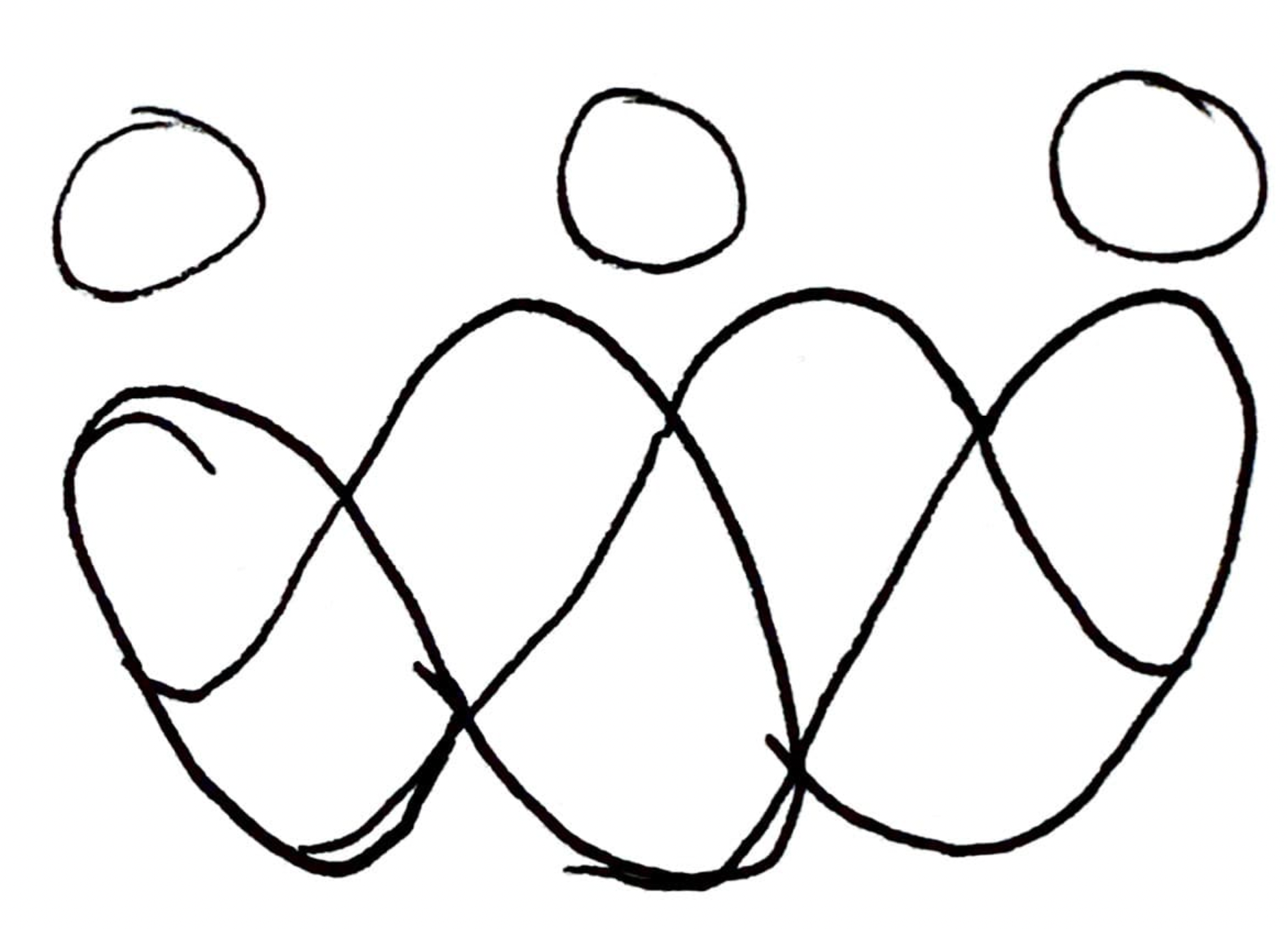
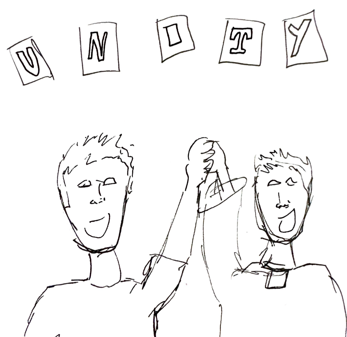


I made notes on the main relations between football and religion and started to create some thumbnails. the illustrations above are for community and unity.
I thought about how I could use cut-out magazine typography and visuals that are less direct. However as I continued, it became apparent that it would be more difficult than I anticipated to illustrate exactly what I want to show.
I'm going to make sure I don't limit my creative direction for this project and keep exploring other possible avenue's.
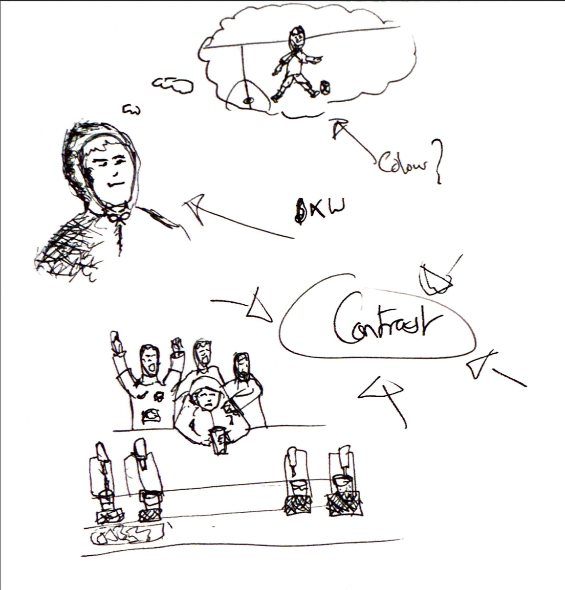
another subject of interest I came across through my research, was the impact football can have on mental health. Not only does the sport provide better physical health, it improves well being for both supporters and players.
I sketched some brief ideas for how I can visually represent the mental benefits of football and the culture that comes with it.
referring back to the artists I looked at for inspiration, I could apply some of the contrasting tools they used into my project. I think a light to dark colour differentiation could be really effective in highlighting the diversity within my illustrations. expressing change in mood and well being via shift in brightness in colour.
a blur effect on the surrounding imagery could also work well in emphasising features. now I need to start experimenting and see what does and doesn't work. I'm also still keen on trying magazine typography to lend depth into my illustrations.
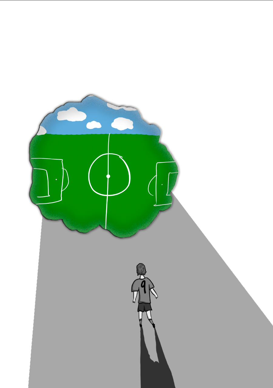
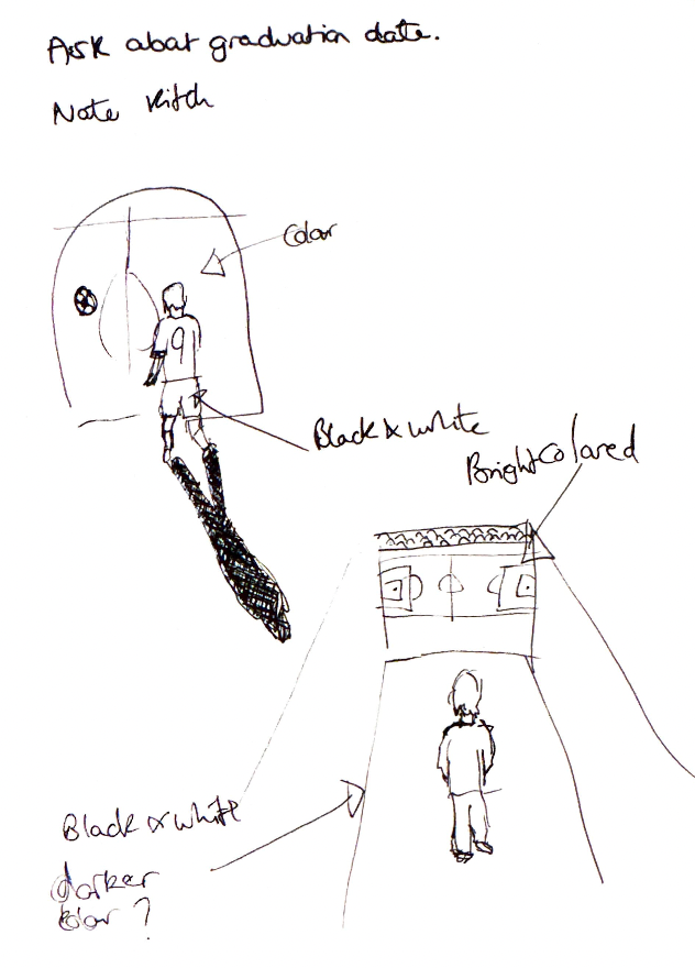
I had the idea to create a frame within the image, revealing the positive setting the player would be looking towards in hopes of escaping the dark. this is to represent the transition of going from bad to good mental health.
I like the contrast and the effect of making the frame look like a tear through the page. however, I'm not keen on the overall composition and style. it feels quite messy and flat.
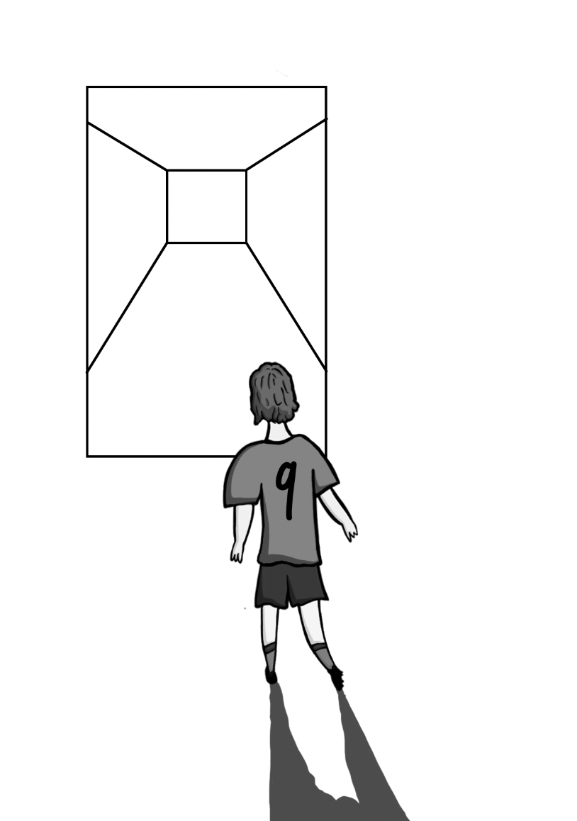
I re-evaluated how I could create the frame. maybe changing the image to a stadium tunnel to walk out through. Still unsure about this concept I'm moving on to try something different.


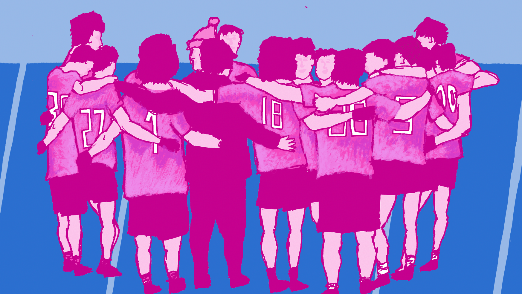
After some feedback, I thought about exactly what it is I'm trying to show through this project. I did some primary research, asking what it is people think about first when it comes to the positive impact on their mental health from football. from this I concluded that the social benefits and being with others in a team, was the most common response.
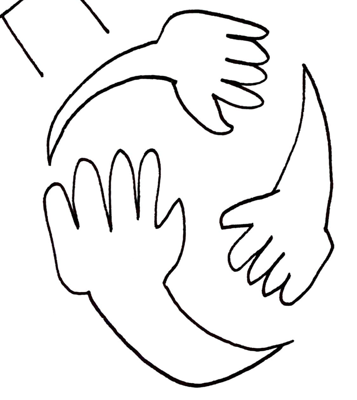
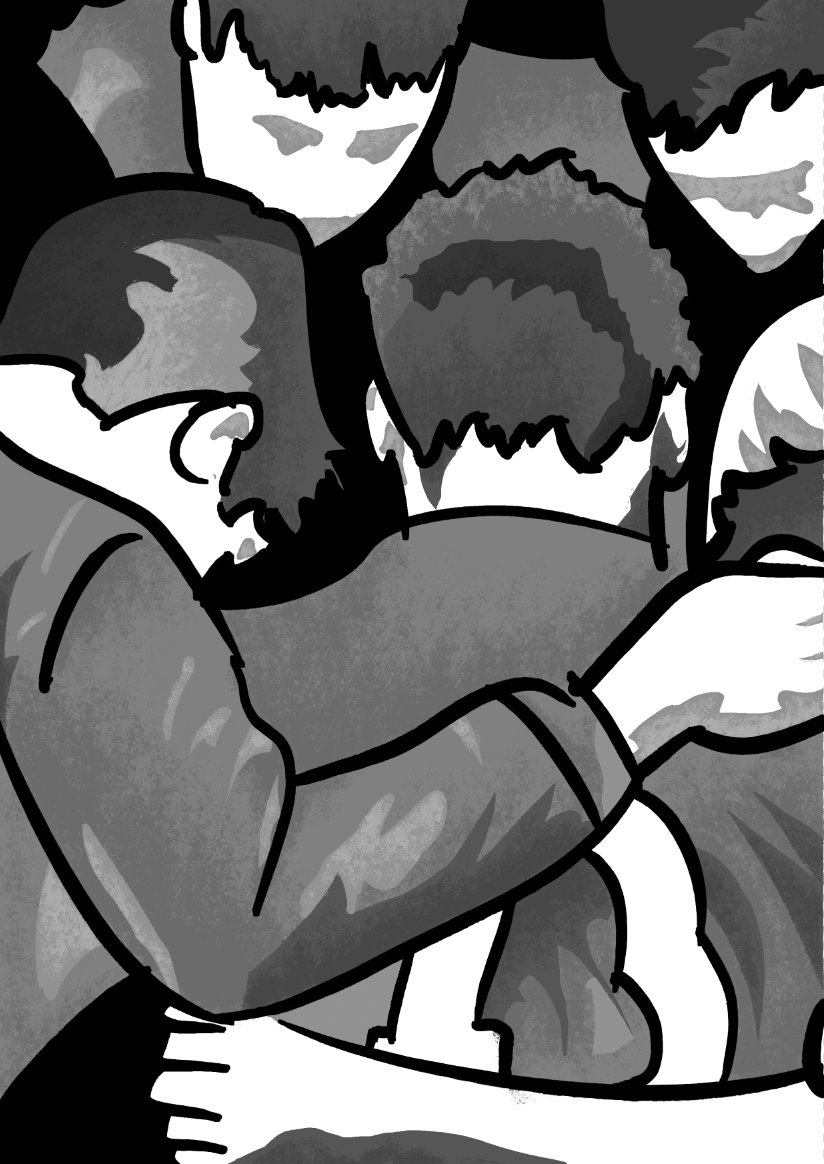
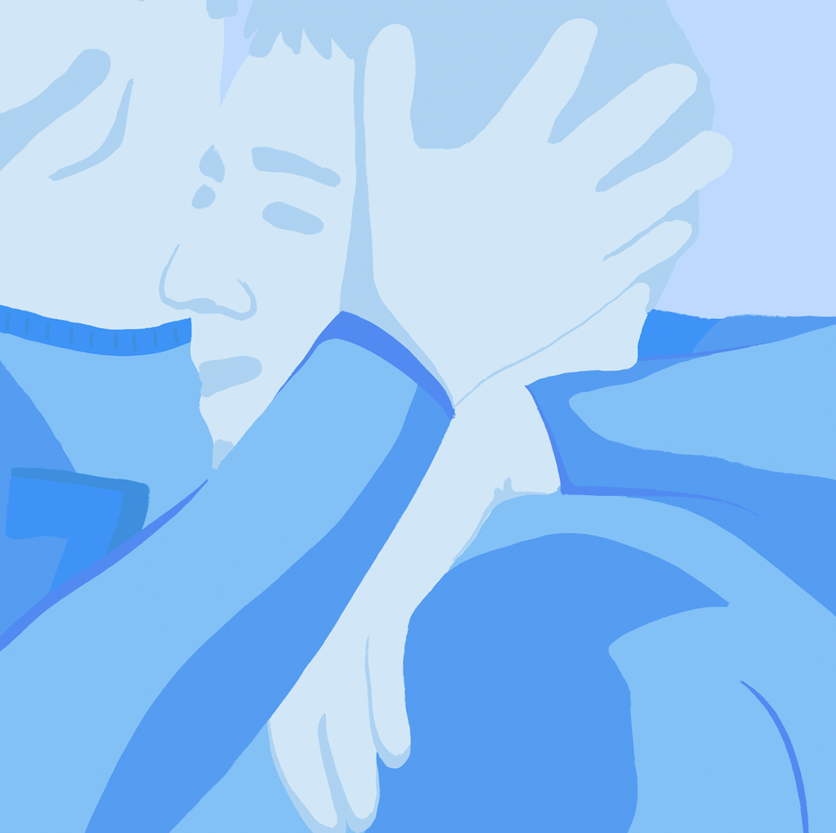
I then drafted some more thumbnails thinking about how to represent togetherness visually. I recognised that the showing of hand placement and expression through actions was an effective way to do this.
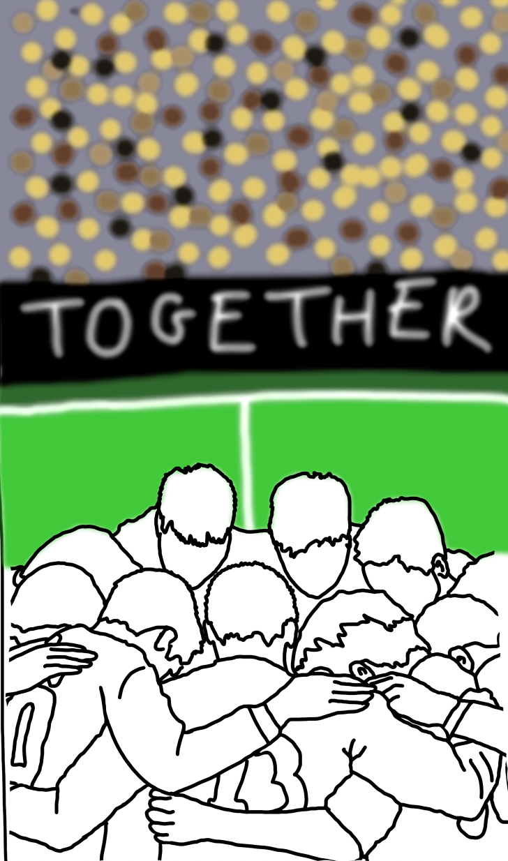

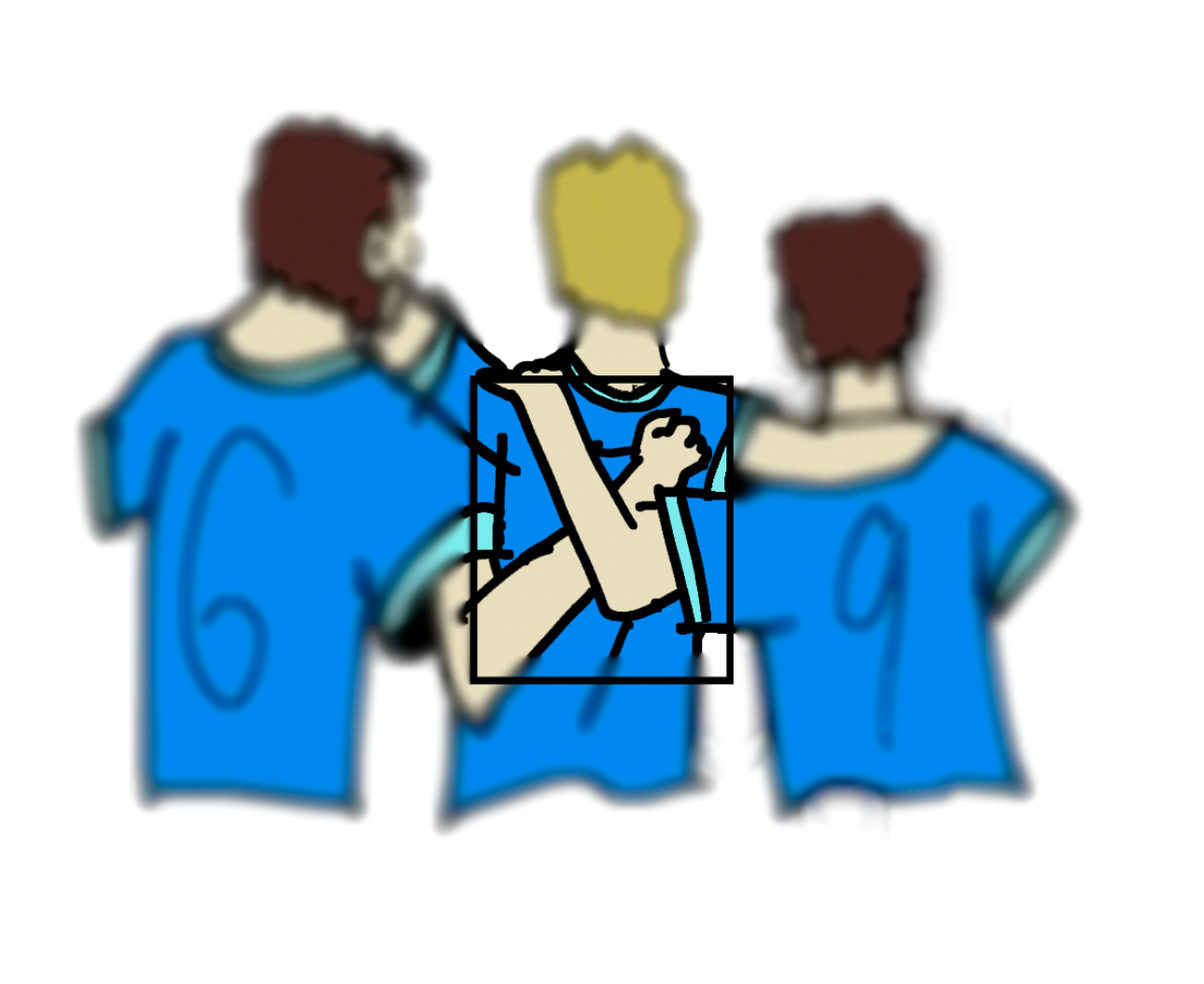
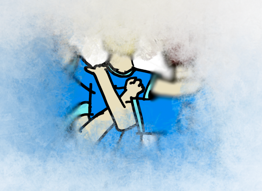
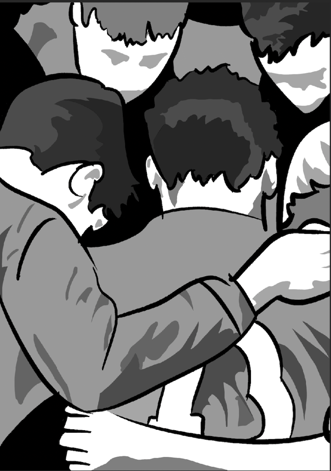
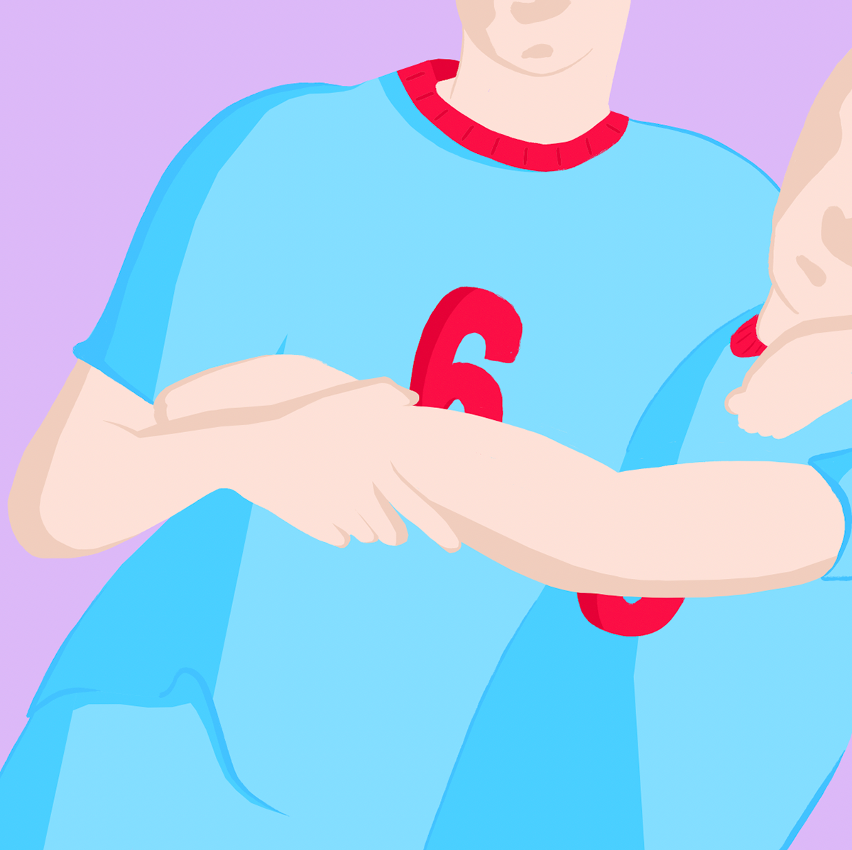
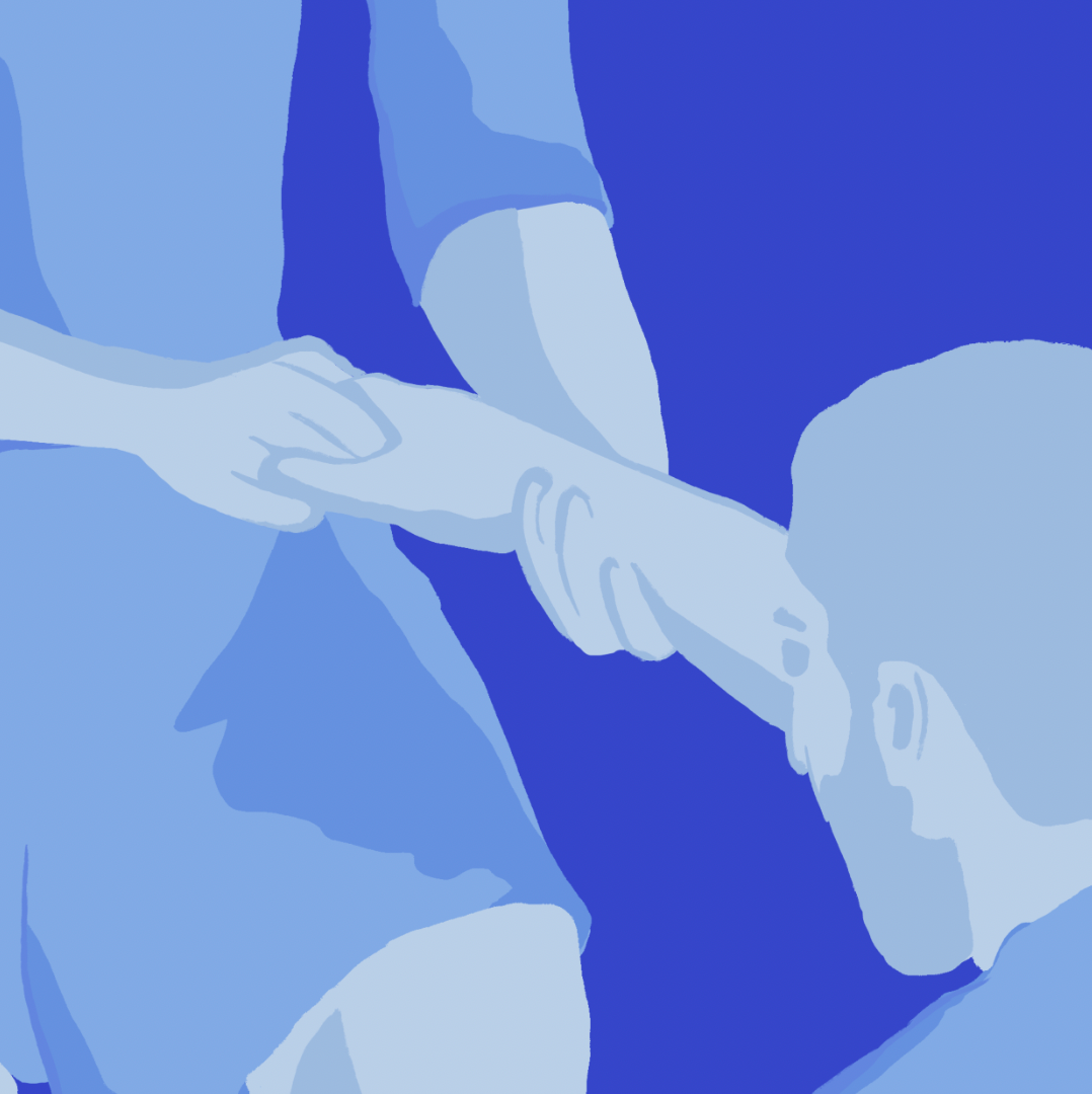
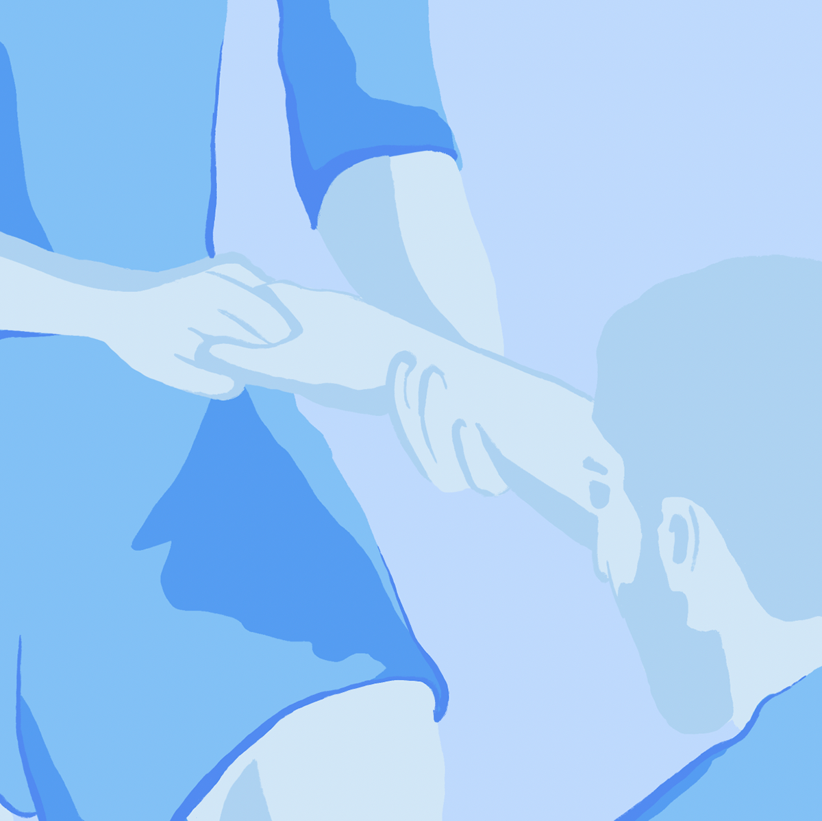
on photoshop I put together a sketch of a team in a huddle. I like how the hands are wrapping around one another showing multiple people as one. although I think I could play around with the composition to highlight this some more.
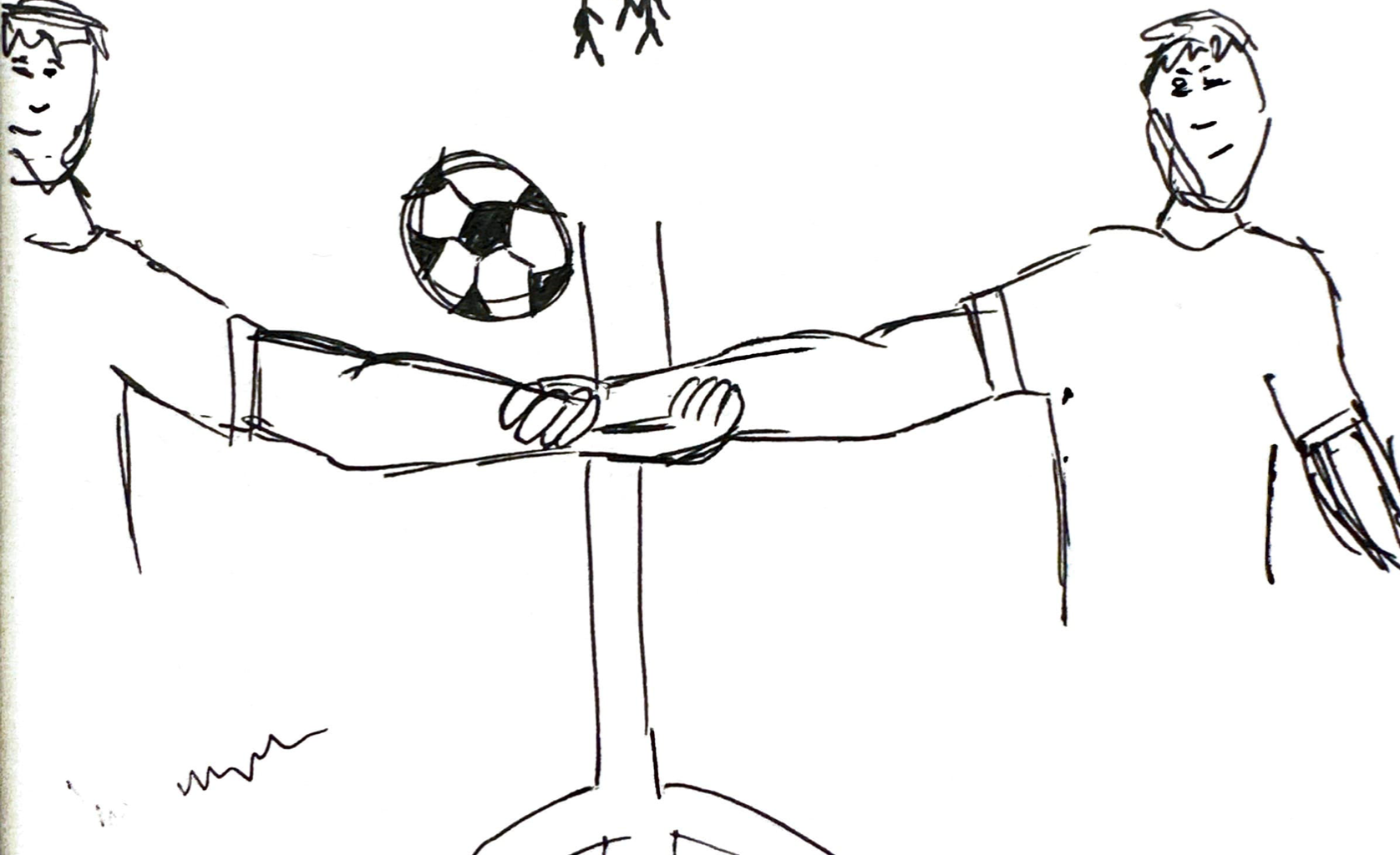
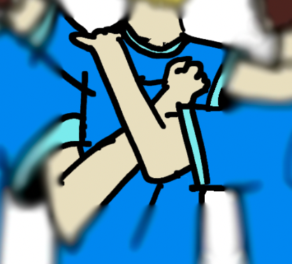
by focusing on a smaller part of the huddle I think I can more clearly evidence the togetherness being shown. seeing as the hands are now the forefront of the image I definitely prefer this as a composition.
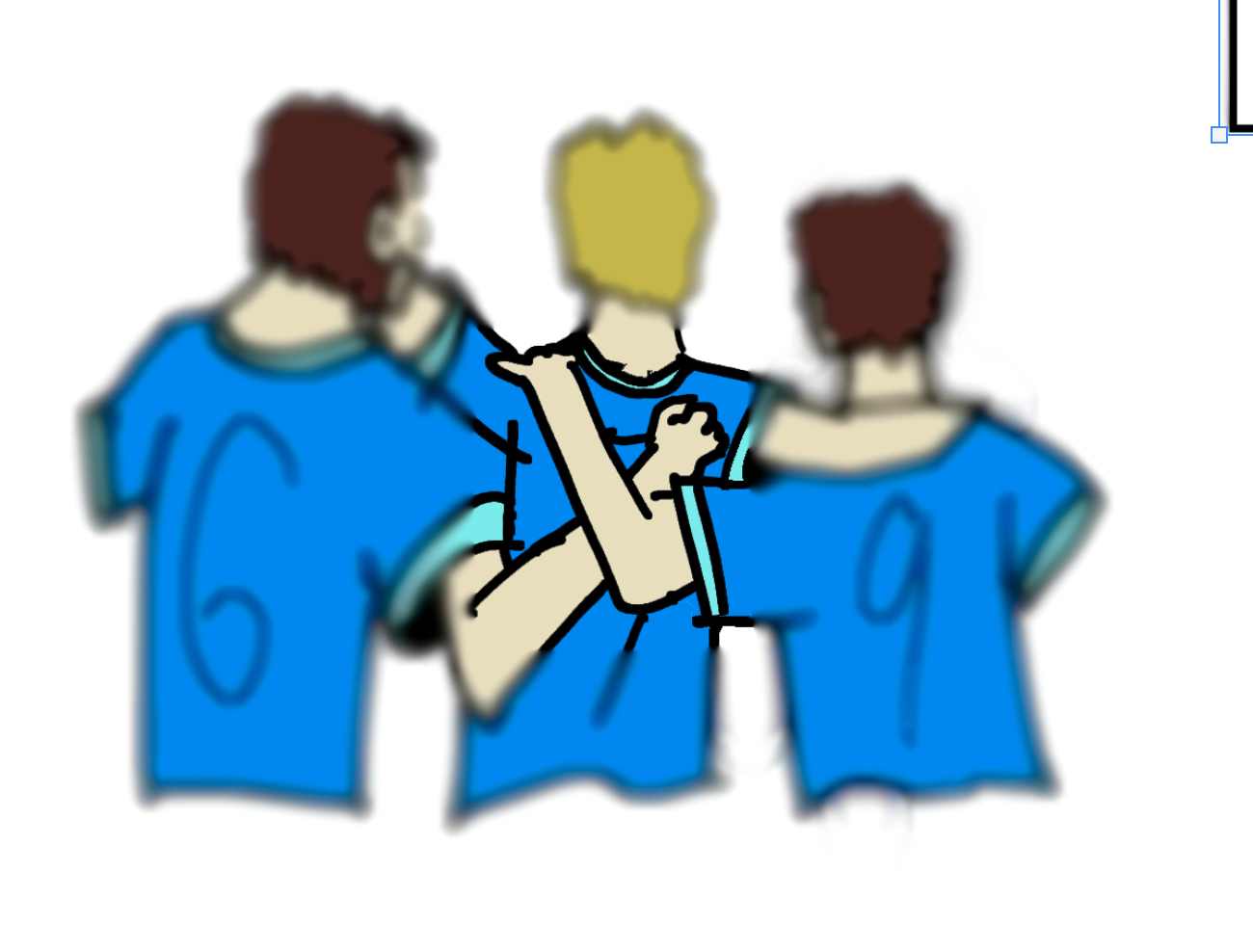
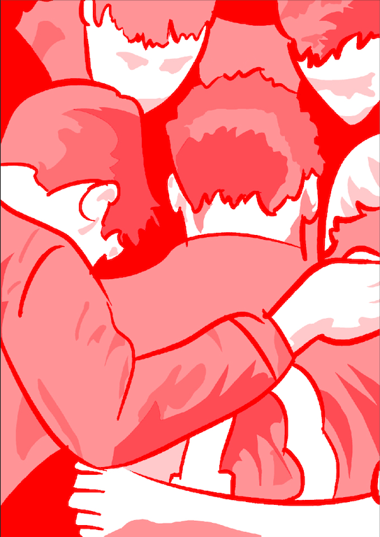
I also used a brush pen to trace over the image, giving it a smoother and more aesthetic appeal.
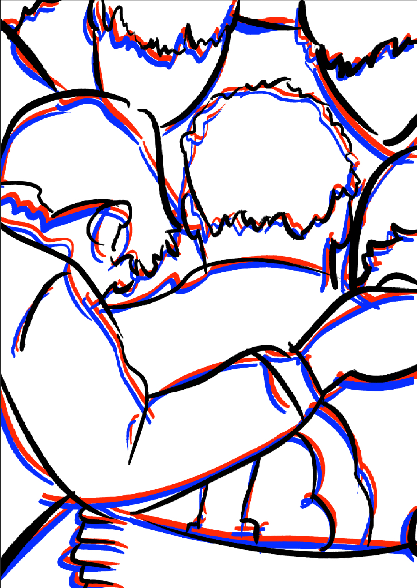
then i added some overlaying lines in a couple different colours just to see how it might look, but I don't think it adds anything to it, maybe even makes it worse.


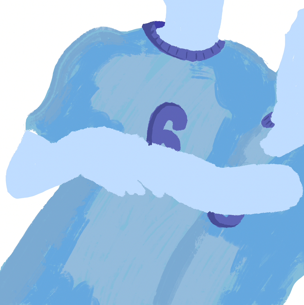
My next priority is to address the sense of hollowness in the image. I began experimenting with layering to depict the shading of the players. Initially, I used a grayscale colour palette, although this may change later, I’m currently focused on building the foundational shading. After assembling the layers, I was pleased with the aesthetic of the design. however, I feel it could benefit from additional depth, as it still appears slightly flat.

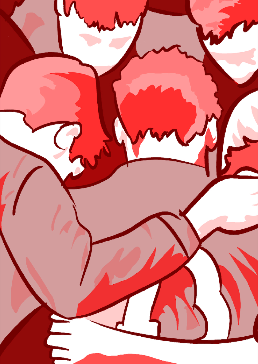
Continuing with my experimentation, I explored different color palettes to observe the impact they might have on the image.
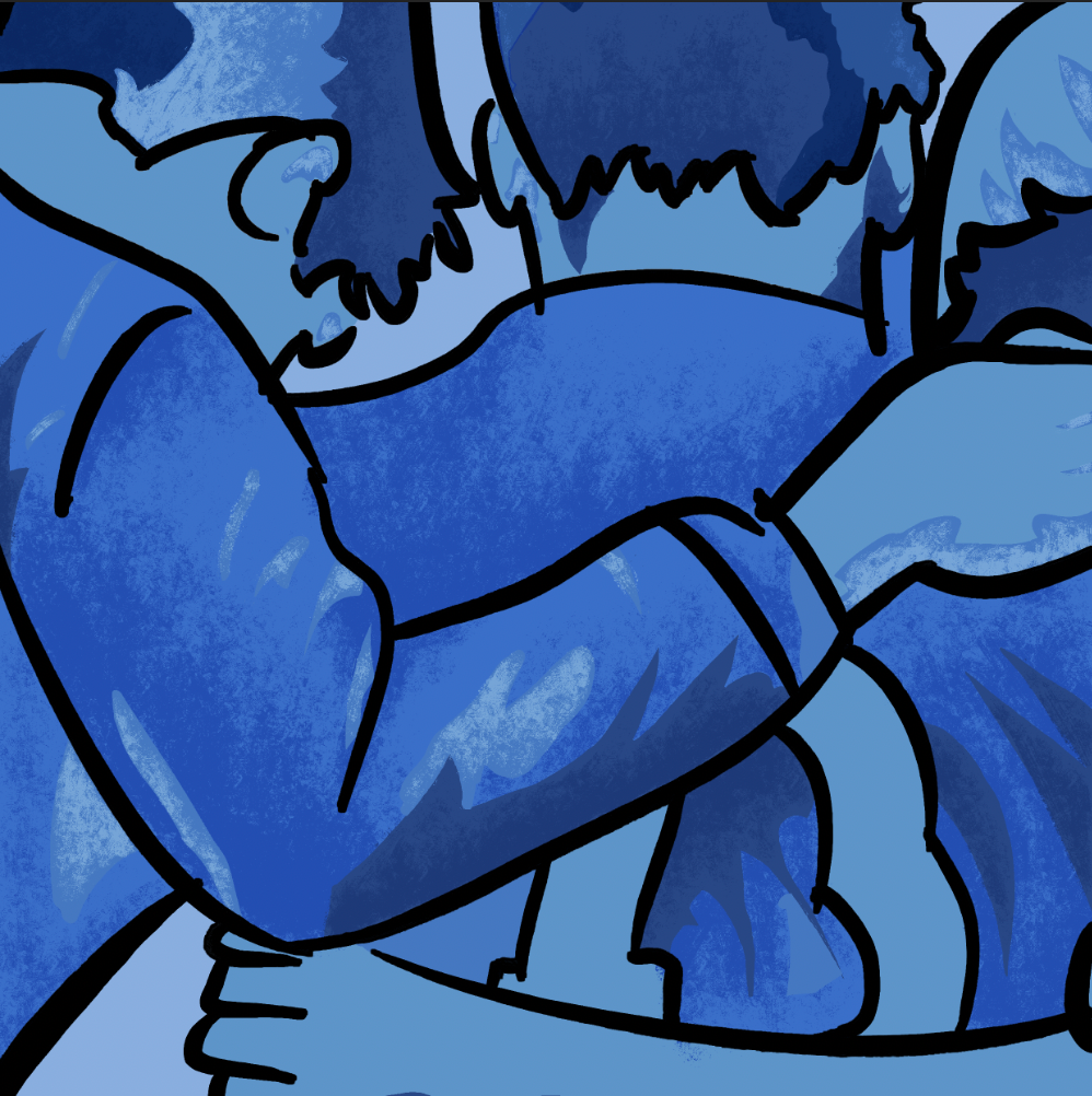

My previous adjustments led me to conclude that a blue colour palette worked best for this illustration, as it effectively conveyed the lighthearted tone I intended.
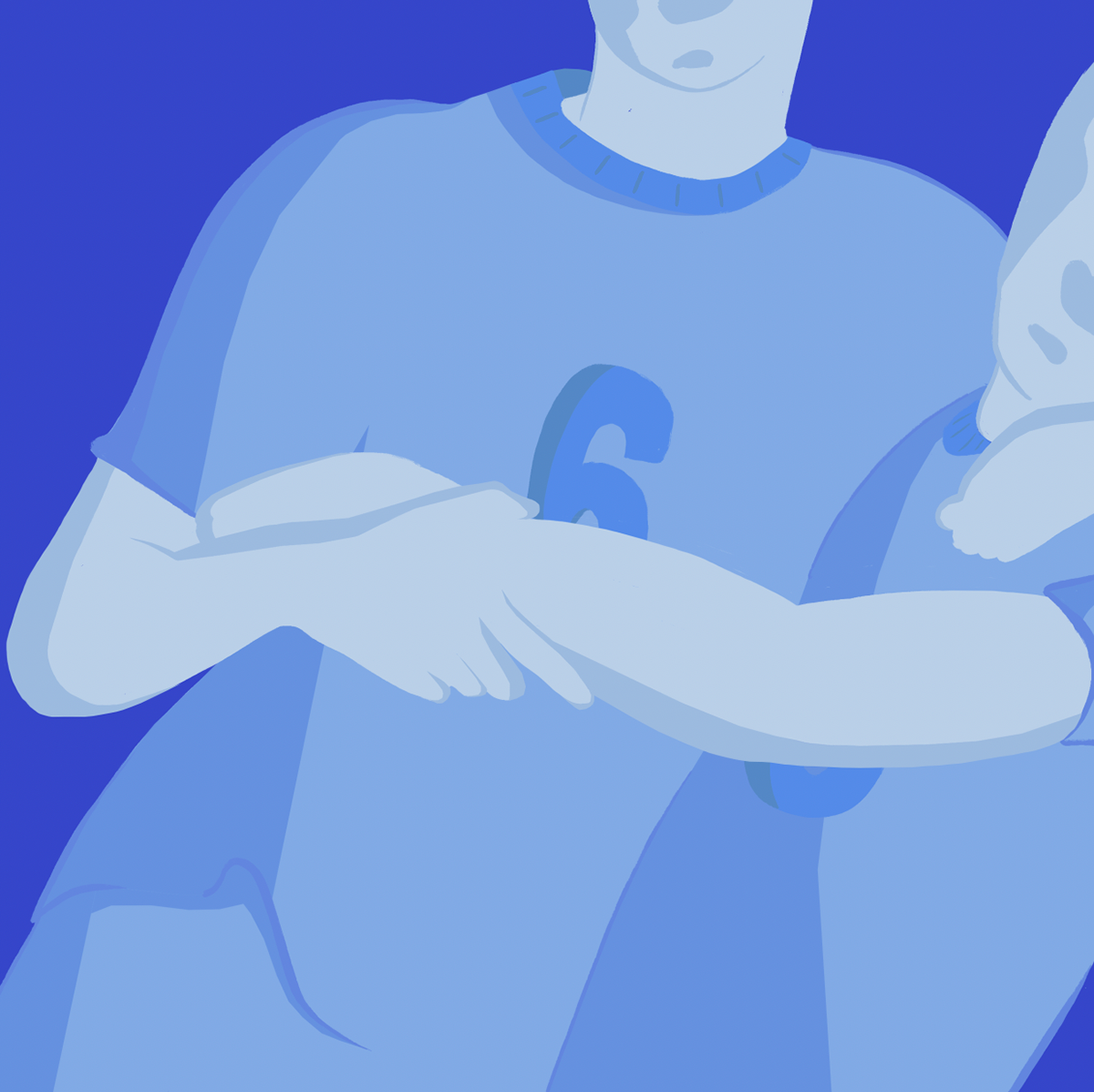
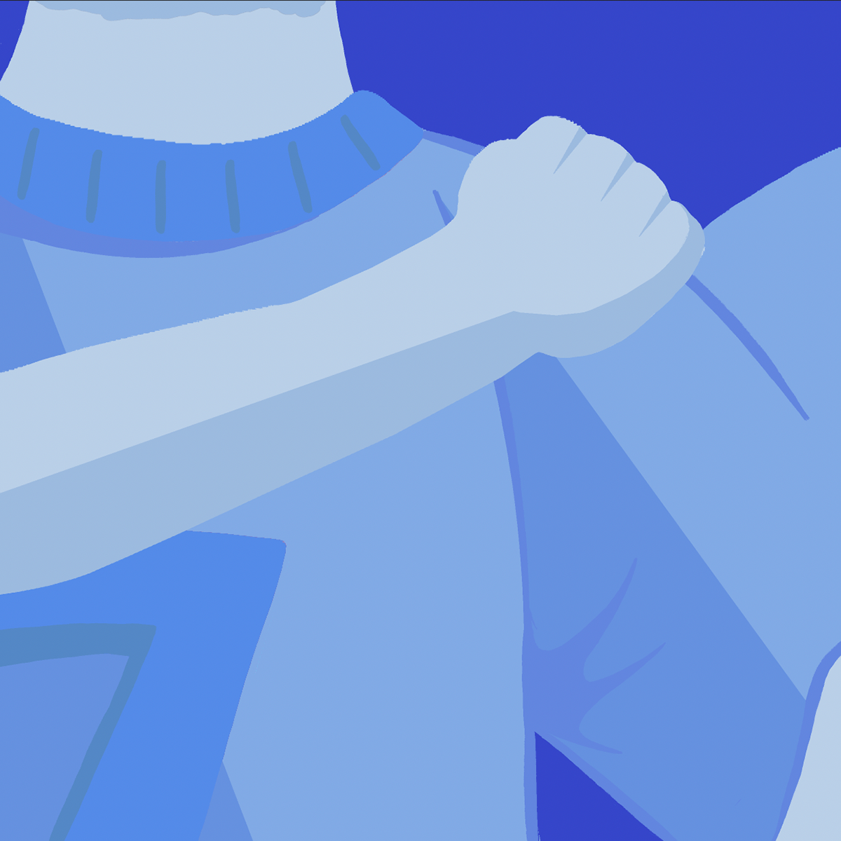
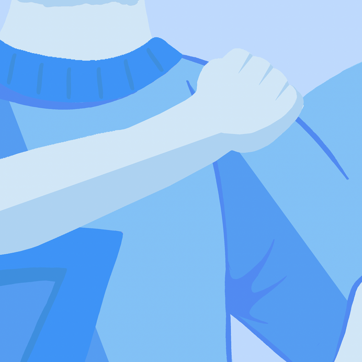
I realized that further cropping the composition to focus on the hands could be a valuable development. Highlighting the hands emphasises the importance of platonic physical contact between teammates, powerfully illustrating unity.

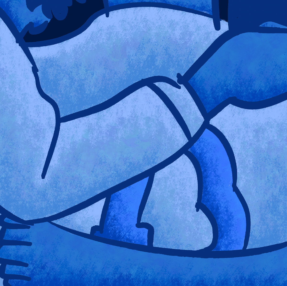
After cropping the image, I also noticed that using a square frame would better emphasise the key elements of the composition, drawing greater attention to the arms embracing one another with more impact and clarity.
Another change I implemented was adding texture to the shading. I felt this introduced more depth to the design; however, I’m uncertain about its overall effectiveness. I think some reflection is needed before deciding whether to keep it.


These thumbnails are preliminary designs for my degree show piece. The goal is to create a physical artwork that encapsulates the essence of my project for the upcoming degree show. My concept centers around two characters embracing, which I plan to translate into a wooden template.


My original inspiration came from the character Baemax in Big Hero 6 and the Rugby World Cup animation. However, since my project focuses on football, I’m concerned that these styles feel too bulky and may not convey the message I intend.
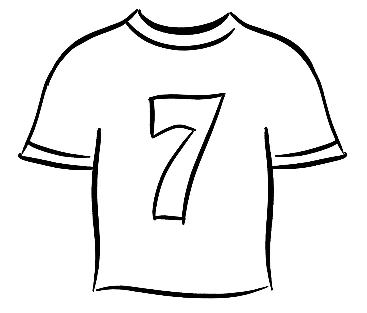
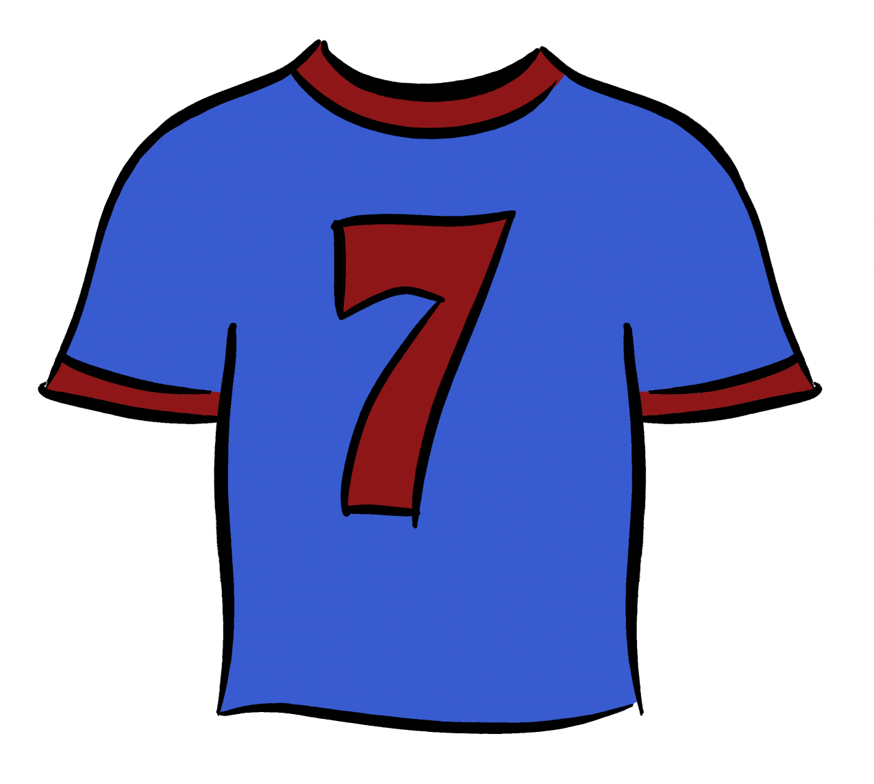
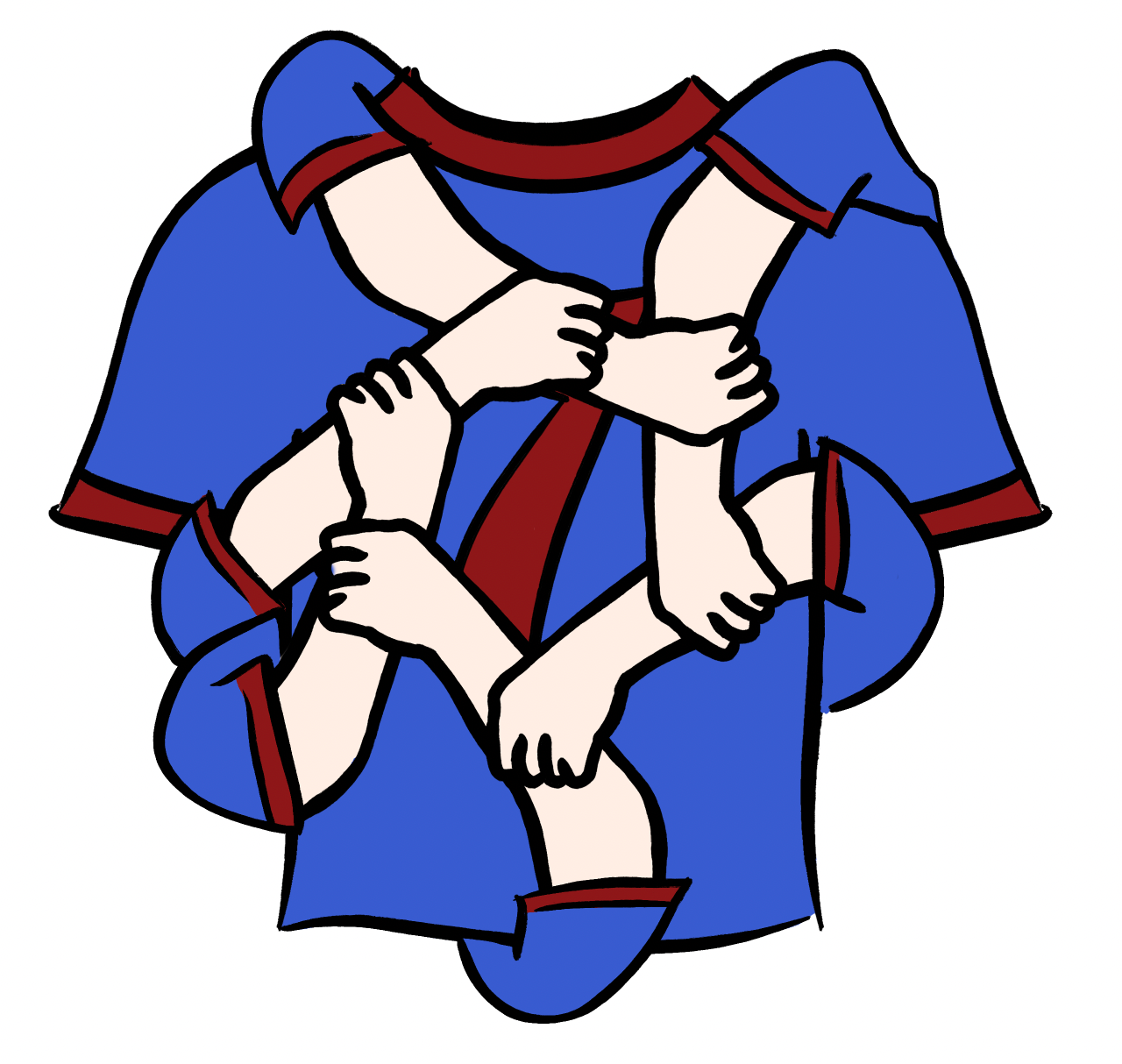
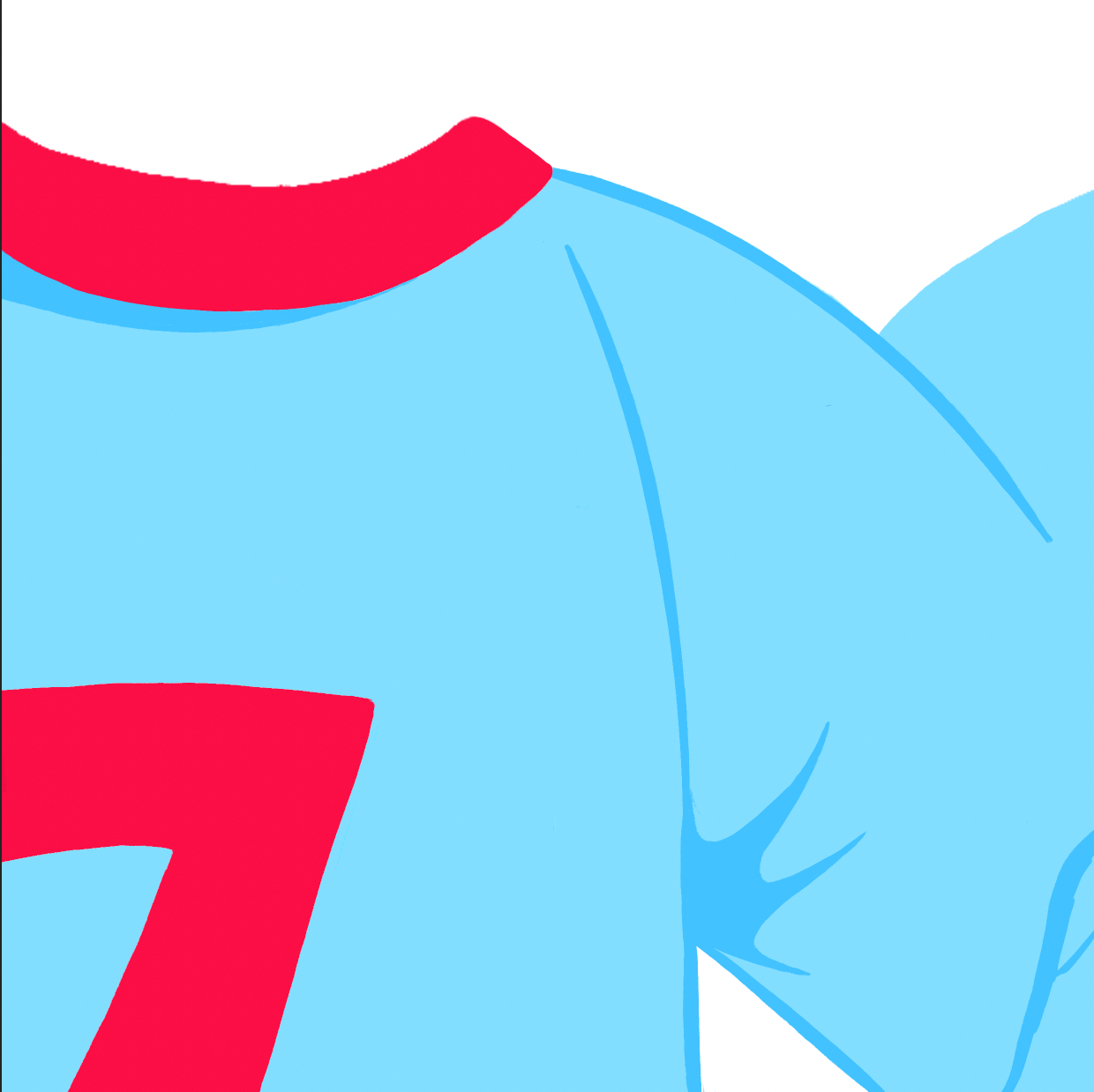
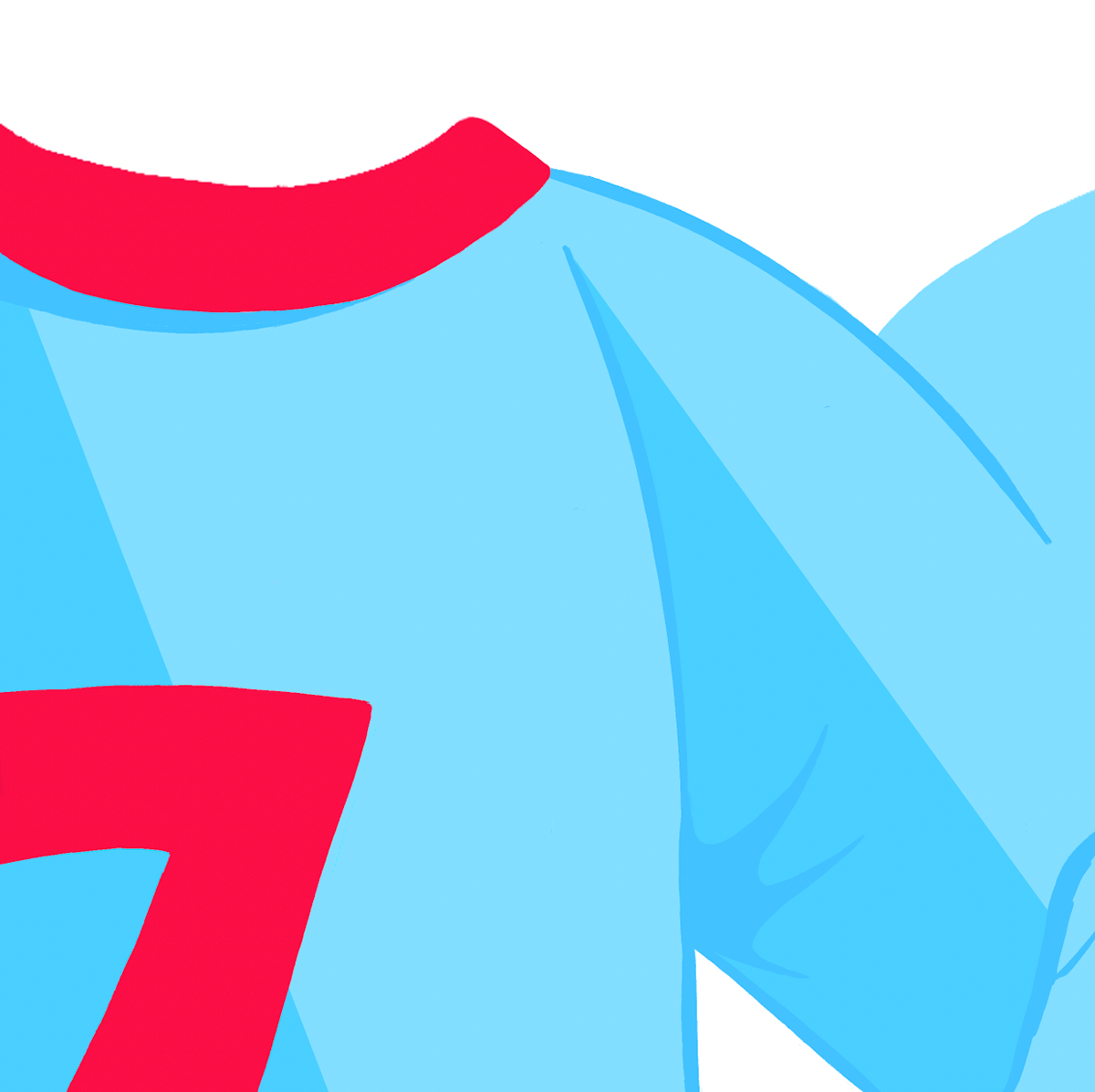
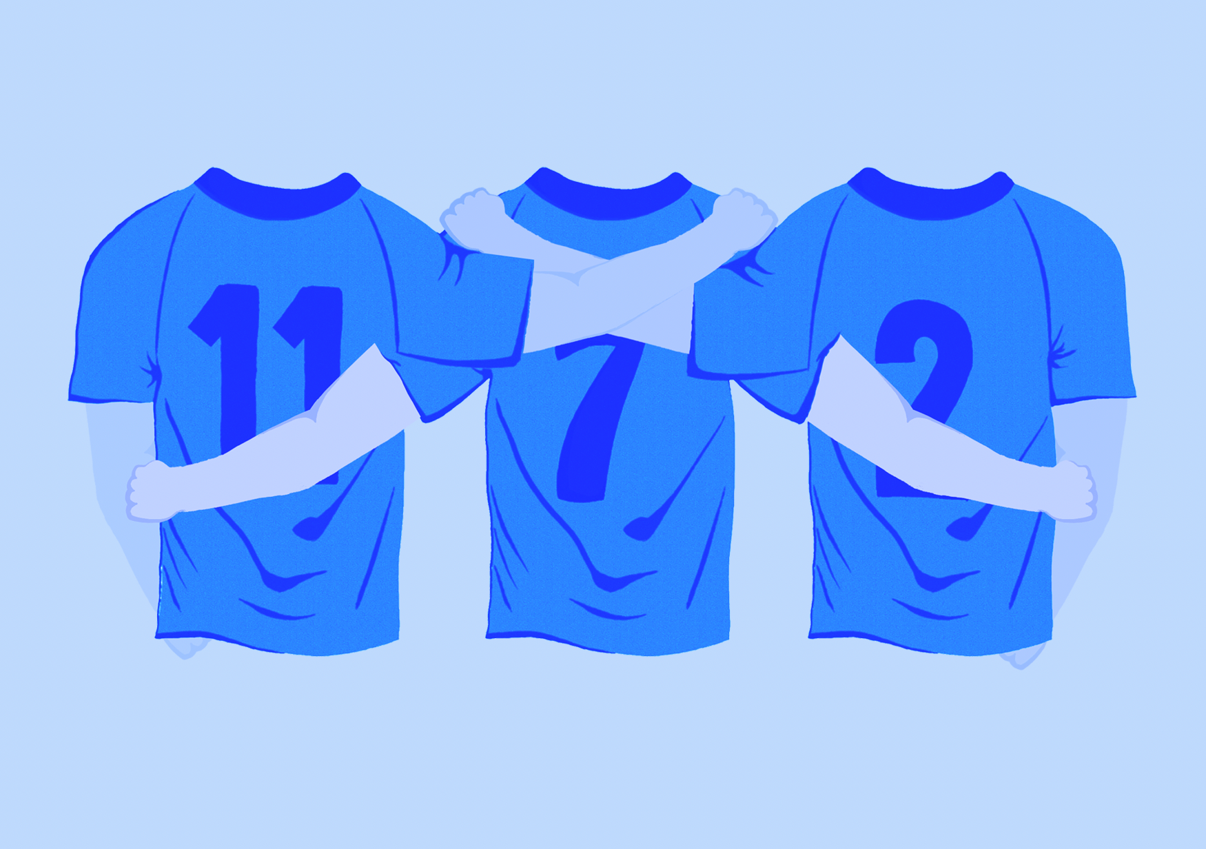
Shifting back to a more football-oriented concept, I designed an illustrated football shirt with the intention of creating multiple versions that could link arms, symbolizing the unity and togetherness at the heart of this project. I also experimented with incorporating a circular arrangement of arms as a symbol of unity, but it ended up feeling cluttered and didn’t complement the design as I had hoped.
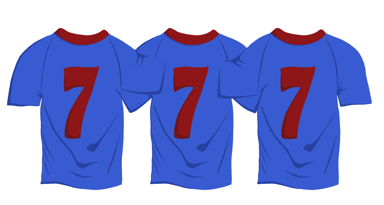

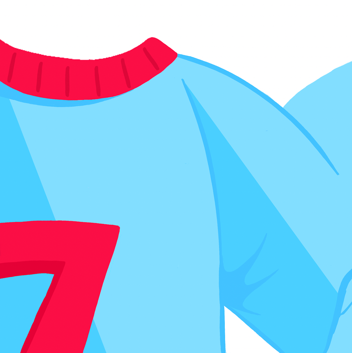
Furthermore, I created a trio of football shirts and added the arms. I can now see the design starting to take shape as I envisioned. That said, I believe there’s still room for development. I’m also uncertain about the colour choices, so that will be my next area of focus.

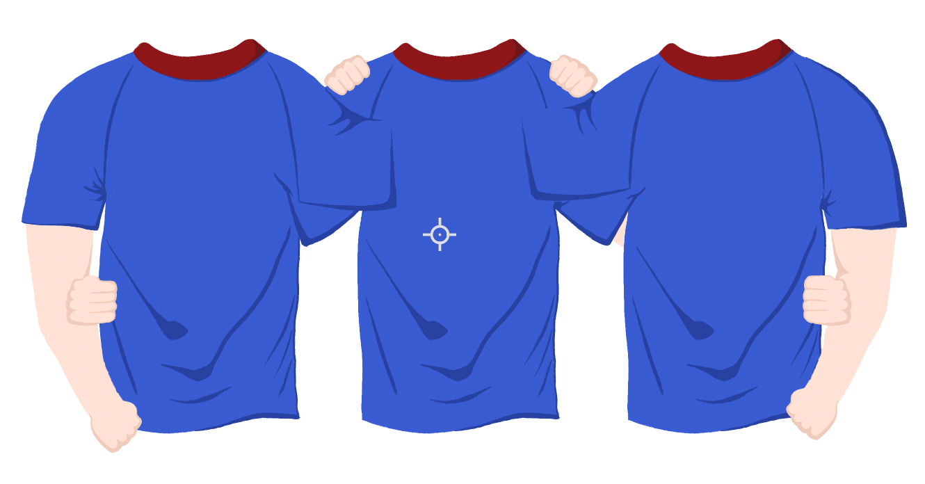
To finalize my representational piece design, I refined the color palette with various shades of blue. I feel this adjustment enhances the outcome, distinguishing it from the initial, more surface level concept. By incorporating blue tones and removing the skin colors, the design now feels more creative and unique. Overall, I’m satisfied with the result and excited to see it come to life in its physical form.

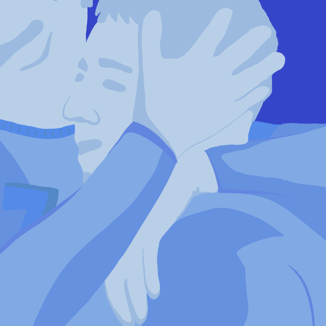
Continuing with this project, I explored a different illustrative style and composition. My goal is to accentuate hand positioning and the act of embracing, conveying platonic affection with greater impact. I’m also experimenting with a more minimalistic approach to see how it complements the compositions.

To assist with the style of the illustrations, I revisited Raj Dhunna's work for inspiration.

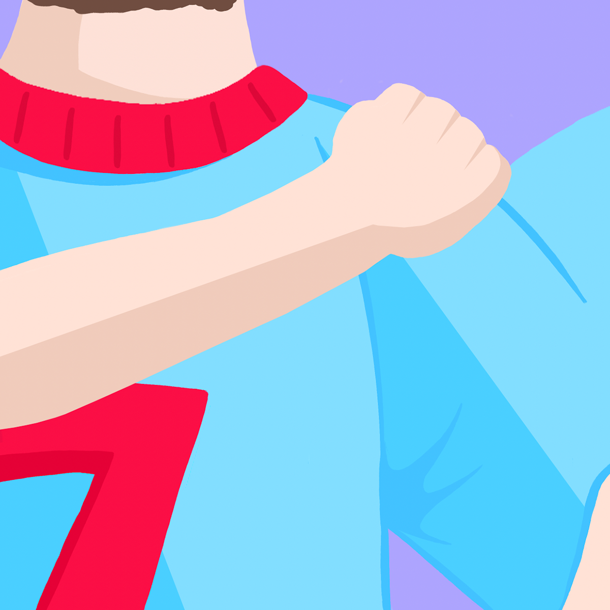

I'm starting to see progress in the outcomes I’m producing, as they are beginning to reflect both the meaning and purpose I want to convey, along with an illustrative style I appreciate. However, there are still challenges to address, particularly with the colour choices. The light blue and red currently feel immature and unpolished, so I plan to investigate this further.
After reflecting on my degree show piece, I decided to return to the blue color palette, as it better conveys the tone I’m aiming for. I also experimented with adding texture again but found that I prefer the design without it.

Confident that I’ve found the style and format I want for my outcomes, I created a range of compositions, each expressing the unity and togetherness I aimed to capture. With multiple pieces now assembled, the project feels cohesive and strong.


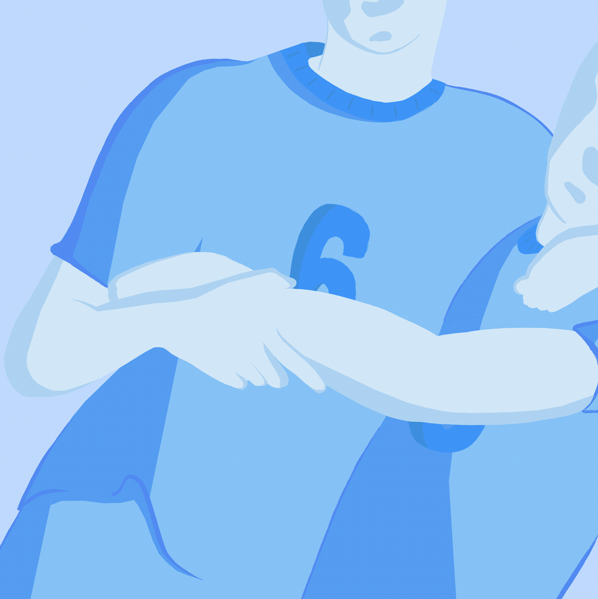
Before continuing with the rest of my designs, I noticed that the darker blue background was somewhat detracting from the overall tone of the image. I decided to use a lighter shade to better enhance the intended mood.
After making this adjustment, I completed the full range of my designs. now satisfied with how they looked, my next step is to research the best ways to display them.
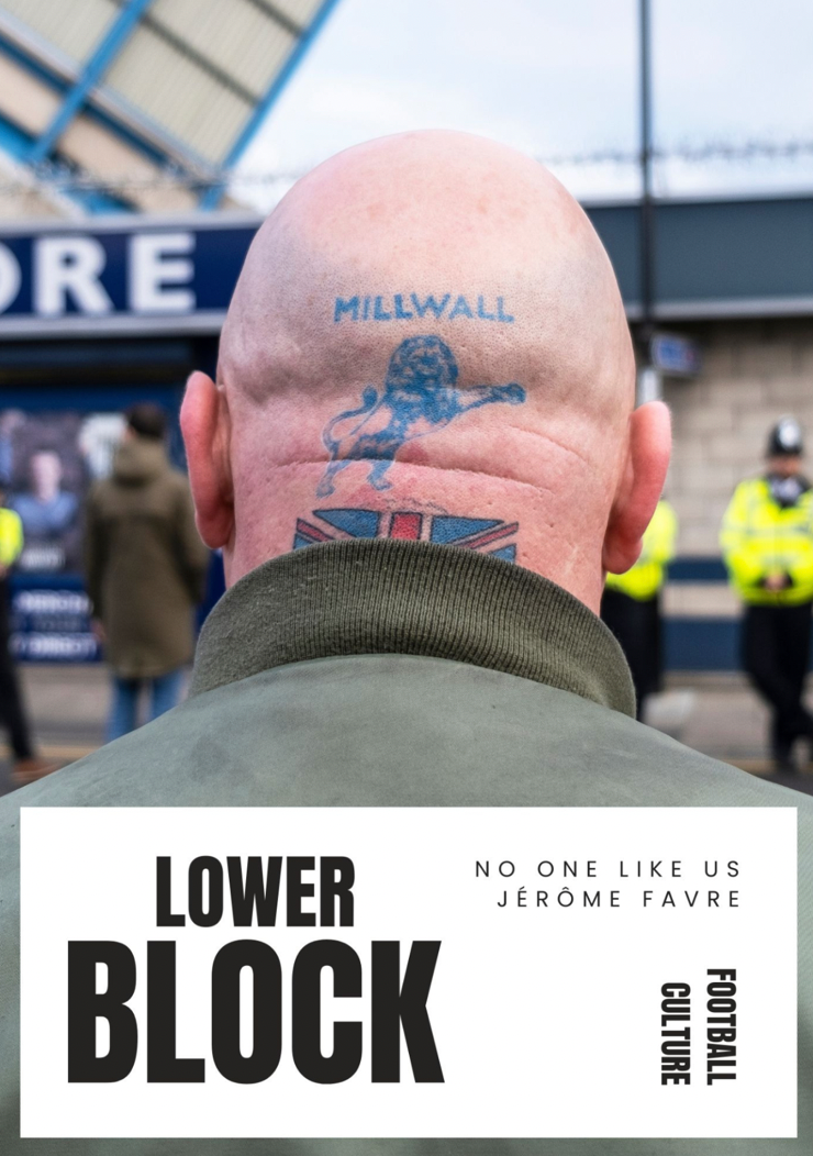
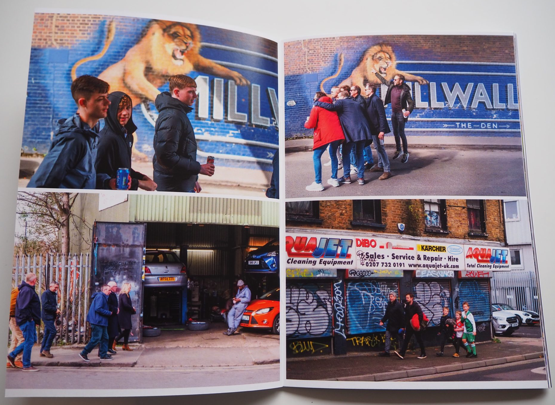
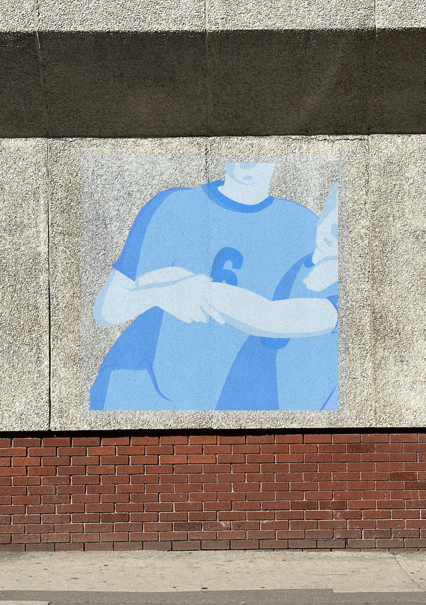
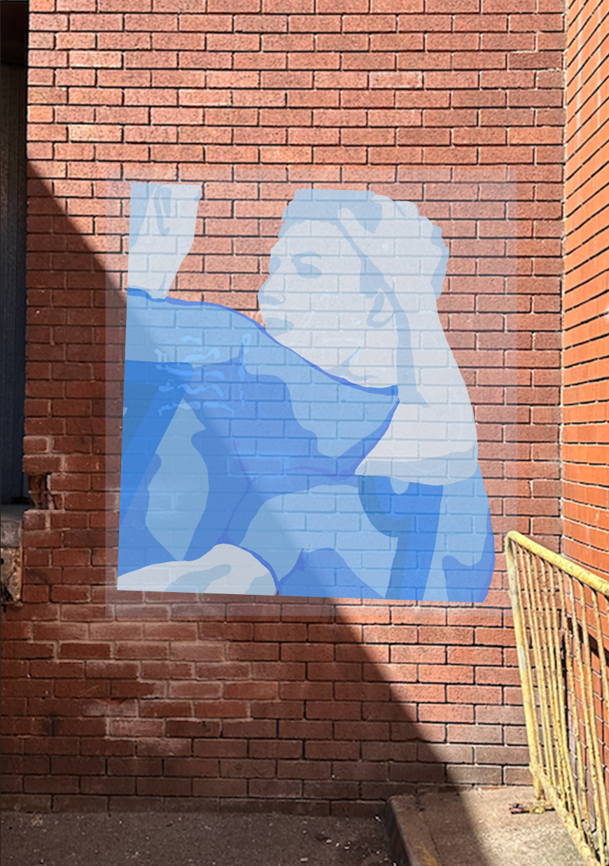
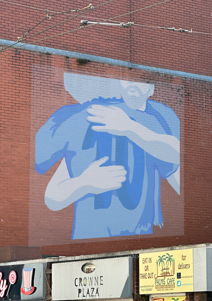
While researching ways to exhibit my work, I came across Jerome Favre’s No One Likes Us, a photographic series capturing the community behind the infamous Millwall football team, revealing the authentic unity among its fans.

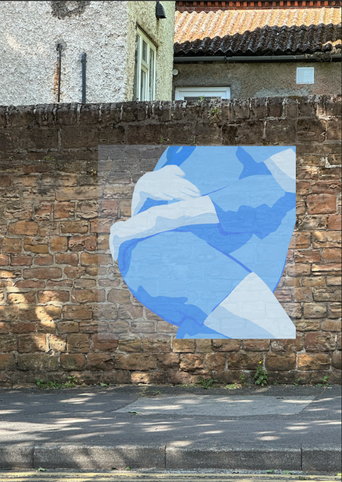

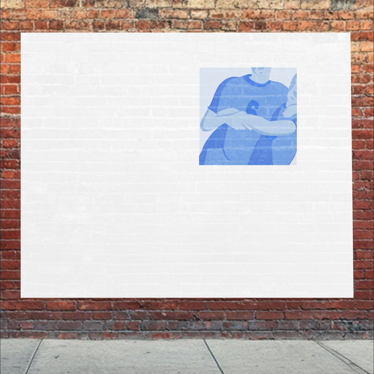
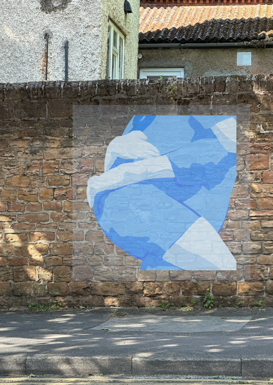
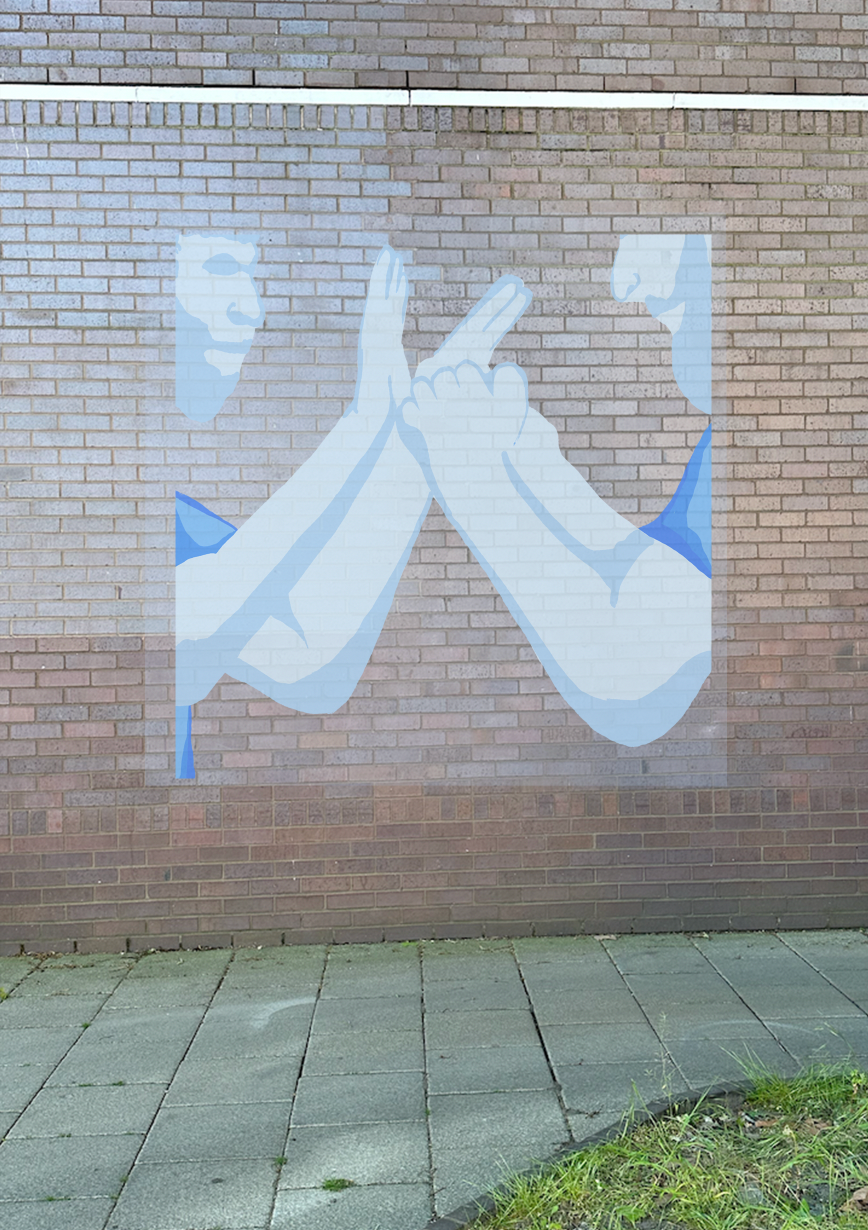
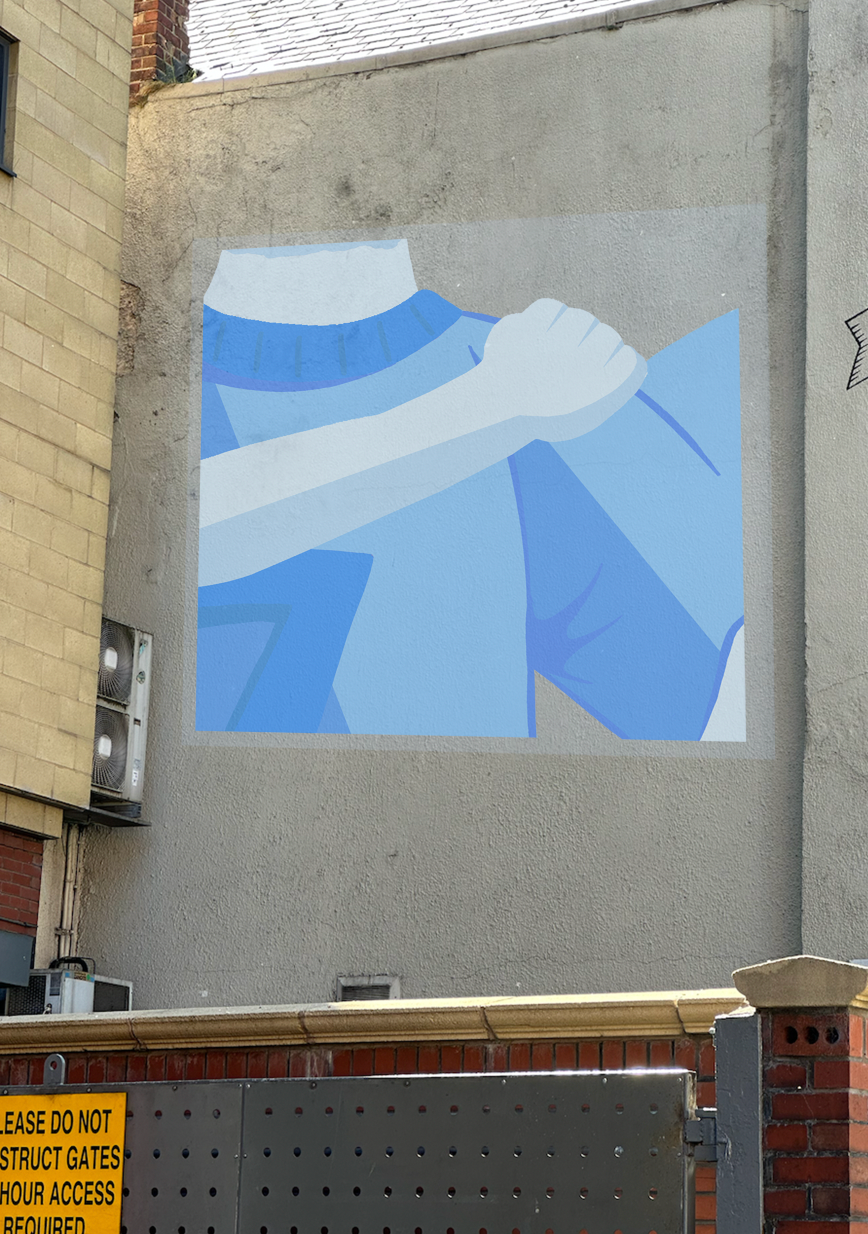
Noticing the industrial environments captured in Favre’s work, I want to present my outcome in a similar setting. Displaying my pieces within the kinds of spaces where football communities exist would strongly complement the core themes of my project. To achieve this, I photographed walls and structures in comparable environments to use as backgrounds for mounting my designs as murals.
I then adjusted the framing to find the best way to showcase the murals, ensuring they stand out against the industrial backdrop and capture attention in an engaging and visually striking way.


I then adjusted the framing to find the best way to showcase the murals, ensuring they stand out against the industrial backdrop and capture attention in an engaging and visually striking way.
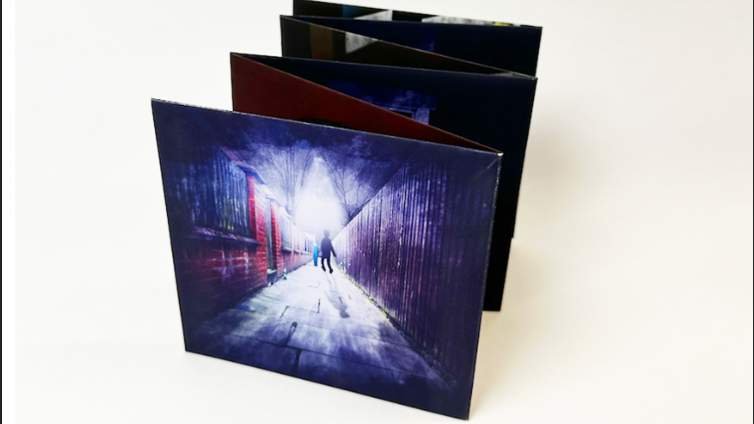
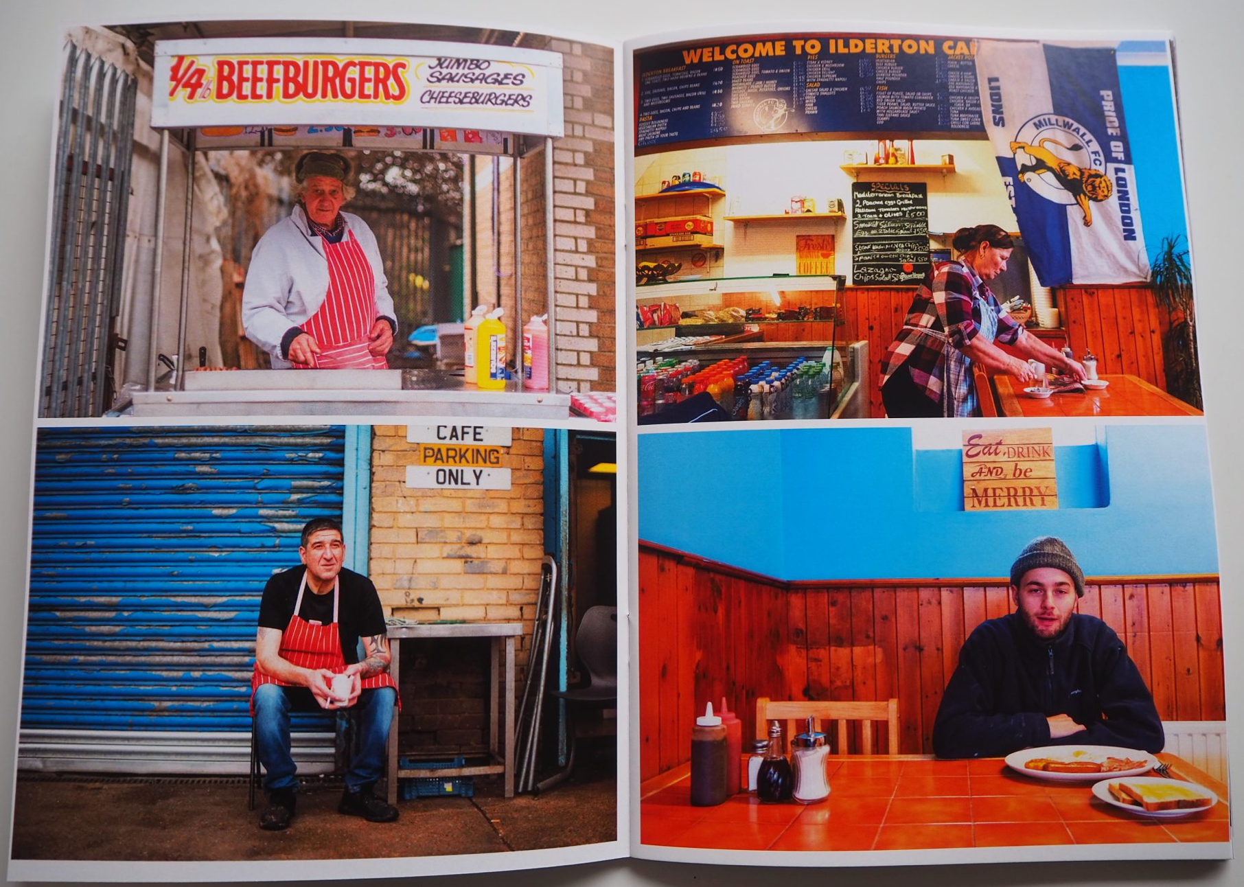
Now satisfied with the outcomes, I plan to compile them into a book designed to resemble a football program, featuring a glossy finish. I believe this approach will add an authentic touch and resonate well with the project’s theme.
Now that the layout is structured for print, I’m eager to see the final outcome come to life.
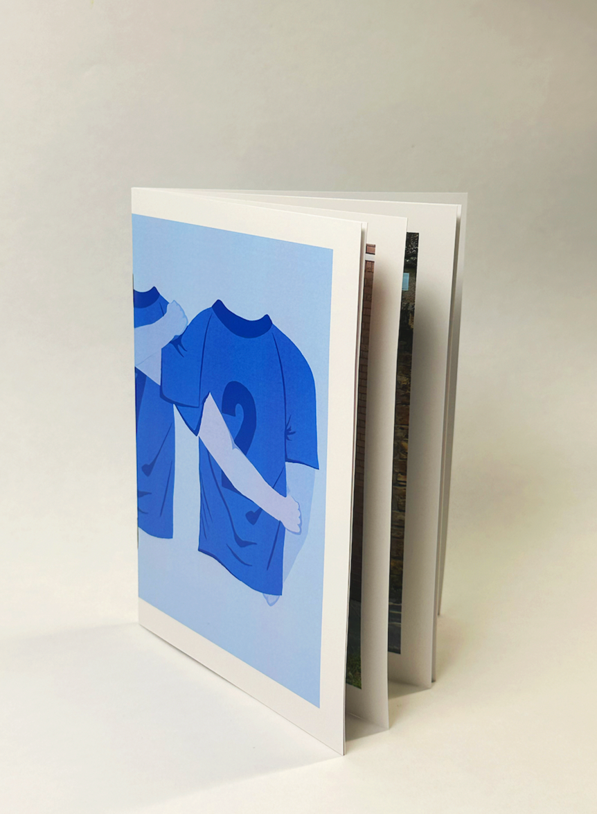
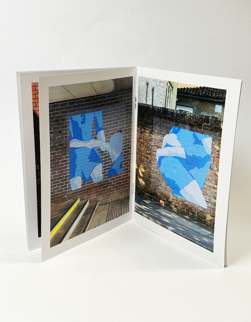

This is the finished book, and I’m very pleased with it. not only does it convey everything I intended for the project but also has a professional and well crafted appearance.